A comprehensive test suite for evaluating the correctness of visual design panels in code-first design tools. Run these tests against any design-in-code tool to verify that what the panel displays actually matches the underlying CSS.
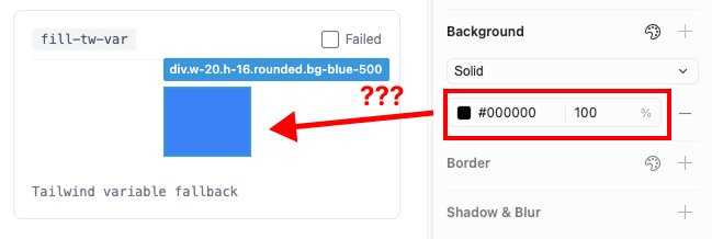
Example failure: a bg-blue-500 element using a Tailwind CSS variable fallback renders as #000000 in the panel.
Design-in-code tools promise to let designers work directly in the browser. But a design panel is only useful if it's correct. If clicking an element shows the wrong alignment, the wrong color, or the wrong border weight, the tool is worse than having no panel at all.
We built this test gym to hold ourselves — and others — accountable. Every test case checks a single, unambiguous property. Either the panel reports the correct value, or it doesn't.
We evaluated Cursor's design sidebar and Inspector against 89 core test cases drawn from this gym.
| Tool | Passed | Failed | Pass Rate |
|---|---|---|---|
| Inspector | 85 / 89 | 4 | 95.5% |
| Cursor | 46 / 89 | 43 | 51.7% |
| Category | Tests | Cursor | Inspector | What's Tested |
|---|---|---|---|---|
| Auto Layout | 18 | 7 fail | 1 fail | Flow direction, alignment detection, gap, padding, margins, distribution, size constraints |
| Fill | 8 | 3 fail | 0 fail | Solid colors, RGB/HSL formats, opacity, CSS variables, Tailwind classes, gradients |
| Stroke | 12 | 6 fail | 1 fail | Border colors, widths, styles, individual sides, mixed widths, inside/center/outside positioning |
| Typography | 10 | 3 fail | 0 fail | Font family, weight, size (px/rem/em), line height, letter spacing, text alignment |
| Appearance | 10 | 4 fail | 1 fail | Opacity, uniform radius, individual corners, mixed corners, elliptical radius, visibility |
| Effects | 12 | 8 fail | 1 fail | Tailwind shadows, custom box-shadow, inner shadows, blur, backdrop blur, stacked effects |
| Position | 10 | 6 fail | 0 fail | Static/relative/absolute, rotation, flip (scaleX/scaleY), combined transforms, translate |
| Text Layout | 5 | 3 fail | 0 fail | Auto width/height, fixed size, block vs inline, flex-grow text, multi-line |
| Element Types | 4 | 3 fail | 0 fail | Semantic elements, containers, interactive elements, typography panel relevance |
The gym contains 9 sections covering every property a visual design panel needs to get right.
Position types (static, relative, absolute, sticky), rotation transforms, scale and flip, combined transforms, flex and grid alignment context, translate offsets, sibling relationships.
Flow types (block, flex row, flex column, grid), flex wrap, gap values, grid column/row gap, padding, margins, size constraints (min/max), overflow/clip, alignment grid (9-point for both horizontal and vertical flow), distributed alignment (space-between, space-around, space-evenly), dimension units (px, %, rem, calc, var).
Text resizing modes (auto width, auto height, fixed size), block vs inline elements, padding and asymmetric padding, margins and negative margins, width constraints, multi-line wrapping, text in flex containers (flex-grow, flex row).
Opacity levels (0%–100% in fine increments), uniform border radius, individual corner radius, mixed corner values, large radius values, visibility states, combined opacity + radius, radius units (px, rem, em, %, elliptical).
Font families (Inter, Georgia, Fira Code, Playfair Display, system-ui, Arial), font weights (100–900), font sizes (10px–48px), font size units (rem, em, clamp), line heights (ratio and px), letter spacing (em and px), text alignment (left, center, right, justify), vertical text alignment, block element behavior, combined styles.
Solid hex colors, neutral/grayscale, RGB/RGBA, HSL/HSLA, background opacity, transparent/none, CSS variables, Tailwind variable fallbacks, Tailwind color classes, linear/radial/Tailwind gradients, fill visibility.
Border colors, widths (1–12px), styles (solid, dashed, dotted), border opacity, individual sides (top/right/bottom/left only), mixed border widths, border position (inside via border, center via box-shadow, outside via outline), no-border states, border with radius, Tailwind border classes, stroke visibility, mutation test cases.
Tailwind shadow presets (sm through 2xl, none), custom drop shadows (subtle/medium/heavy), shadow offset directions, blur values, spread values, colored shadows, inner shadows (inset), layer blur (filter: blur), backdrop blur (backdrop-filter), stacked/multiple effects, no-effect states, effect visibility.
Text elements (h1–h4, p, span, label, strong/em), container elements (div, section, article, nav, header, footer, main, aside), layout containers (flex, grid), image elements (img, svg, picture), interactive elements (button, anchor, inputs, select, textarea, range), replaced elements (iframe, video), lists, tables, forms, semantic elements (figure, blockquote, code, pre).
npm install
npm run dev
Open http://localhost:5173 in your browser alongside your design-in-code tool's panel.
- Click on the lighter-colored box inside each test case
- Compare what your design panel reports to the expected value shown in the test label
- If the panel reports the wrong value, check the Failed checkbox
- Optionally add a note describing what went wrong
- When done, click Copy Test IDs or Copy Prompts to export your failures
The repo includes integration tests you can run with:
npx vitest run --config vitest.integration.config.tsFrom our evaluation, design panels tend to fail in predictable ways:
- Alignment detection in horizontal flow — The panel swaps axes or shows wrong positions
- Unit preservation — REM and percentage values get converted to incorrect px values
- Border position detection —
outlineandbox-shadowborders get misclassified as shadows - Distribution detection —
space-between,space-around,space-evenlyaren't recognized - CSS variable resolution — Tailwind variable fallbacks show as black or missing
- Color format support — RGB and HSL values aren't parsed
- Shadow class detection — Tailwind shadow utilities are decomposed into individual shadows instead of recognized as a class
Add new test cases by creating a <TestItem> in the appropriate section file under src/sections/. Each test case should:
- Apply a single, unambiguous CSS property to the target element
- Have a clear
testIdandlabeldescribing the expected value - Be visually verifiable by clicking the element and checking the panel
- Include in the pull-request what the expect output is for that selection.
MIT
Built by the Inspector team.