customizable multi-action-button component for react-native
npm i react-native-action-button --saveFirst, require it from your app's JavaScript files with:
var ActionButton = require('react-native-action-button');ActionButton component is the main component which wraps everything and provides a couple of props (see Config below).
ActionButton.Item specifies an Action Button. You have to include at least 1 ActionButton.Item.
var React = require('react-native');
var { Component, Stylesheet, View, } = React;
var ActionButton = require('react-native-action-button'),
Icon = require('react-native-vector-icons/Ionicons');
class App extends Component {
constructor(props) {
super(props);
}
render() {
return (
<View style={{flex:1}}>
<ActionButton bgColor="rgba(23, 9, 107, 0.75)" buttonColor="rgba(63,159,107,1)">
<ActionButton.Item title="New Task" onPress={() => console.log("new task tapped!")}>
<Icon name="android-create" style={styles.actionButtonIcon} />
</ActionButton.Item>
<ActionButton.Item title="My Notifications" onPress={() => {}}>
<Icon name="android-notifications-none" style={styles.actionButtonIcon} />
</ActionButton.Item>
</ActionButton>
</View>
);
}
}
var styles = StyleSheet.create({
actionButtonIcon: {
fontSize: 20,
height: 22,
color: 'black',
},
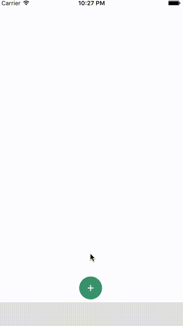
});This will create a floating Button in the bottom right corner with 2 action buttons.
Also this example uses react-native-vector-icons for the button Icons.
| Property | Type | Default | Description |
|---|---|---|---|
| active | boolean | false | action buttons visible or not |
| type | string | "float" | either float (bigger btns) or tab (smaller btns) + position changes |
| position | string | "right" / "center" | one of: left center and right |
| bgColor | string | "transparent" | background color when ActionButtons are visible |
| buttonColor | string | "rgba(0,0,0,1)" | background color of the +Button (must be rgba value!) |
| spacing | number | 20 | spacing between the ActionButton.Items |
| offsetX | number | 10 / 30 | offset to the sides of the screen |
| offsetY | number | 4 / 30 | offset to the bottom of the screen |
| Property | Type | Default | Description |
|---|---|---|---|
| title | string | undefined | the title shown next to the button |
| onPress | func | null | required function, triggers when a button is tapped |
| buttonColor | string | "white" | background color of the Button |