This package provides an easy to use, ready to go and customizable wrapper around file input, with option for image previews and returning file as base64 string.
npm install --save react-file-input-previews-base64import FileInputComponent from 'react-file-input-previews-base64'<FileInputComponent
labelText="Select file"
labelStyle={{fontSize:14}}
multiple={true}
callbackFunction={(file_arr)=>{console.log(file_arr)}}
accept="image/*"
/>| Prop | Type | Effect | Default Value |
|---|---|---|---|
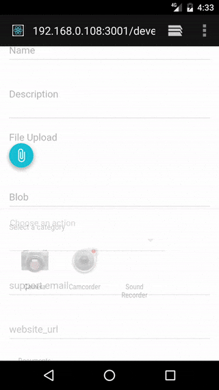
| labelText | string | The text to show in label | "File Upload" |
| multiple | boolean | Whether multiple files can be selected or not | true |
| accept | string | string which is passed to accept field of input tag, to specify the types of files that can be selected | "*" |
| imagePreview | boolean | Whether preview section is shown or not | true |
| useTapEventPlugin | boolean | Whether to use onTouchTap or onClick | false |
| callbackFunction | function | The function to be called when files are processed, can take either array of file describing objects or single object depending on if multiple files are allowed | ()=>{} |
| nonPreviewComponent | component | Component to show in preview section for non-image files, title, size and type are passed to this as props | included <NonPreviewDefaultComponent /> |
| buttonComponent | component | The component to show for button, onClick or onTouchTap will be merged to its props to trigger the file selector box to show internally | <button type="button">Attach</button> |
| imageContainerStyle | object | Object passed to style prop of image preview section container div | {display:"flex", flexDirection:"row", width:"100%", flexWrap:"wrap"} |
| imageStyle | object | Object passed to style prop of image previews | {marginTop: 5, marginBottom: 5, marginRight: 5, width: "auto", height: "30vmin", boxShadow:"rgba(0, 0, 0, 0.188235) 0px 10px 30px, rgba(0, 0, 0, 0.227451) 0px 6px 10px"} |
| parentStyle | object | Object passed to style prop of container div of whole component | {marginTop:14} |
| labelStyle | object | Object passed to style prop of label | {fontSize: 16,color:'rgba(0, 0, 0, 0.298039)',display:'block'} |
| inputId | string | String passed to id prop of input and htmlFor tag of label components;if not present clicking on label won't trigger the file sector to show | none |
| inputName | string | String passed to name prop of input, if not present using thi component as part of form will not work. | none |
- onTouchTap is implmented by react-tap-event-plugin and is used in the amazing material-ui.
- I am using this with material-ui library and the default props for styles follows the material design pattern.
- The structure of file describing object is:
{
  name: "IMG_20160813_102226.jpg",
  type: "image/jpeg",
  size: 645,
  base64: "data:image/jpeg;base64,/9j/4SzyRXhpZgAATU0AKgA...",
  file: File
}