NavigationRail, NavigationBar, NavigationDrawer controls for MaterialDesign3 #2628
Conversation
Fix a bug where the shadow would remain in Standard OpenMode
Change the layout and navigation to use the new Navigation controls
 Keboo
left a comment
Keboo
left a comment
Keboo
left a comment
There was a problem hiding this comment.
First of all, let me start by saying thank you. This work looks amazing!
I left a few small comments, but I think this is very close to being merged.
As for your question on the *Assist classes. My preference would be to keep them together. Attached properties are difficult to discover as it is, so I would be hesitant to separate them out. With that said, I suspect there may be cases where an attached property only applies to MD2 or MD3. For those I think we will just need to evaluate on a case-by-case basis.
| <converters:BorderClipConverter x:Key="BorderClipConverter"/> | ||
| <converters:BrushRoundConverter x:Key="BrushRoundConverter"/> | ||
|
|
||
| <Style x:Key="MaterialDesign3NavigationBarListBoxItem" TargetType="{x:Type ListBoxItem}"> |
There was a problem hiding this comment.
For the MD3 styles the naming pattern we want to start using is the prefix "MaterialDesgin3.". Similar comment for the other new styles as well.
| <Style x:Key="MaterialDesign3NavigationBarListBoxItem" TargetType="{x:Type ListBoxItem}"> | |
| <Style x:Key="MaterialDesign3.NavigationBarListBoxItem" TargetType="{x:Type ListBoxItem}"> |
|
|
||
| <Grid Height="80" | ||
| Background="{DynamicResource MaterialDesignCardBackground}"> | ||
| <ListBox Height="80" |
There was a problem hiding this comment.
I would wrap each of these ListBoxes in a XamlDisplay control (this is from the ShowMeTheXaml package). It is what provides the little button people can click on to see the XAML contained within it.
 Keboo
added
enhancement
demo app
Keboo
added
enhancement
demo app
Co-authored-by: Kevin B <[email protected]>
And add FAB to Drawer
|
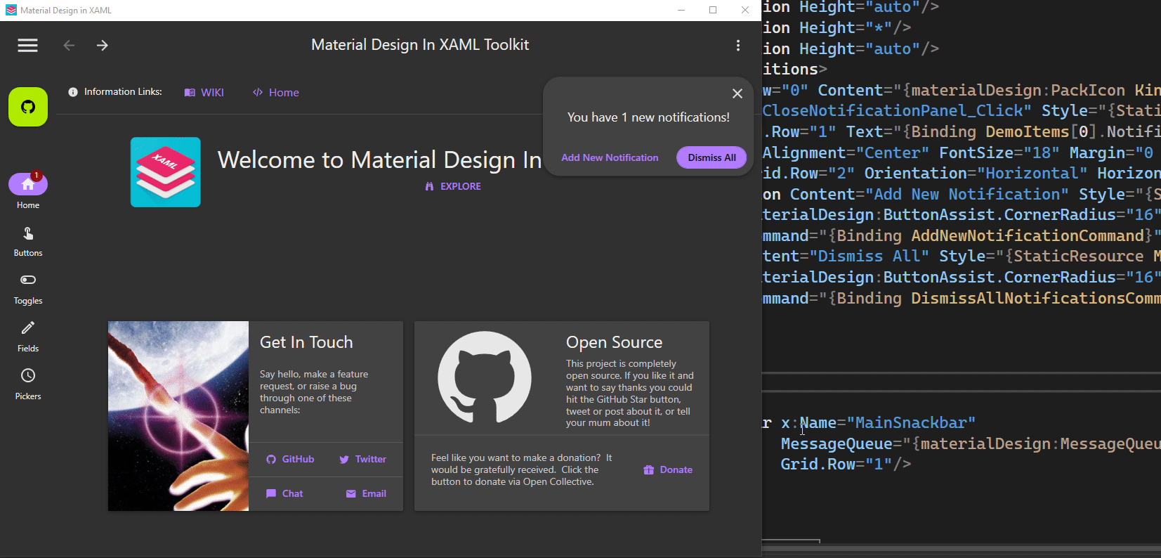
I've fixed the errors and added the badge to the navigation controls. Some changes also to the Demo App. To showcase the badge I've added a Notifications property to the DemoItem class and a little control to increase or dismiss the notifications. Also new an extended FAB and a collapse button in the drawer when in standard mode.
|
|
Where is this groovy new demo? I downloaded the 4.5.0 demo and it seems mostly as it was. |
|
@BigBadBleuCheese it lives under the MaterialDesign3.Demo.Wpf directory in the repo. However your comments reminds me that it has not been added to the pipeline which is why it is not currently being included in the release artifacts. I will work on getting that added, because it is pretty cool. |
3 participants
Summary
From issue #2578
I've added the Navigation Rail, Navigation Bar and Navigation Drawer controls as styles for the ListBox. This is probably not ideal, as it had already been pointed out, as it limits some of the things that can be done, but it was also somewhat easier for me to do rather than creating a completely new CustomControl. In the future that may be a better way to implement the controls though.
The messy part has to do with the Icons, since it needs both a selected version and an unselected (outlined) version. The best way I came up with was to make them a part of the Style, so it works like this:
Or this without MVVM:
I still have to add the Badge to the items, as per spec. Waiting for feedback before I do. I also haven't re-implemented the TabControl style for NavigationRail, should I?
Navigation Rail
Specs: https://m3.material.io/components/navigation-rail/overview
Navigation Bar
Specs: https://m3.material.io/components/navigation-bar/overview
Navigation Drawer
Specs: https://m3.material.io/components/navigation-drawer/overview
Demo App
I've updated the DemoApp to use NavigationRail, NavigationBar and NavigationDrawer in relation to the size of the window, similarly to this: https://m3.material.io/foundations/adaptive-design/overview
I'll wait for feedback.
By the way, should we differentiate the *Assist.cs files between MD2 and MD3 or should we leave them the same?