Slimmer top/bottom spacing inside notices #16589
Conversation
 aduth
left a comment
aduth
left a comment
There was a problem hiding this comment.
Code-wise this looks good, and I agree the padding is both too much and inconsistent with the rest of the admin.
I was curious where the original values might have come from, and I note that the rest of the admin uses a total of 1em margin for paragraphs in a notice:
I don't know if we care to mimic this, or if it's necessary to adjust other style values here (there's default padding on the notice itself, in addition to the margin of the content).)
|
This has been bugging me for a while but I've been too busy to fix it, so I'm very happy to see this PR! Thanks @kjellr! |
There was a problem hiding this comment.

I knew there was some back and forth here. It looks like this breaks the alignment of the "close" button in the regular notices of the editor.
Try
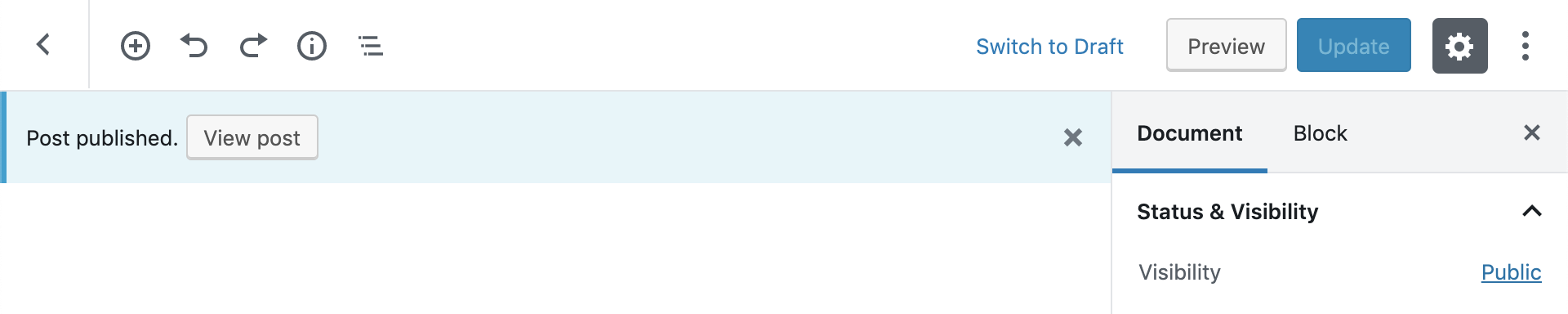
wp.data.dispatch('core/notices').createNotice(
		'info',
		'Post published.', // Text string to display.
		{
			isDismissible: true, // Whether the user can dismiss the notice.
			// Any actions the user can perform.
            actions: [
				{
					onClick: () => console.log( 'test' ),
					label: 'View post'
				}
			]
		}
	);
So that they're not the same height as the sidebar's nav.
|
@youknowriad good catch. I pushed a new change that sets the top/bottom margins to
|
|
Thanks everyone! |
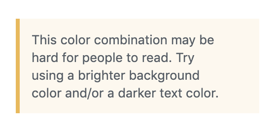
Currently, our Notice component ships with
1emof padding on the top and bottom of the content area:This results in a lot of extra room on the top and bottom of the text:
This PR changes that spacing to
$grid-size-small, to balance it out with the spacing on the sides, and to align to our standard spacing increments, instead of1em: