Use a darker frame for template mode and previews #31044
Conversation
| color: $white; | ||
| border-radius: 0; | ||
| height: $header-height; | ||
| height: $header-height + 1px; |
There was a problem hiding this comment.
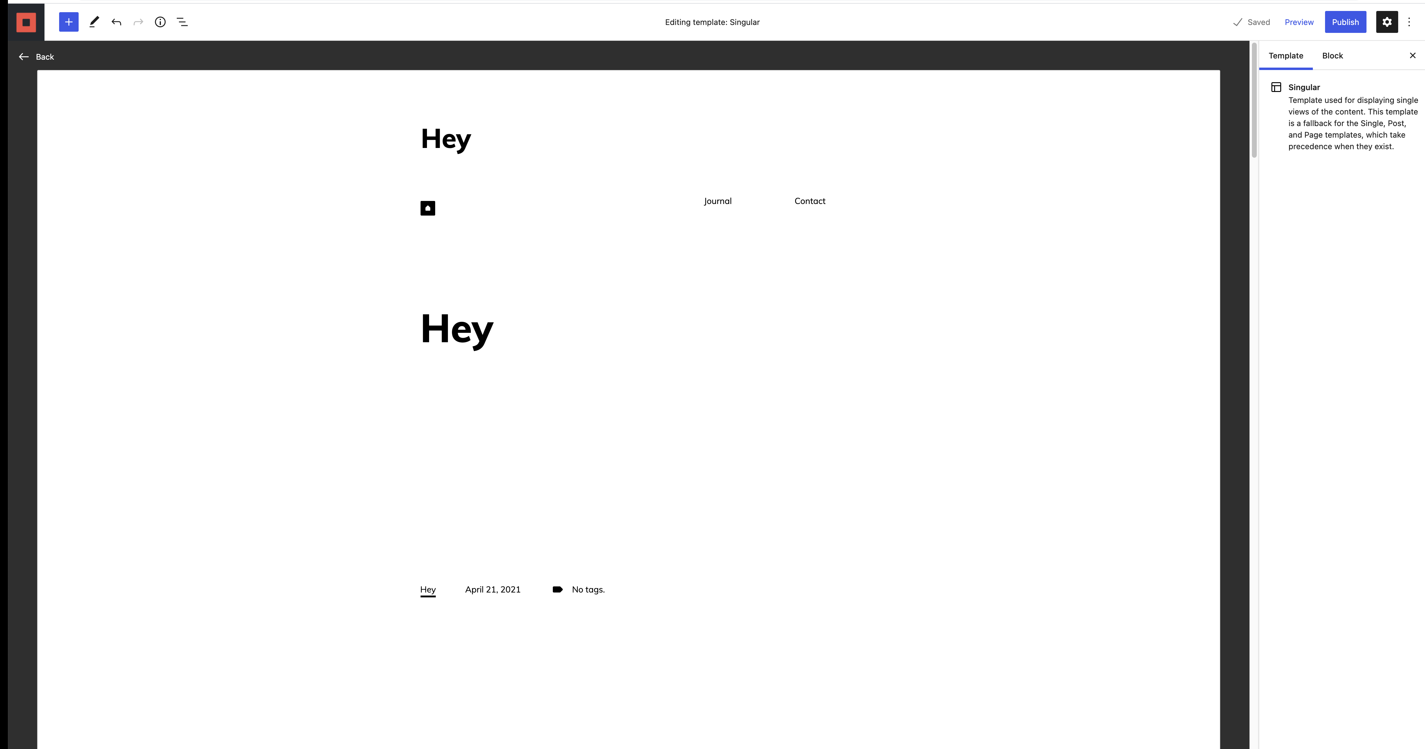
This small hack is here to not show the light border under the toggle, especially in "preview" or "template mode"
There was a problem hiding this comment.
You can use $border-width here, that returns 1px. Not because we need to change the contents of that variable very often, but it helps work sort of like a comment to explain what that pixel is for.
There was a problem hiding this comment.
We should probably add a similar hack to "hide" the inspector border too.
|
Size Change: +469 B (0%) Total Size: 1.47 MB
ℹ️ View Unchanged
|
|
Looks good. @jameskoster what color is the border on the canvas in your mockups? Is it still the light gray used here?
|
|
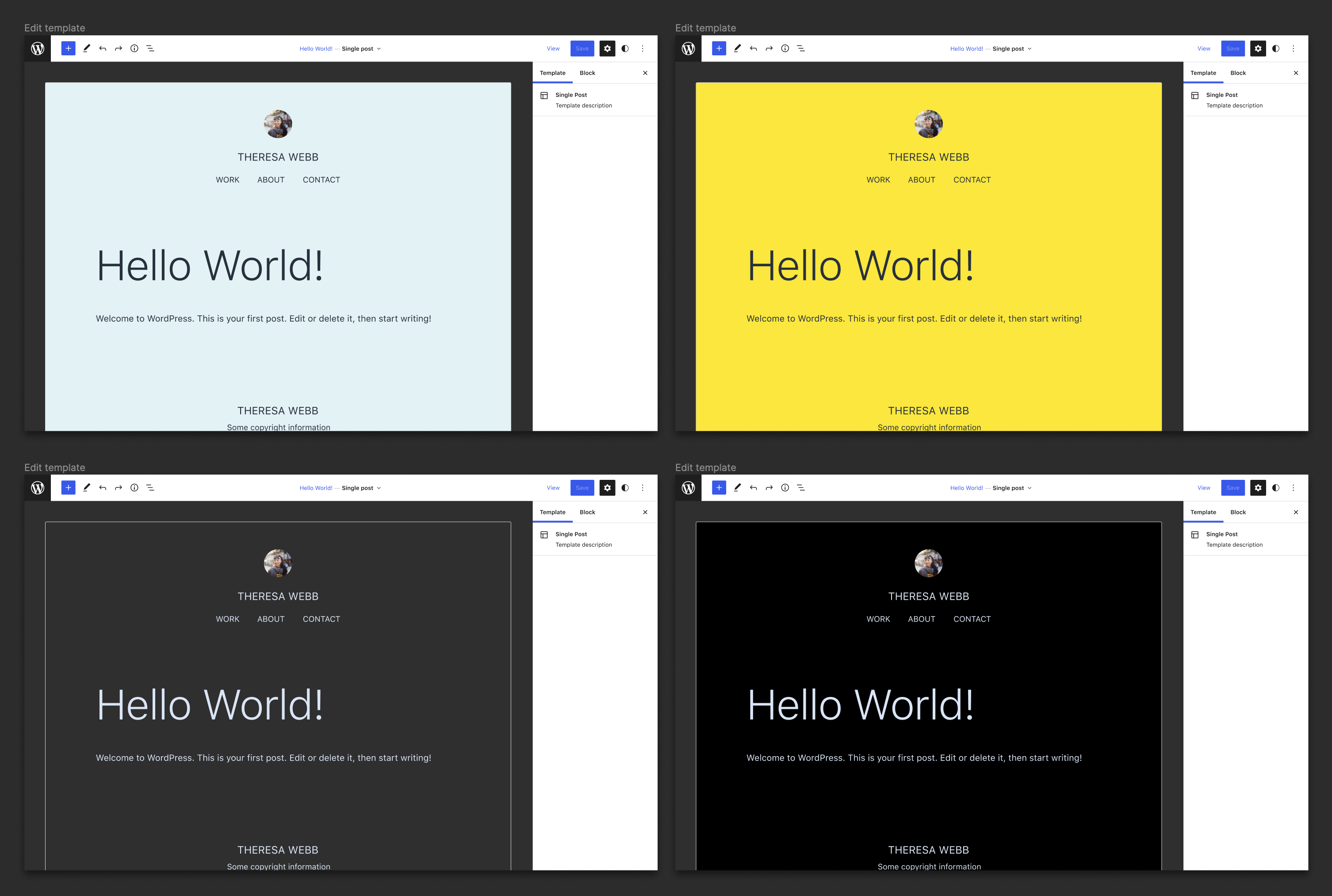
Personally I think the dark grey clashes with the color of the W button that takes you back to the dashboard. Back link: When the link is clicked, -active, the color is so dark that it is close to invisible. |
|
When clicking the back link, chrome, windows. |

Yes I've been using the same color we use for all borders which I believe is grey-300. It works well to distinguish the frame against a variety of different theme background colors:
Another option is to use elevation...
... which works better on the dark frame than the light one. But still presents other challenges. |
|
how is this looking? |
|
I think it's good to go. |
Based on the latest designs, it seems we now want a darker frame for template mode and previews.