-
Notifications
You must be signed in to change notification settings - Fork 4.7k
[RNMobile] Tweaks to Badge Component's Styling #32865
New issue
Have a question about this project? Sign up for a free GitHub account to open an issue and contact its maintainers and the community.
By clicking “Sign up for GitHub”, you agree to our terms of service and privacy statement. We’ll occasionally send you account related emails.
Already on GitHub? Sign in to your account
Conversation
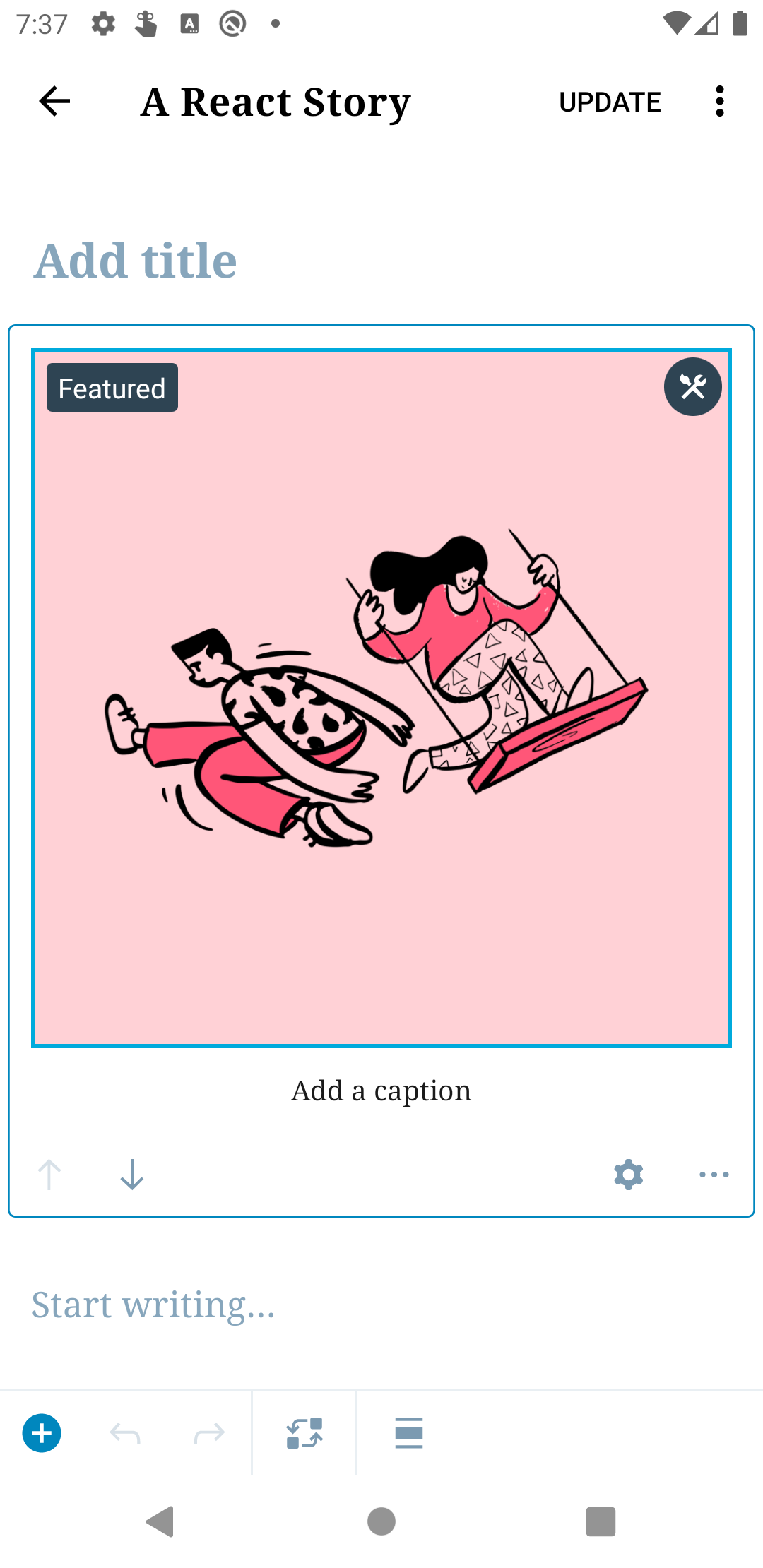
The background colour of the badge component is updated to a darker gray colour with this commit (from $gray-70 to $gray-dark). This matches the colour of the edit button, which is displayed to the upper right of the image block when selected.
|
Size Change: 0 B Total Size: 1.04 MB ℹ️ View Unchanged
|
The component's margin and padding is updated with this commit to match the original designs for the badge component.
|
@iamthomasbishop, I've made an initial pass at correcting the component's styles based on your feedback. I've followed the original padding/margin for the badge component, but let me know if there's anything else you think needs changing here. I prefer the larger margin when the badge is by itself (without the edit button displaying) but wondered whether the badge may now look a bit "off" when displayed alongside the image block's edit button. It's possible I've been staring at this too long. :D I'll defer to your preference here, as I don't have a super strong opinion either way.
|
 iamthomasbishop
left a comment
There was a problem hiding this comment.
Choose a reason for hiding this comment
The reason will be displayed to describe this comment to others. Learn more.
Thanks for the ping, @SiobhyB ! This looks pretty good, esp the last example above, because it's closer to vertically centered with the edit button on the opposite side:
Let's roll with that for now, and we can always iterate if necessary in the future. Nice work!
It was agreed that the original margin of 8px works better for the badge, as it is more vertically aligned with the image block's edit badge. See: #32865 (review)
|
Thank you for this @iamthomasbishop, I've gone ahead to update the margin to the |


gutenberg-mobile: wordpress-mobile/gutenberg-mobile#3642Description
This PR includes some tweaks to the badge component's styling. Specifically, it reduces its padding and changes the background color to a darker gray.
How has this been tested?
The updated badge component was compared to the original design mocks here:
To view the badge component:
Screenshots
Tested on a Pixel 3a emulator, Android 10
Types of changes
Checklist:
*.native.jsfiles for terms that need renaming or removal).