Modal headings and labels missing editor text color #51246
Conversation
 github-actions
bot
added
the
First-time Contributor
github-actions
bot
added
the
First-time Contributor
|
👋 Thanks for your first Pull Request and for helping build the future of Gutenberg and WordPress, @ghorivipul97! In case you missed it, we'd love to have you join us in our Slack community, where we hold regularly weekly meetings open to anyone to coordinate with each other. If you want to learn more about WordPress development in general, check out the Core Handbook full of helpful information. |
|
👋 @ghorivipul97, thank you for working on this! It looks like you may need to run |
 mikachan
left a comment
mikachan
left a comment
mikachan
left a comment
There was a problem hiding this comment.
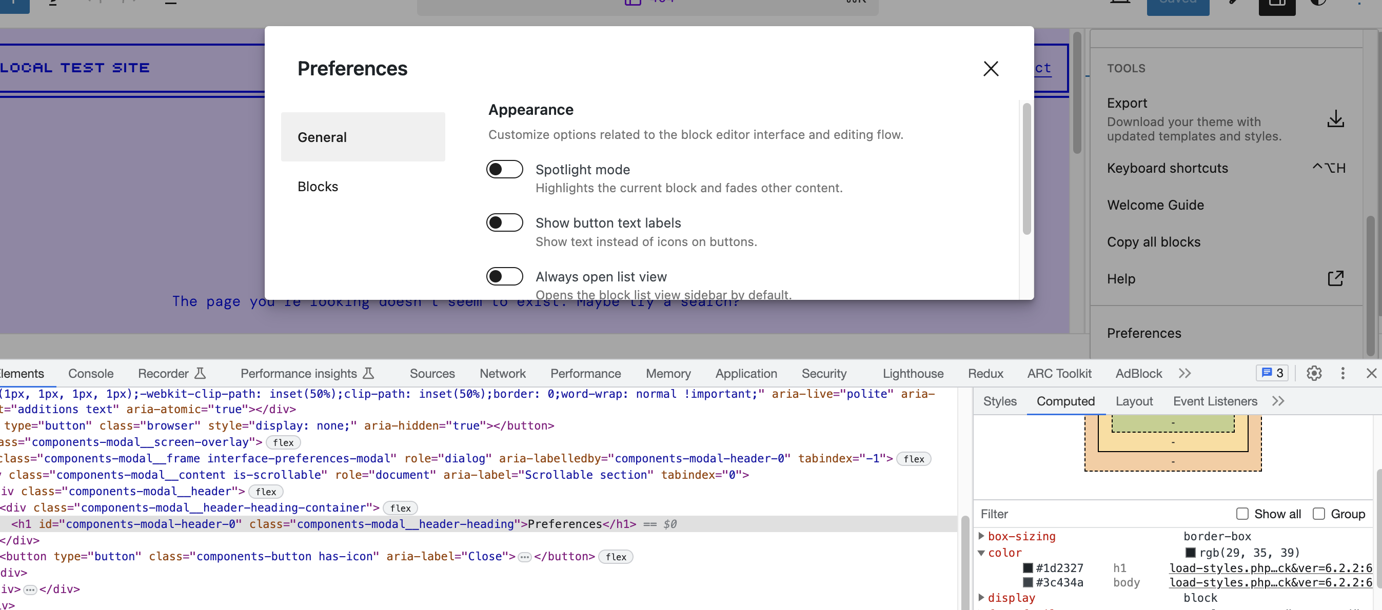
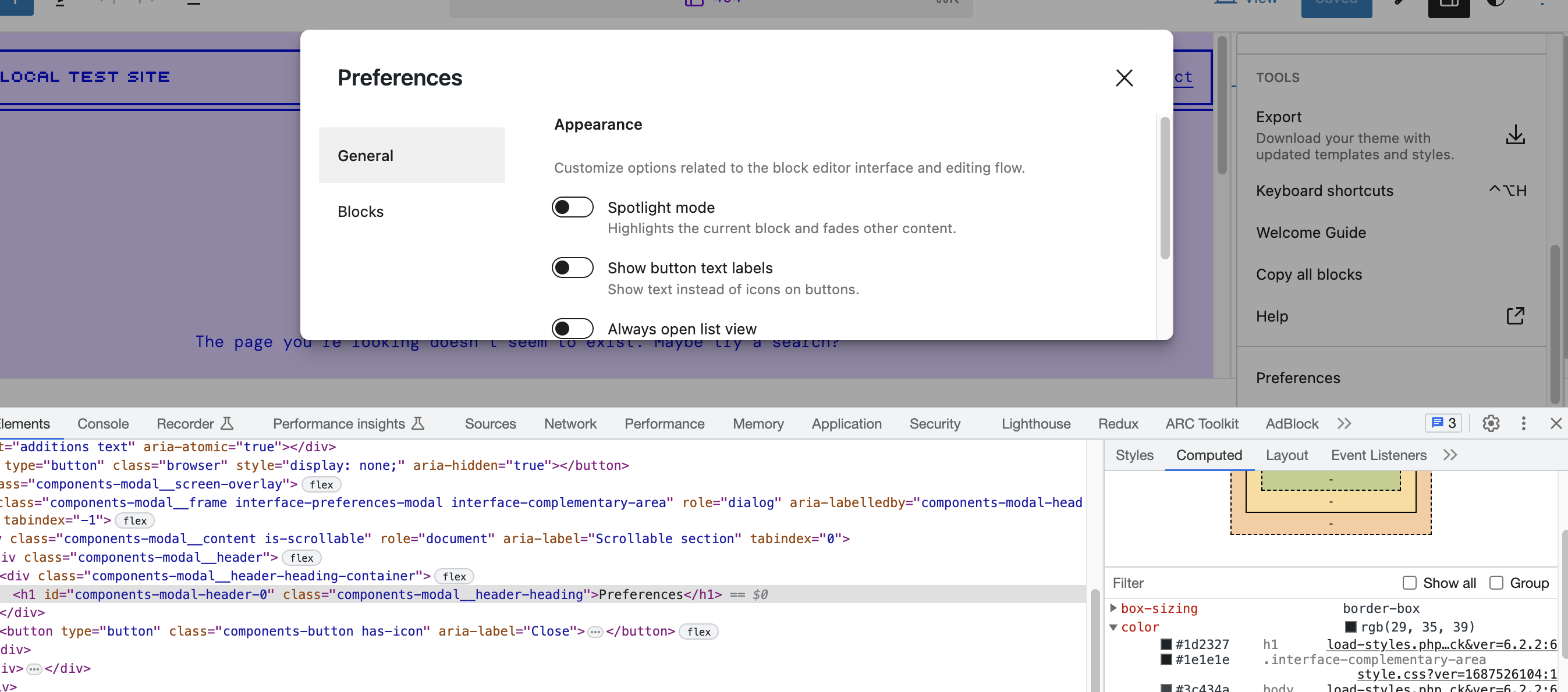
It looks like the heading color has not been applied, but I can see the additional class has been added to the modal container:
| Trunk | This PR |
|---|---|
 |
 |
It seems that the desired color #1e1e1e is being overridden by #1d2327. We perhaps need to add this style somewhere more specifically, maybe somewhere like this: https://github.com/WordPress/gutenberg/blob/trunk/packages/components/src/modal/style.scss#L92
okay |
 stokesman
left a comment
stokesman
left a comment
stokesman
left a comment
There was a problem hiding this comment.
Thanks for working on this!
I think we might want to petition for some design scrutiny here because it does affect more than just text colors. The margin and size of subheadings are also affected. A comparison:

(The smaller and more spaced out headings is this PR).
Because the class/styles from the Interface package are making the difference I'd want to think it’s good and helps with consistency. Although, I'd not say that spacing is an improvement.
I think we might consider moving this forward by only affecting color and leaving the rest for another issue.
| h1 { | ||
| line-height: 1; | ||
| margin: 0; | ||
| color: $gray-900; |
There was a problem hiding this comment.
| color: $gray-900; | |
| color: $components-color-foreground; |
In the components package this is the appropriate variable to apply for color (so that it can be themed).
| return ( | ||
| <Modal | ||
| className="interface-preferences-modal" | ||
| className="interface-preferences-modal interface-complementary-area" |
There was a problem hiding this comment.
This is the change that also brings in font-size and margin differences to the subheadings. Another thing to note is this won't correct the color issues noted in other modals like the one for Block locking mentioned in the issue. Those modals aren't based on this component. I'd be interested in evaluating some other options.
One option might be to simply add a rule for color here:
Another option if we do want all the font-size and margin differences is to convert the styles of interface-complementary-area into a mixin that can also be used on interface-preferences-modal because I think that'd be cleaner than doubling up on class names from the interface package on this element.
Finally if it's not considered too prescriptive there's a rule we could add to the base Modal component that would obviate the need to change anything in the Interface package and also cover the other modals. That's something like this:
.components-modal__frame * {
	color: $components-color-foreground;
}
I'm not sure that would get sign-off from the component crew but it'd be the most succinct way to fix this.
 Mamaduka
added
the
[Status] Stale
Mamaduka
added
the
[Status] Stale
|
Hi, @ghorivipul97 Would you still like to work on this PR and address the feedback? Otherwise, we can close this as "stale". |
|
The following accounts have interacted with this PR and/or linked issues. I will continue to update these lists as activity occurs. You can also manually ask me to refresh this list by adding the If you're merging code through a pull request on GitHub, copy and paste the following into the bottom of the merge commit message. To understand the WordPress project's expectations around crediting contributors, please review the Contributor Attribution page in the Core Handbook. |
 t-hamano
added
[Type] Bug
t-hamano
added
[Type] Bug
|
Thank you for working on this. Closing as fixed in #71311 |
6 participants
#50448
What?
Added Default Color of Model heading & Labels
Why?
Default theme color and editor text color are different so need to apply common colour for all model
How?
Apply default color class to model edior
Testing Instructions