Project - User-Centric Frontend Development - DGYM.
The project will cover the main marketing website for DGYM. It is designed to be responsible and accessible on a lot of devices, making it easy to navigate for potential gym users.
The end user of this project is people that want join in a gym to weight loss, tone the muscles, get in helth in a nice and confortable place in a neighbourhood.
The end user want to see information about the subscribe, gym equipment, gym classes see what the gym have to offer to help they in your purposes and how to get in touch with the gym.
The objective of the projct is to help the gym get more subscribes with a easy and simple website.
- As a user I want to find out more about the gym prices.
- As a user I want to find out if the gym is the closest gym from my neighbourhood.
- As a user I want to know how to subscribe.
- As a user I want to know about the classes they offer.
- As a user I want to get in touch with the gym easily.
- As a user I want to be able to find the gym addres and post code.
- As a user I want to find the gym's social media links easily.
-
- I've chosen the colours thinking in a colorful place which reminds me of happiness and strong fellings as strong colours.
-
- Sans-serif is the main font used on the whole website with serif as fallback.
- It was chosen for being the most-used font and are compatibles to all devices and browsers.
-
- All images were chosen for giving the feeling of happiness in the gym.
-
-
top menu (desktop navigation)
-
sidebar menu (mobile navigation)
-
footer
-
containers/cards
-
buttons
-
form
-
text input
-
email input
-
textarea inputs
-
maps
-
images
-
icons
-
Navigation Bar
- The full responsive navigation bar includes logo and links to the Home Page, 'Our Classes', 'Contact us' and 'Find us' sections.
- goes to toggle navigation on small devices
- sticks to the top so links are present no matter where the user is on the page

-
Hero Section
- The Hero Section will be a landing page for the user and a call to action text with a 'Join Now' button.
- This section covers a brief overview of what the gym stands for and its principal selling points.
- Join Now Button scrolls user down nicely to contact form
- placement of text adjusts responsively and remains above the image
-
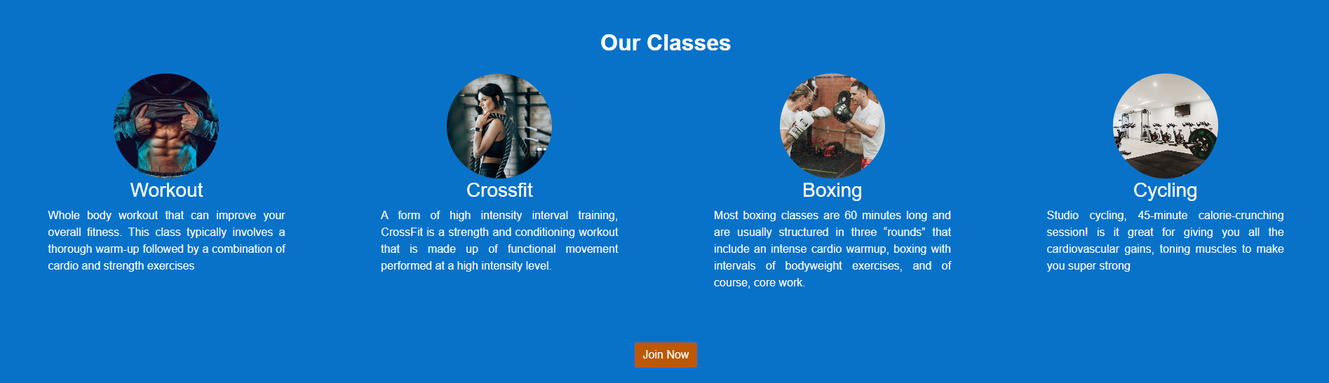
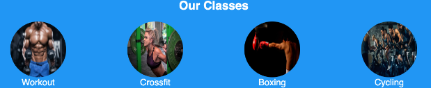
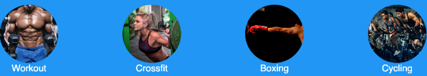
Our classes section
- All the four classes/activities that are provided by the gym.
- A brief informational text about each of them.
- A 'Join Now' button that, like the home page one, sends the user to the form section.
- items reduce from 4 columns desktop to 2 on tablets and one on phone
- Join Now Button scrolls user down nicely to contact form
- text is left aligned to make it easy to read
-
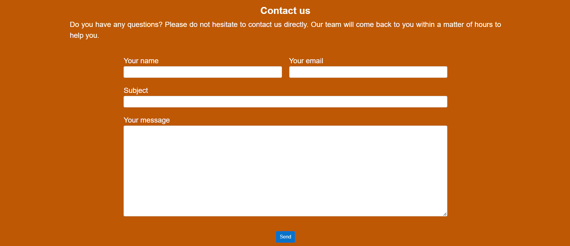
Contact us section
- A form to contact the gym including a field for name, email, subject, message and a send button.
- validation of user input on fields is done to ensure email is entered
- all fields are required to be populated before submitting the form
- fields are big enough for friendly interaction on mobile devices
- form takes user to confirmation page, so it seems like they remain on site vs form dump
-
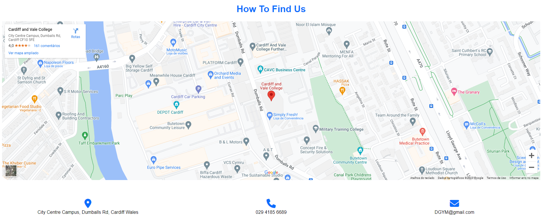
Find us section
- An interactive map with the gym location
- The written location, phone number and email to contact
- phone, address and email adjusts to one column on mobile devices from 3 on desktop
-
Footer
- Links for the section in the page: home, classes, contact and find us.
- Links for gym's social media: facebook, twitter, google and instagram.
- Copyright note.
- links open in separate tabs so user can go back to our site easily without browser back button

- On my footer I used transform: rotate(-15deg) scale(1.5); to move a bit my social icons when I hover on it.
- HTML5
- CSS3
- Bootstrap5
- Bootstrap was used to assist with the responsiveness and styling of the website.
- Font Awesome:
- Font Awesome was used to get the icon to be the website's favicon and icons throughout the website.
- jQuery:
- jQuery came with Bootstrap to make the navbar responsive.
- GitHub:
- GitHub is used to store the projects code after being pushed from GitHub Desktop.
- GitHub Desktop
- GitHub Desktop was used to push the code from the local repository to GitHub.
- vsCode
- vsCode was used to write and format code
- Balsamiq:
- Balsamiq was used to create the wireframes during the design process.5.
-
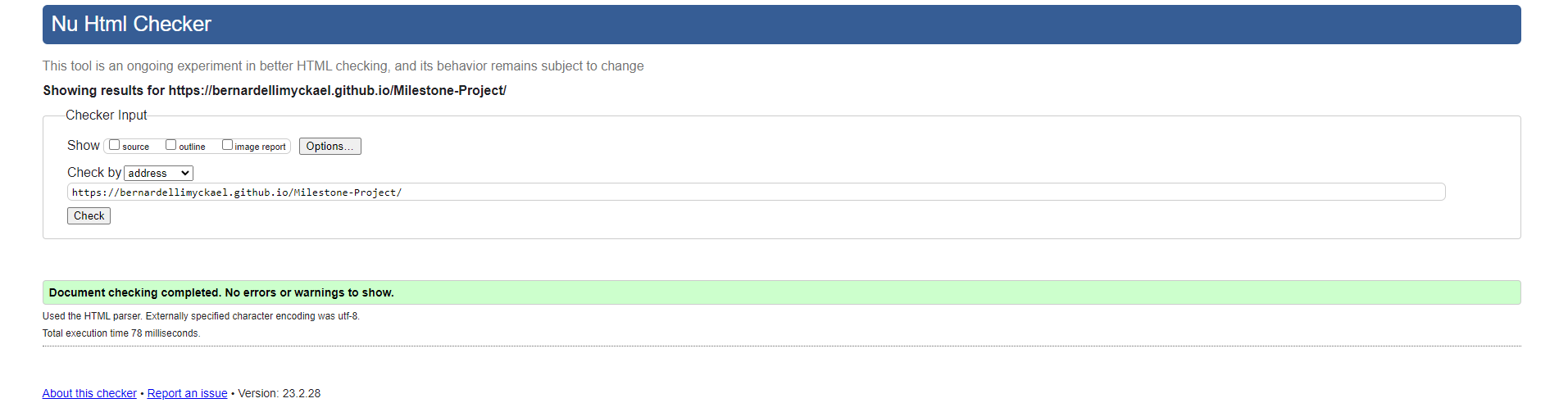
- Used to validate all HTML code
-
- Used to validate all CSS code
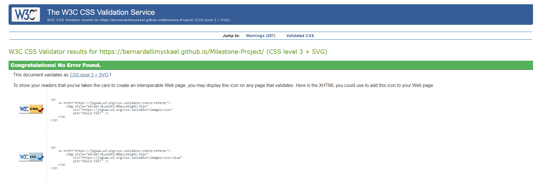
-
- Used to validate and test accessibility of the website
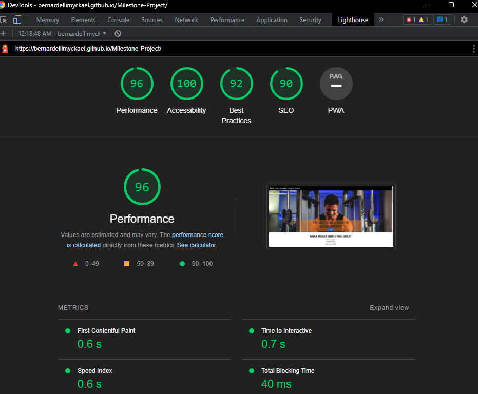
-
- Used to validate and test responsiveness of the website
-
- Used to validate and test colours contrast
- The Website was tested on Google Chrome, Internet Explorer and Microsoft Edge browsers.
- The website was viewed on a variety of devices such as Desktop, Laptop, MotoG10, Samsung S20fe and simulators.
- A large amount of testing was done to ensure that all page sections were linking correctly.
- Friends and family members were asked to review the site and documentation to point out any bugs and/or user experience issues.
-
The button 'Join Now' in orange box in the main home page, when rotating small/medium devices to landscape view, would be pushed out of the box downwards.
-
The bug happened for the height being based on the height view, instead 'height: auto;' sorted the bug.
-
The imagens was strach and to fix it I used the object-fit:cover; and now the images is pretty good
-
Before
- after fix bug
Images not accurate due to copyright purposes. Because I needed to change images that were taken from google before to new images taken from Unsplash.
-
Navigation menu doesn't collapse when clicking on links, tried few differents methods unsuccessfully, I ask my mentor for help and she helped me showing a JavaScript code to fix it.
-
When I would click on send button it made an error beacuse I was using the method="post" so I took it out and put a link to thank you page.
-
When I started coding I was using Gitpod and I used git push to push it to my repository and I thought it worked but when I turned off my computer and turned on again I didn't find it on my github, so I lost it all and I start using VsCode and GitHub Desktop to push it to my repository since.
The project was deployed to GitHub Pages using the following steps:
- Log in to GitHub and locate the GitHub Repository
- At the top of the Repository (not top of page), locate the "Settings" Button on the menu.
- Alternatively Click Here for a GIF demonstrating the process starting from Step 2.
- Scroll down the Settings page until you locate the "GitHub Pages" Section.
- Under "Source", click the dropdown called "None" and select "Master Branch".
- The page will automatically refresh.
- Scroll back down through the page to locate the now published site link in the "GitHub Pages" section.
- Readme Template taken from GitHub:
-
Bootstrap: Bootstrap used for adding navigation menu code
-
MDBootstrap: Bootstrap Library used throughout the project mainly to:
- Making site responsive using the Bootstrap Grid System.
- Adding contact and footer code.
- Using classes for colour, font, margin, padding, etc.
-
W3Schools: used for guiding in differents parts of code.
-
Dave Atchley's post on Medium This script was taken directly to solve mobile navigation toggle
-
About section 'What makes our gyms great' text was taken from Pure Gym website.
-
'Our Classes' section was taken from google description for each activity.
-
All other content was written by the developer.
- All Images were taken from unsplash
- Photo by Charles Gaudreault
- Photo by Spencer Davis
- Photo by Humphrey Muleba
- Photo by Mark Adriane
- Photo by Total Shape
- My Mentor Malia Havlicek for continuous helpful feedback.
This project is for educational use only and was created for the Code Institute Module of User Centric front end development
Created by Myckael Bernardelli