wallet-staging: visual and ixd feedback #72
Description
Copied over from notion.so document
Overiew / Receive / Settings
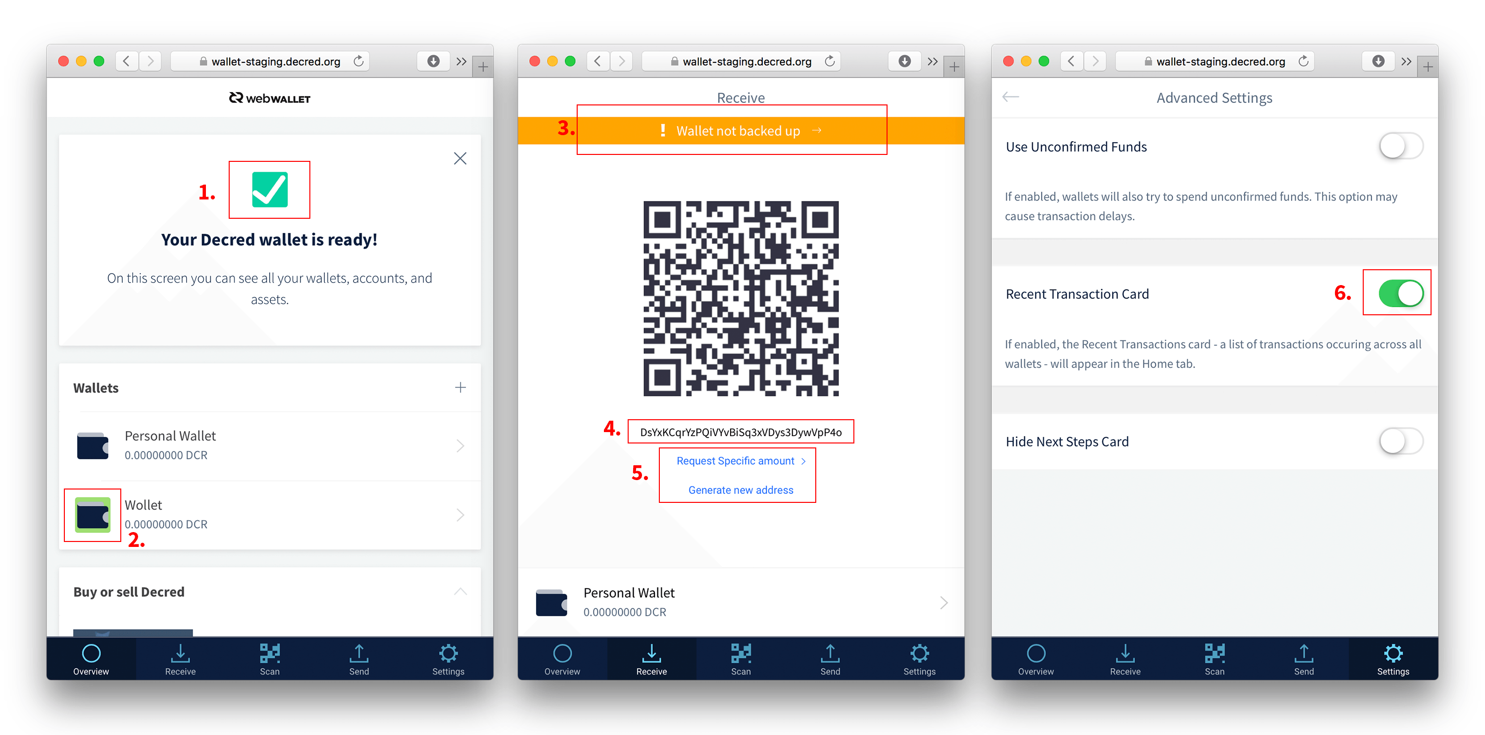
- 1. Lets use the same check-arrow icon as used elsewhere under settings (e.g. https://wallet-staging.decred.org/#/tabs/language ) Can remove the background and only have the icon as fill #41bf53
- 2. Wallet color coding (accessed from wallet preferences) should be fully disabled until we can work out a way to have the wallet icons change color and not the bounding boxes.
- 3. Error notifications with background fill color #fd714b
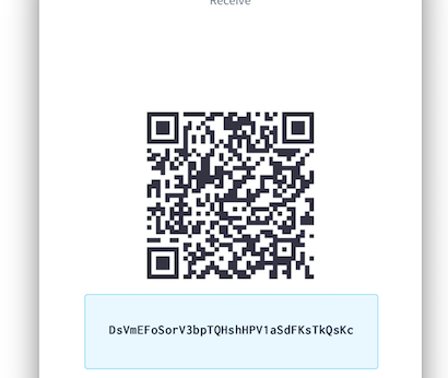
- 4. Receive adress: change font to inconsolate and type size larger (e.g. same as Onboarding titles). As addition could also add a background to it, with hover and react states to indicate the interactivity – that this can be copied straight to clipboard. I can create a better visual design example for this or as backup use the same model as for back-up phrase.
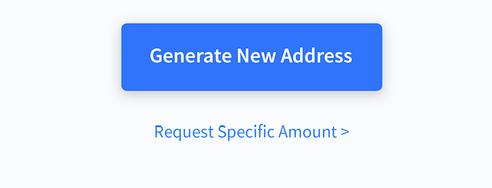
- 5. Generate new address should probably be a first level button. The second (or even third) level can be Text link. (+ Needs to take into account spacing for mobile use)
- 6. Activated toggle with color fill #2971ff
Send
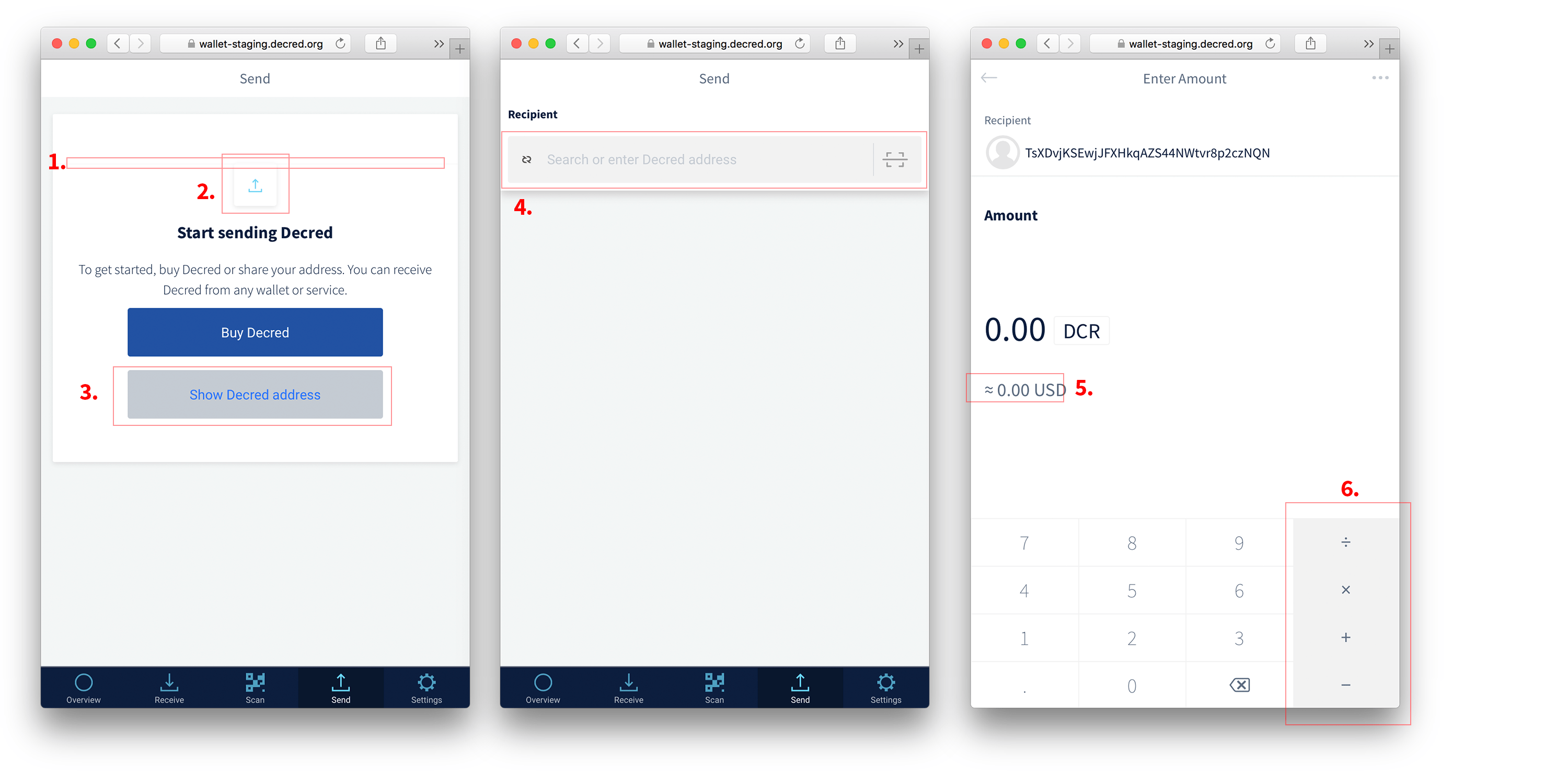
- 1. There's a 1 px light grey stroke there, can remove that.
- 2. Can remove the icon there + the copy needs a bit of re-writing.
"Your wallet has no funds
To get started, You can buy DCR from cryptocurrency exchanges or share Your address. You can receive DCR from any wallet or service. "
- 3. Change "Show Decred Address" to a third level button (text link). Elsewise this view might be slightly confusing.
Backup
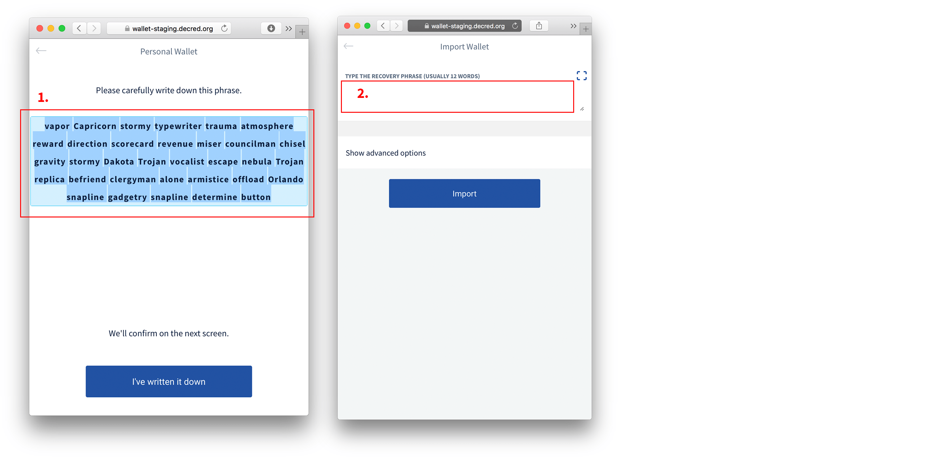
- 1. Text should not be selectable.
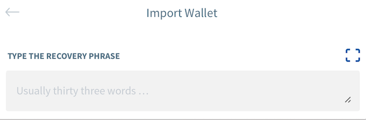
- 2. We need indicate that there's an input field where to type the phrase. This can be a similar grey field as used elsewhere to display the address and amounts.
Onboarding / Backup
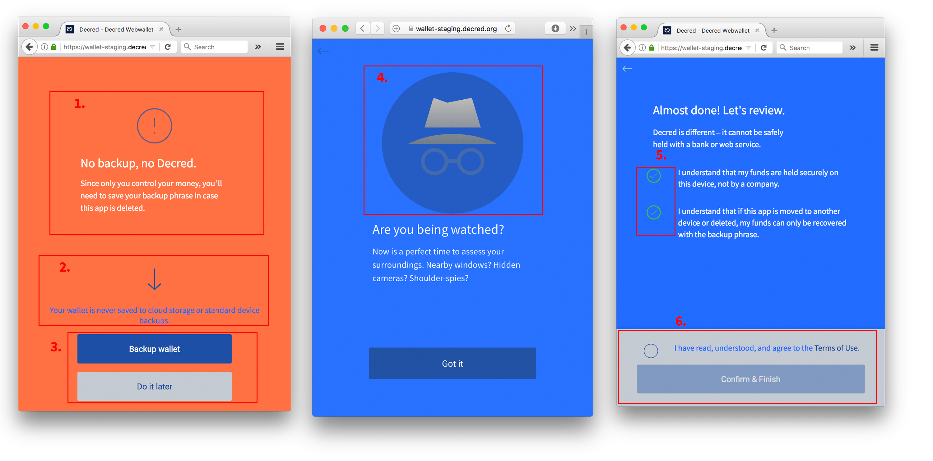
- 1. I think rather than taking a negative note to start with, it needs a different call to action for taking the time to back-up the wallet. Onboarding slides + other reminders should be enough to make it clear that it's important. Will send something later this week + also illustration. Perhaps it can be even combined with the "Are you being watched" view.
- 2. Remove the blue icon and add "Your wallet is never…" as part of the first copy
- 3. Let's add a similar white background to the bottom section (as there is for onboarding). This way the blue and grey things don't clash as much with the various backgrounds.
Do it later can then also be just a text link. - 4. Added new illustration: dcr_-_investigator.zip

- 5. Checkboxes color #ffffff
- 6. Bottom section background #ffffff;
button state disabled:
background : #8997A5;
(font) color : #596D81;
Sending
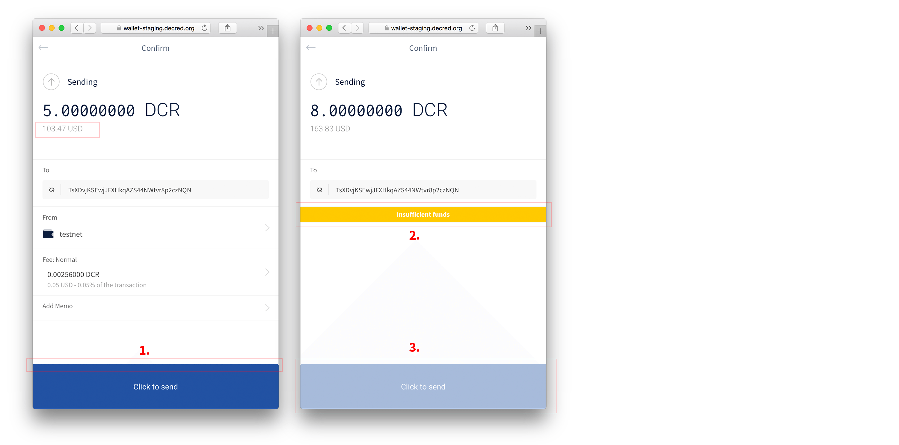
Question regarding USD values: Where does the USD value come from? Should we specify this for the users somewhere or enable them to select a source?
- 1. Can remove the rounded corners from the top left and right.
- 2. Error notification color #fd714b
- 3. Button state disabled:
background : #8997A5;
(font) color : #596D81;
Extra bit: also is it possible to use the same 1st level button style as mainsite? I think @sander has sent the css earlier.