A financial charting library for Flutter applications, offering a comprehensive suite of features for technical analysis and trading visualization. It supports multiple chart types (candlestick, line, etc.), a wide range of technical indicators (RSI, MACD, Bollinger Bands, etc.), and interactive drawing tools. The library comes with customizable themes to match your application's visual style. Built specifically for financial applications, it includes essential features like price markers, barriers, and crosshairs, making it ideal for trading platforms, financial analysis tools, and market data visualization.
 |
|---|
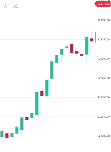
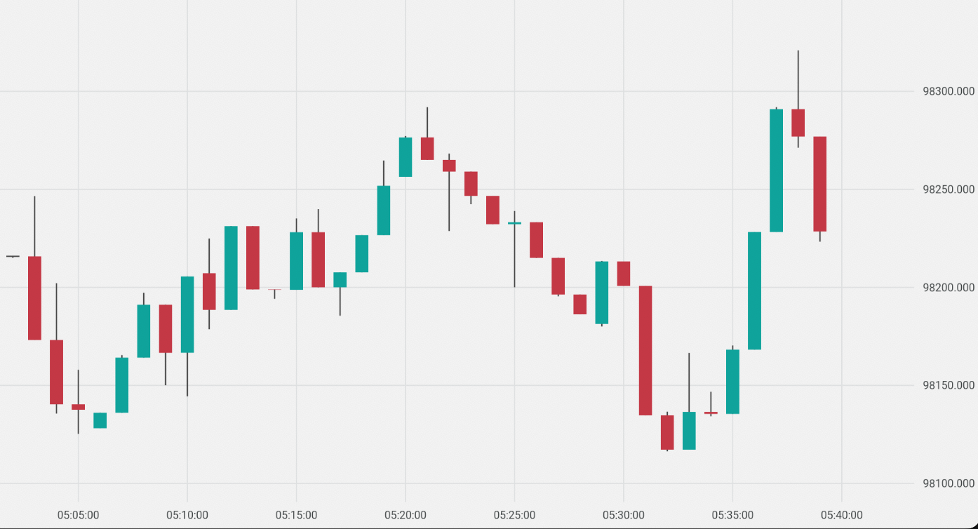
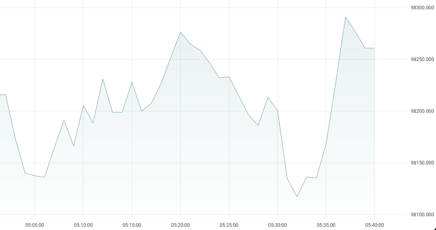
| Different Chart Types | Annotations and Crosshair |
|---|---|
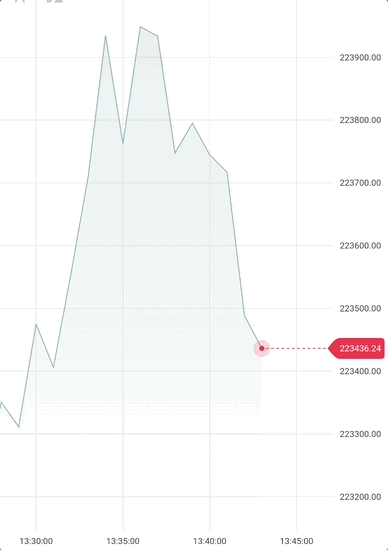 |
 |
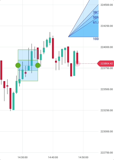
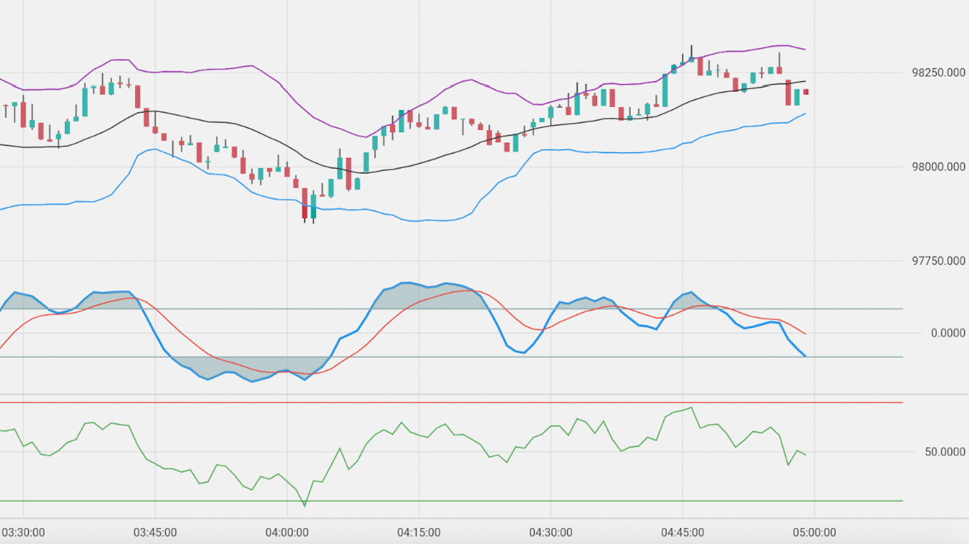
| Technical Indicators | Interactive tools |
|---|---|
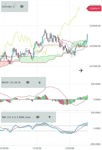 |
 |
- Dart SDK: >=3.0.0 <4.0.0
- Flutter: >=3.10.1
Add this to your project's pubspec.yaml file:
deriv_chart: ^0.3.7Import the library with:
import 'package:deriv_chart/deriv_chart.dart';Simplest usage, adding a candlestick chart:
final candle1 = Candle(
  epoch: DateTime(...),
  high: 400,
  low: 50,
  open: 200,
  close: 100,
);
final candle2 = Candle(
  epoch: DateTime(...),
  high: 500,
  low: 100,
  open: 100,
  close: 500,
);

final candles = [candle1, candle2, ...]
// Or provide your own data from a data source.
...

Chart(
  mainSeries: CandleSeries(candles),
  pipSize: 3, // Number of decimal places when showing values on y-axis
  granularity: granularity, // Duration in milliseconds: for candles, this is the candle period; for ticks, this is the average time between ticks
);
Supply different Series for mainSeries parameter to switch between chart types (candle, line, etc.).
For example, to show a line chart we pass a LineSeries:
Chart(
  mainSeries: LineSeries(candles),
  pipSize: 3,
);
You can change the appearance of Series by giving style to them.
Chart(
  mainSeries: CandleSeries(
    candles,
    style: CandleStyle(
        positiveColor: Colors.green,
        negativeColor: Colors.red
    ),
  ),
  ...
);To add horizontal/vertical barriers, specify them in the annotations parameter of the chart:
Chart(
  mainSeries: LineSeries(candles),
  pipSize: 3,
  annotations: <ChartAnnotation> [
    HorizontalBarrier(98161.950),
    VerticalBarrier(candles.last.epoch, title: 'V Barrier'),
  ],
);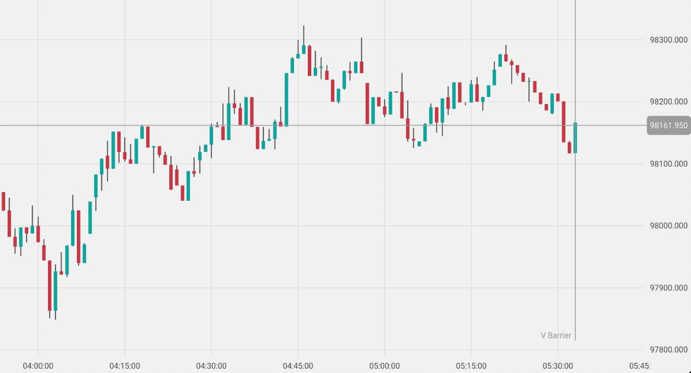
The appearance of Annotations can also be changed by passing custom styles.
HorizontalBarrier(
      ...
      style: HorizontalBarrierStyle(
        color: const Color(0xFF00A79E),
        isDashed: false,
      ),
      visibility: HorizontalBarrierVisibility.forceToStayOnRange,
    )
You can also create custom Barriers by creating subclasses of ChartAnnotation and draw the annotation differently.
(An example will be provided).
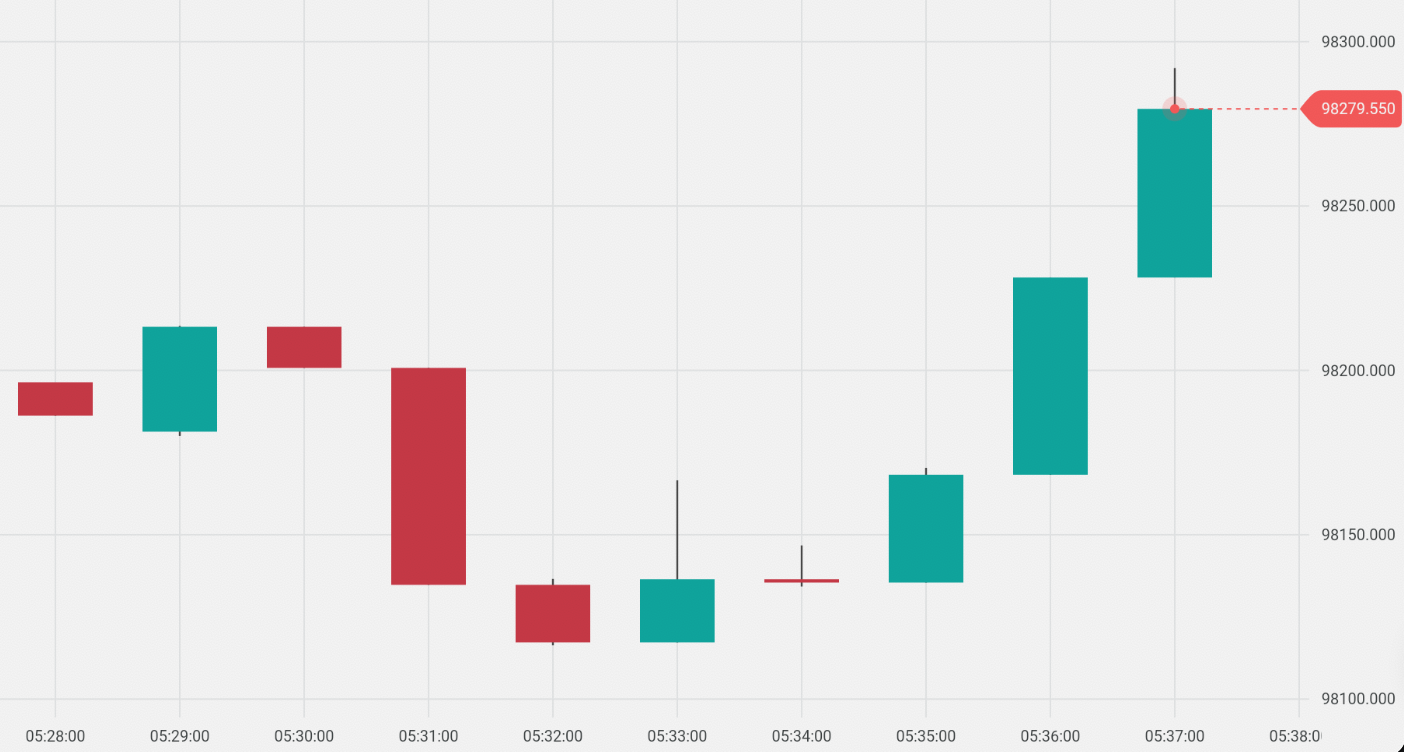
For example, there is a special annotation called TickIndicator which is used to show a tick on the chart.
Chart(
  mainSeries: LineSeries(candles),
  pipSize: 3,
  annotations: <ChartAnnotation> [
    TickIndicator(candles.last),
  ],
);
Here's a comprehensive example showing how to use multiple indicators with different configurations:
You can add indicators by passing overlayConfigs and bottomConfigs to the Chart widget.
overlayConfigs are indicators that share the same y-axis as the main series and are drawn on top of it.
bottomConfigs are indicators that have a separate y-axis and are drawn below the main series.
Chart(
  mainSeries: CandleSeries(candles),
  overlayConfigs: [
    // Bollinger Bands
    BollingerBandsIndicatorConfig(
      period: 20,
      standardDeviation: 2,
      movingAverageType: MovingAverageType.exponential,
      upperLineStyle: LineStyle(color: Colors.purple),
      middleLineStyle: LineStyle(color: Colors.black),
      lowerLineStyle: LineStyle(color: Colors.blue),
    ),
  ],
  // Bottom indicators with separate scale
  bottomConfigs: [
    SMIIndicatorConfig(
      period: 14,
      signalPeriod: 9,
      lineStyle: LineStyle(color: Colors.blue, thickness: 2),
      signalLineStyle: LineStyle(color: Colors.red),
    ),
    // Relative Strength Index (RSI)
    RSIIndicatorConfig(
      period: 14,
      lineStyle: LineStyle(
        color: Colors.green,
        thickness: 1,
      ),
      oscillatorLinesConfig: OscillatorLinesConfig(
        overboughtValue: 70,
        oversoldValue: 30,
        overboughtStyle: LineStyle(color: Colors.red),
        oversoldStyle: LineStyle(color: Colors.green),
      ),
      showZones: true,
    ),
    SMIIndicatorConfig(period: 10, lineStyle: LineStyle(color: Colors.green))
  ],
  pipSize: 3,
  granularity: 60, // 1 minute candles
);
The package includes the following technical indicators:
- Simple Moving Average (SMA)
- Exponential Moving Average (EMA)
- Double Exponential Moving Average (DEMA)
- Triple Exponential Moving Average (TEMA)
- Triangular Moving Average (TRIMA)
- Weighted Moving Average (WMA)
- Modified Moving Average (MMA)
- Least Squares Moving Average (LSMA)
- Hull Moving Average (HMA)
- Variable Moving Average (VMA)
- Welles Wilder Smoothing Moving Average (WWSMA)
- Zero-Lag Exponential Moving Average (ZELMA)
- Relative Strength Index (RSI)
- Stochastic Momentum Index (SMI)
- Moving Average Convergence Divergence (MACD)
- Awesome Oscillator
- Williams %R
- Rate of Change (ROC)
- Chande Momentum Oscillator (CMO)
- Gator Oscillator
- Average Directional Index (ADX)
- Parabolic SAR
- Ichimoku Cloud
- Bollinger Bands
- Average True Range (ATR)
- Standard Deviation
- Variance
- Donchian Channel
- Moving Average Envelope
- Aroon
- Commodity Channel Index (CCI)
- Detrended Price Oscillator (DPO)
- ZigZag
- Fixed Channel Bands (FCB)
- Bullish/Bearish Pattern Recognition
This section will be updated with comprehensive documentation about how to add and configure drawing tools.
For now, you can refer to the Drawing Tools documentation for more details.
Use onVisibleAreaChanged for listening to chart's scrolling and zooming.
leftEpoch is the timestamp of the chart's left edge.
rightEpoch is the timestamp of the chart's right edge.
Check out the example where loading of more data on scrolling is implemented.
Chart(
  mainSeries: LineSeries(candles),
  pipSize: 4,
  onVisibleAreaChanged: (int leftEpoch, int rightEpoch) {
    // do something (e.g., load more data)
  },
);
Use onCrosshairAppeared for listening to the chart's crosshair.
Chart(
  mainSeries: LineSeries(candles),
  pipSize: 4,
  onCrosshairAppeared: () => Vibration.vibrate(duration: 50),
);Supply markerSeries to show markers on the chart.
Chart(
  ...,
  markerSeries: MarkerSeries([
    Marker.up(epoch: 123, quote: 10, onTap: () {}),
    Marker.down(epoch: 124, quote: 12, onTap: () {}),
  ]),
);
Supply activeMarker to show an active marker on the chart.
See example for a complete implementation.
Chart(
  ...,
  markerSeries: MarkerSeries(
    [
      Marker.up(epoch: 123, quote: 10, onTap: () {}),
      Marker.down(epoch: 124, quote: 12, onTap: () {}),
    ],
    activeMarker: ActiveMarker(
      epoch: 123,
      quote: 10,
      onTap: () {},
      onOutsideTap: () {
        // remove active marker
      },
    ),
  ),
Supply entryTick and exitTick to show entry and exit tick markers.
Chart(
  ...,
  markerSeries: MarkerSeries(
    [...],
    entryTick: Tick(epoch: ..., quote: ...),
    exitTick: Tick(epoch: ..., quote: ...),
),The Chart has its own default dark and light themes that switch depending on Theme.of(context).brightness value.
You can supply your own theme, but then you would have to handle switching yourself. To do so, create your own theme class that either implements the ChartTheme interface or extends ChartDefaultDarkTheme/ChartDefaultLightTheme. Override only those properties that you need to be different and then pass it to the Chart widget. See ChartTheme for more info.
class CustomTheme extends ChartDefaultDarkTheme {
  @override
  GridStyle get gridStyle => GridStyle(
        gridLineColor: Colors.yellow,
        xLabelStyle: textStyle(
          textStyle: caption2,
          color: Colors.yellow,
          fontSize: 13,
        ),
      );
}Chart(
...
theme: customTheme /*instance of your custom theme*/,
...
)To use ChartLocalization, add the ChartLocalization.delegate to your localizationsDelegates inside the MaterialApp where you added the chart.
When you want to change the locale of the chart, use this code:
ChartLocalization.load(locale);A wrapper around the Chart widget that provides functionality to add, remove, and update indicators, as well as manage saving and restoring selected ones in storage.
To learn more about how to customize the indicators feature using DerivChart, check this documentation.
All properties from the Chart widget are available here as well, except overlaySeries and bottomSeries which are managed internally.
DerivChart(
   mainSeries: CandleSeries(candles),
   granularity: 60, // 60 seconds
   activeSymbol: 'default',
   pipSize: 4,
)A controller that can be provided to the chart to programmatically control scrolling and scaling behavior.
final ChartController _controller = ChartController();

....

Chart(
    ...
    controller: _controller,
    ...
)


_controller.scrollToLastTick();
_controller.scale(100);For more detailed information, check out these documentation files:
- How Chart Library Works
- Data Series
- Data Painters
- Drawing Tools
- DerivChart Widget Usage
- Contributing
The project uses Mermaid diagrams for visualizing architecture and processes. These diagrams are stored as separate files and referenced in the documentation.
-
Update diagrams and generate SVG files from the Mermaid code:
- Update diagram code. You can use the Mermaid Live Editor or any other Mermaid-compatible editor.
- Use the
to generate SVG files
-
The documentation files (like
doc/interactive_layer.md) reference these SVG files using standard Markdown image syntax:
This approach separates the diagram code from the documentation, making both easier to maintain.
Key dependencies include:
- deriv_technical_analysis: ^1.1.1
- provider: ^6.0.5
- shared_preferences: ^2.1.0
- intl: ^0.19.0
For a complete list of dependencies, see the pubspec.yaml file.