Skip to content

Conversation

@georgehrke
Copy link
Member

At Nextcloud conference, @tcitworld and me also discussed that we should consider merging calendar and subscription list, because many users don't understand why some shared calendars appear in calendars and others appear in subscriptions.

I was experimenting a little and came up with this for a new list design:

81C681FD-5747-4C1F-A82D-011BBFB168CB

716E506D-D56B-4AA5-8A11-9117EF39CD38

This would also satisfy users who preferred the old behaviour of calendars with VEvent and VTodo.

@tcitworld @jancborchardt What do you think about this proposal?

@georgehrke georgehrke added the 2. developing Work in progress label Oct 21, 2019
@georgehrke
Copy link
Member Author

78C07BA9-FCBF-46CA-8ACE-17BC83D56559

Or alternatively without bold font, but with icon.

@tcitworld
Copy link
Member

tcitworld commented Oct 21, 2019

What I can think of right away:

  • Maybe an icon like this one for the calendars with tasks?
  • How do you distinguish between calendars shared with you which are read-only or write access?
  • Find a way to distinguish subscriptions? We have already the « shared by public link » information that is associated to the link icon, so it's not great to have a link icon to express this.

Maybe we can only differentiate write/read-only status ?

@georgehrke
Copy link
Member Author

Maybe an icon like this one for the calendars with tasks?

👍

How do you distinguish shared calendars which are read-only and write access?

Does it matter to be able to tell them apart in the calendar-list?
If you click an event that's in one of those calendars or you try to create a new one, you will only see the writable ones.

Maybe we can only differentiate write/read-only status ?

Not sure i completely get your point, but that's what calendar list and subscription list did all those years?

@tcitworld
Copy link
Member

Maybe we can only differentiate write/read-only status ?

Not sure i completely get your point, but that's what calendar list and subscription list did all those years?

Yeah, but I felt it made still sense to differentiate them somehow, even in a merged list, in order to explain why they wouldn't be available in the calendar picker.
The use case I'm thinking of is when someone shares you a calendar but you can't understand why you can't create events in it, so you might think of a bug but it's just that the owner of the calendar didn't check "write access".

Therefore I feel it would be nice to show something like a tooltip / title when hovering over the calendar to tell this, or some kind of other visual tip.

@jancborchardt
Copy link
Member

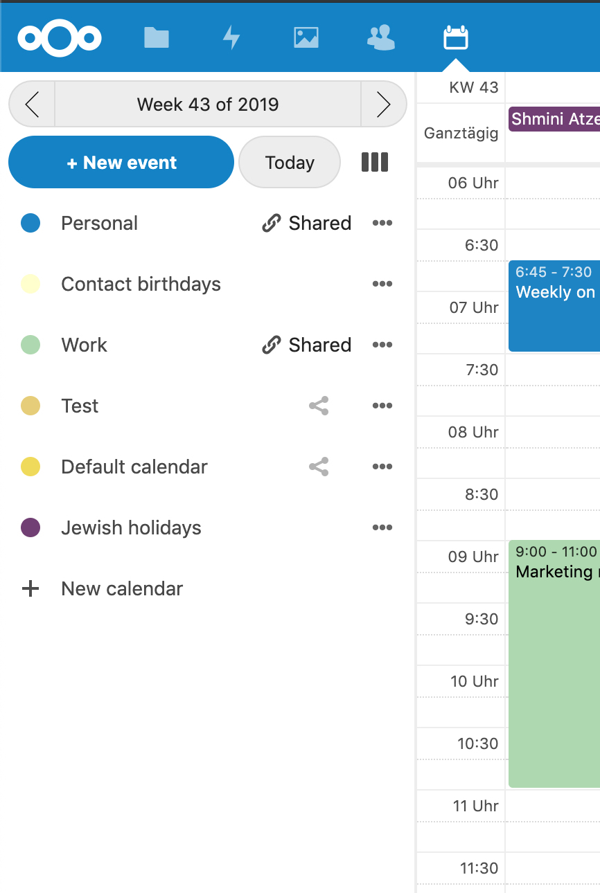
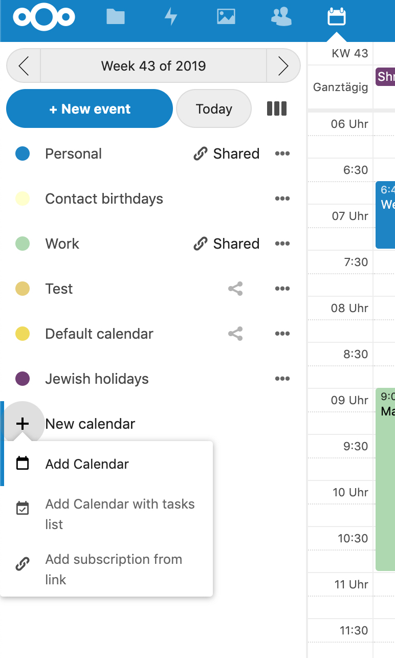
Sounds good. But the heading "My calendars" is a bit unneeded here (apart from us never using the "my" form in the interface).

We could cut the header and put the "+ Add calendar" (which opens the popover) as a half-grey entry at the bottom of the list. (Just like we have that proposal for Contacts for "+ Add group" as last item in the group list.)

@georgehrke
Copy link
Member Author

georgehrke commented Oct 22, 2019

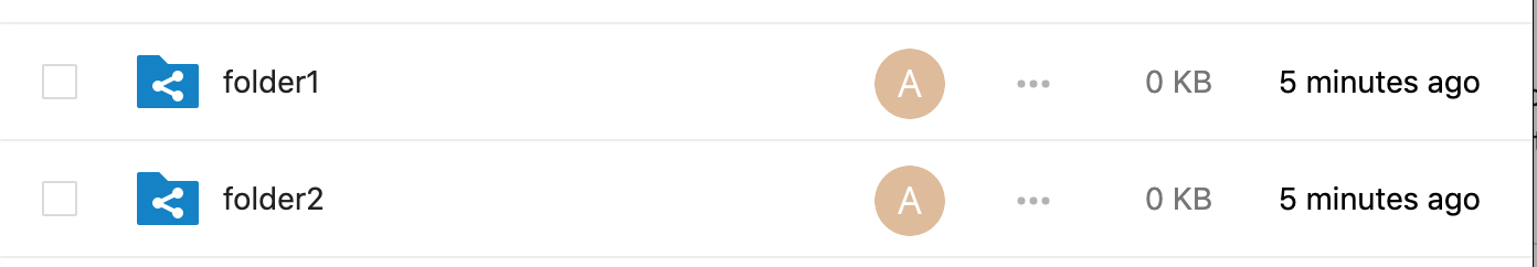
@tcitworld I checked and no other app does that. Like in files, you can see the Avatar to indicate it is shared with you, but from this screenshot you can't tell that one is read-only and the other is read-write:
0A2FC2A2-DA8C-4096-ADC6-9CFF41B852C0

Same for contacts.

@jancborchardt What's your call on this? Is it necessary to be able to tell read-only and read-write shared calendars apart in the calendar-list?

@tcitworld
Copy link
Member

tcitworld commented Oct 22, 2019

I checked and no other app does that. Like in files, you can see the Avatar to indicate it is shared with you, but from this screenshot you can't tell that one is read-only and the other is read-write.

Thinking back, the issue is not at the calendar list level but at the calendar picker level (since you're not using the calendar list to create a new event). So...disregard everything I said about this, it doesn't apply here. I'm still interested in discussing how we could do something at the calendar picker level.

@georgehrke
Copy link
Member Author

Thinking back, the issue is not at the calendar list level but at the calendar picker level (since you're not using the calendar list to create a new event). So...disregard everything I said about this, it doesn't apply here. I'm still interested in discussing how we could do something at the calendar picker level.

I already added an avatars to the calendar-picker, in case the calendar is shared with you.
But feel free to open another issue to discuss further changes to it :)

@jancborchardt
Copy link
Member

Yeah, I’d also say the discussion on adding an indicator or how to differentiate is separate from this here. :)

@georgehrke georgehrke force-pushed the feature/noid/merge_calendar_subscription_list branch from cbad4eb to d4eaa95 Compare October 23, 2019 18:46
@georgehrke
Copy link
Member Author

georgehrke commented Oct 23, 2019

Closed menu open menu
5E57249B-9B15-4988-AE34-E79CF12A0165 9A1CA80A-6F46-4B8C-B4CB-4B0ADDDBEF9B

@georgehrke
Copy link
Member Author

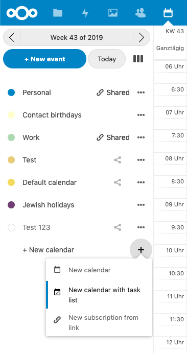
I still have to reduce the default opacity of the New Calendar entry.

@jancborchardt
Copy link
Member

jancborchardt commented Oct 23, 2019

Nice stuff! More design feedback:

  • "+ Add calendar" is better wording as all the items in the menu are "Add" sorry scratch that, let’s keep "New" here as otherwise it’s strange with the same wording of the menu that opens then … :D Also we have "+ New event" so that’s symmetric
  • The whole "+ Add calendar" list entry should be clickable, not just the icon. As such, the menu should open centered below the list item, with the triangle pointing to the middle, not to the icon. :) Then the popdown can also be wider to fit the whole text of the entries, not needing to break the text.
  • Minor wording: "Add calendar with task list" (not "tasks list", and lowercase "calendar" as it doesn’t refer to the app, same for the "Add calendar" entry above)
  • The entry should be var(--color-text-maxcontrast) just like the "Show all folders"/"Collapse" list entries in Mail

Kind of related since we are working on the list:

  • There could be a bit of whitespace (spacer element is in the vue component, right?) above the calendar list, below the "New event" / "Today" buttons. Otherwise it looks cramped.
  • The "Shared" icon with text is closer to the 3-dot icon than the share icon, why that?
  • The "Contact birthdays" calendar, being a default calendar, needs a color that is better visible and fits with the others? The one you use for "Default calendar" in the screenshot would fit.

Moved to #1582 since it's really not related to this PR.

@georgehrke
Copy link
Member Author

The whole "+ Add calendar" list entry should be clickable, not just the icon.

That's already the case. https://github.com/nextcloud/calendar/pull/1551/files#diff-d389c50efe9671db3af56f7d289e3f62R26 :)

As such, the menu should open centered below the list item, with the triangle pointing to the middle, not to the icon. :) Then the popdown can also be wider to fit the whole text of the entries, not needing to break the text.

I can make it wider, but i would like to stick to using the vue Actions component, because it has all the great accessibility keyboard stuff, which is a lot of work to rebuild. The only downside about Actions is that it currently requires an icon as central element.
Unless @skjnldsv has some good recommendation here :)

@skjnldsv
Copy link
Member

Unless @skjnldsv has some good recommendation here :)

See https://github.com/nextcloud/calendar/pull/1551/files#r338393703

@georgehrke georgehrke force-pushed the feature/noid/merge_calendar_subscription_list branch from d4eaa95 to 973d5c4 Compare October 24, 2019 10:55
@georgehrke
Copy link
Member Author

Closed menu open menu
E2518B23-8734-4510-BC58-DD15DF444EEB 8980FA5A-BCA1-4E98-93C9-595193C2E699

@georgehrke georgehrke requested a review from skjnldsv October 24, 2019 10:57
@georgehrke georgehrke added 3. to review Waiting for reviews and removed 2. developing Work in progress labels Oct 24, 2019
@skjnldsv
Copy link
Member

The little + in front feels a bit too much 🤔

@georgehrke
Copy link
Member Author

We have the same in front of "+ New event". :)

@skjnldsv
Copy link
Member

We have the same in front of "+ New event". :)

then same comment :p
Can you use the icon-add for the event button?
And no + for the calendar button?

@georgehrke
Copy link
Member Author

It is what @jancborchardt suggested and I like it as well

@skjnldsv
Copy link
Member

It is what @jancborchardt suggested and I like it as well

I think he meant the + we use in every other apps, so the icon-add button :)
dev skjnldsv com_apps_contacts_All%20contacts_41e602ab-83c1-46fc-89c2-57dc392439x01_contacts

@georgehrke
Copy link
Member Author

@jancborchardt ^ ? :)

@georgehrke
Copy link
Member Author

@tcitworld Should we get this in? :)

@tcitworld
Copy link
Member

Let me find time to play with it a bit.

Copy link
Member

@tcitworld tcitworld left a comment

Choose a reason for hiding this comment

The reason will be displayed to describe this comment to others. Learn more.

When a calendar/subscription is created, the creation menu isn't closed. Just set isOpen to false once it's done.

@tcitworld
Copy link
Member

Also a click on + New calendar (not on the 3 dots button) opens the menu but doesn't close it.

@tcitworld
Copy link
Member

And finally I'm also interested in @jancborchardt opinion on using an icon or a + in front of New event or New calendar.

Signed-off-by: Georg Ehrke <[email protected]>

Alternative design with calendar-icon

Signed-off-by: Georg Ehrke <[email protected]>

Move new calendar to bottom of list

Signed-off-by: Georg Ehrke <[email protected]>

Reset new calendar menu on close

Signed-off-by: Georg Ehrke <[email protected]>

use actions instead of counter

Signed-off-by: Georg Ehrke <[email protected]>
@georgehrke georgehrke force-pushed the feature/noid/merge_calendar_subscription_list branch from 29c1da9 to 578d3b3 Compare October 25, 2019 14:41
@georgehrke
Copy link
Member Author

I fixed both issues you mentioned

Copy link
Member

@tcitworld tcitworld left a comment

Choose a reason for hiding this comment

The reason will be displayed to describe this comment to others. Learn more.

We can fix the + situation later.
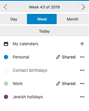
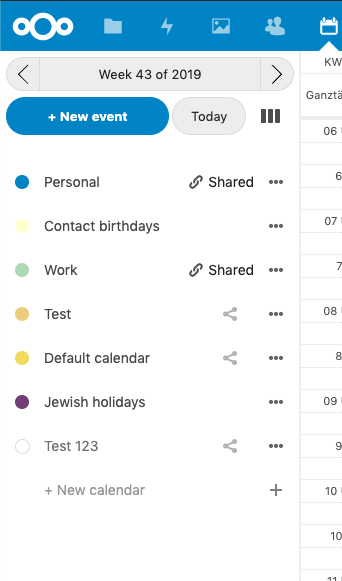
@georgehrke georgehrke merged commit e12f961 into master Oct 25, 2019
@georgehrke georgehrke deleted the feature/noid/merge_calendar_subscription_list branch October 25, 2019 14:50
Sign up for free to join this conversation on GitHub. Already have an account? Sign in to comment

Labels

3. to review Waiting for reviews

Projects

None yet

Development

Successfully merging this pull request may close these issues.

5 participants