Add icon without red dot for red theming colors #135
Conversation
Signed-off-by: Julius Härtl <[email protected]>
|
By testing this PR, I saw we are not showing the notification icon permanently ... is this by intention? I thought we wanted to change this behavior? @nickvergessen |
|
@MariusBluem Works fine for me here. |
|
Hmm, should we really pick white? Or use another color or black for the dot, so it's better spotable? |
|
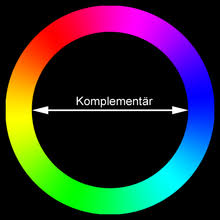
We could simply take the opposite color: |
|
The issue with a black dot is that it might not be nicely visible on the various brightness levels of red colors we can have there:
@MariusBluem Complementary colors also don't work nicely in terms of contrast: The white one still seems to be the most obvious one to me, that is clearly visible though all red color values. In cases when the theming color is bright enough, we still use the regular black icon with the red dot, which also looks good then:
|


|
Yes, it's "visible" but not "disturbing" enough: Do you immediately see that there is a notification? |

I'd say yes, since the icon also doesn't have any opacity as the other icons, but I welcome other ideas on how we can make it a more obvious. |
|
Or we make it flashing ... |
|
We have a little animation, but only for ~3secs. If you load the app in the background you miss it, anyway... lets continue with being productive |
|
I’d say it’s a good enhancement already. In addition, in #104 (comment), @j-ed did a mockup with a blue notification bubble color (we could use Nextcloud blue) which would be used in these cases. Maybe worth a try @juliushaertl? But I’m also fine with it being just white there, as mentioned the opacity is also different. |
|
let's make the dot pulse? |
|
Nothing in the interface should pulse consistently, that's irritating. We do have the form (dot), we simply need to add the color here too. |
|
Here are some examples with the blue dot, but I also think that this doesn't work well in terms of contrast:
But I've no strong opinion on this, let's not invest to much time into an edgecase like this. I'd say we should merge the white one for now and we can still improve later if needed. |


 jancborchardt
left a comment
jancborchardt
left a comment
There was a problem hiding this comment.
Fine by me with the white dot. :)
| .notifications-button.hasNotifications { | ||
| background-repeat: no-repeat; | ||
| background-position: center center; | ||
| background-image: url('../img/notifications-new-fallback.svg?v=1'); |
There was a problem hiding this comment.
Sorry, we are not using background images, but a normal image.
The path is calculated in
notifications/js-src/components/root.vue
Lines 38 to 49 in 94309c8
Can we do this calculation properly there as well?
|
Beside that I'm fine with the white one 👍 |
Signed-off-by: Julius Härtl <[email protected]>
|
I checked out this branch and changed the color to #FF0000 but it still shows the old avatar. Even after clearing the browser cache.
Even after clearing the SCSS caches via |

|
Replaced by #156 |
This adds a fallback icon for primary colors that are red.
The fallback is not used on bright redish colors and on to dark colors where the red dot is clearly visible.
fixes #104
@nextcloud/designers