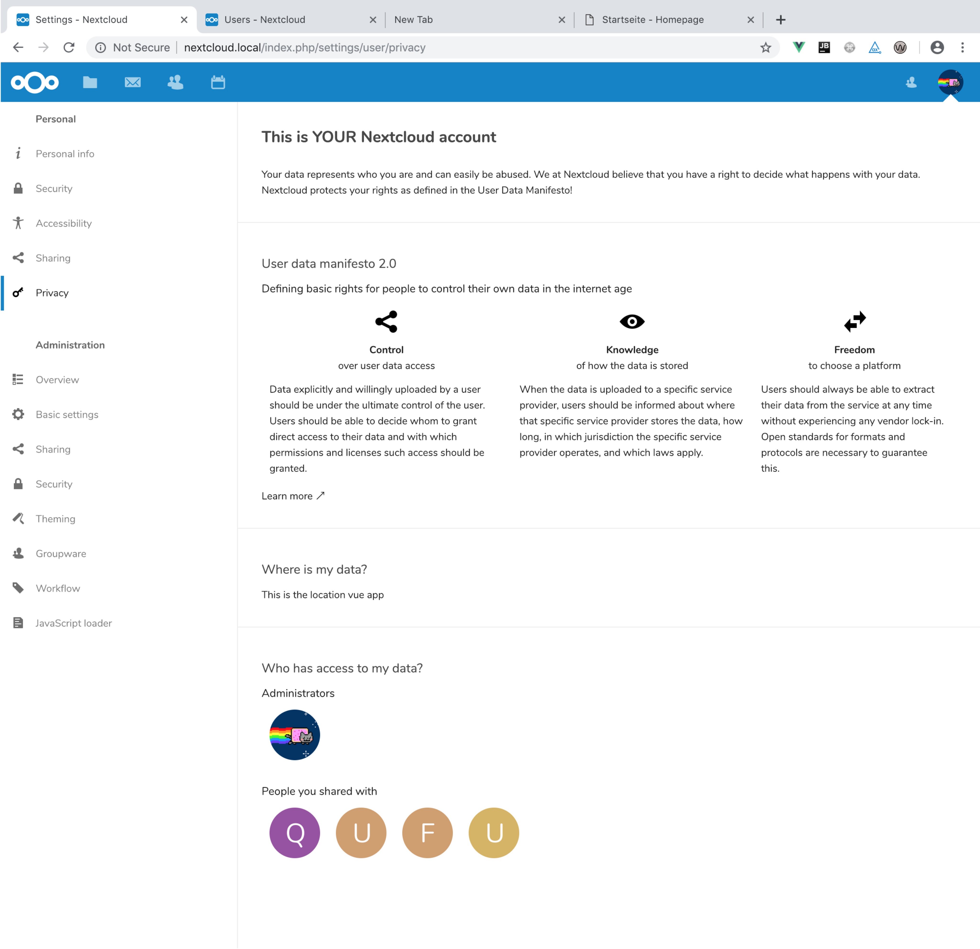
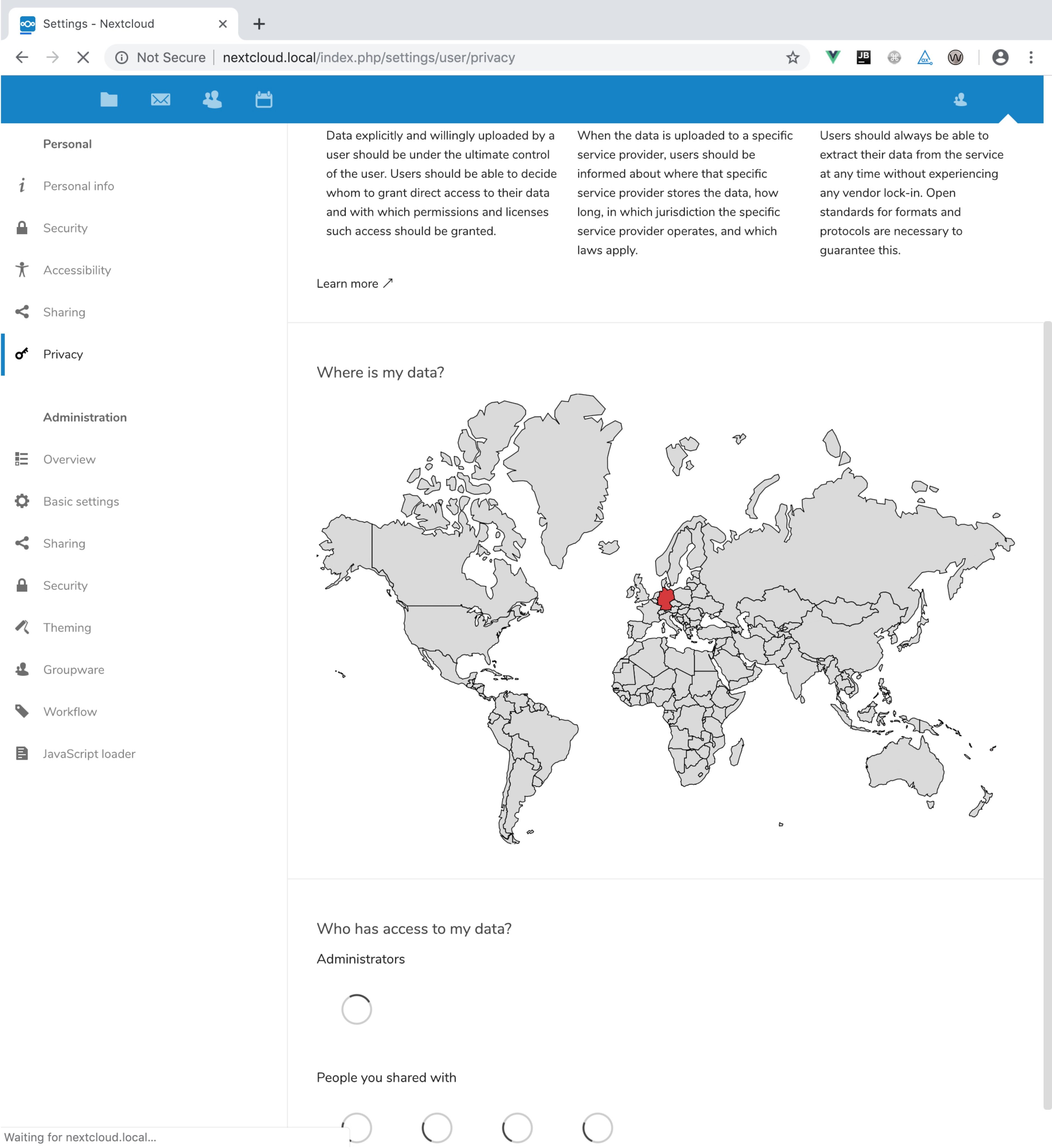
Skip to content

Conversation

@weeman1337
Copy link
Member

@weeman1337 weeman1337 commented Dec 16, 2018

For previous discussions also see #11319.

ToDo

  • personal settings layout improvement
  • settings input view

@weeman1337 weeman1337 added this to the Nextcloud 16 milestone Dec 16, 2018
@weeman1337 weeman1337 self-assigned this Dec 16, 2018
@weeman1337 weeman1337 mentioned this pull request Dec 16, 2018
@weeman1337 weeman1337 added the design Design, UI, UX, etc. label Dec 16, 2018
@weeman1337
Copy link
Member Author

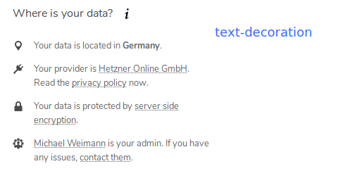
That's what the front end looks so far:
image

For me it's hard to distinguish links and text as they're displayed the same. So I highlighted them with the primary color. I didn't find anything about that in the dev docs.

The "... is your admin" will have two ways for detection:

  • Any admin user if none was selected in the settings
  • The selected one from the settings

Any thoughts about that @nextcloud/designers ?

@jancborchardt
Copy link
Member

Very nice! :)

  • We could think about using "border-bottom: 1px dotted text-color" for marking links. Let's do that separately though as this is something we need to generally fix, but it will need some adjustment (e.g. so text inside buttons which are a class="button" is not underlined)
  • For admins, it's simpler to use "… contact them." instead of "him/her". Works as singular and plural too if there's multiple admins.
  • @shironextcloud what do you think? :)

@skjnldsv
Copy link
Member

I really like it!
I agree with Jan's suggestions. I would also add that the plug icon doesn't really make any sense. Maybe use a server icon?

@weeman1337
Copy link
Member Author

I would also add that the plug icon doesn't really make any sense

Fully agree. This is only a placeholder - I'm not happy with it, too.
Should I extend the NC icon set? Is there any free icon set I can take the icon from?

We could think about using "border-bottom: 1px dotted text-color" for marking links.

✓ will do that

For admins, it's simpler to use "… contact them." instead of "him/her". Works as singular and plural too if there's multiple admins.

@jancborchardt do you suggest listing all admin users then? I thought about picking one of the admins and in addition give the option to define a specific one in the settings.

@skjnldsv
Copy link
Member

@jancborchardt do you suggest listing all admin users then? I thought about picking one of the admins and in addition give the option to define a specific one in the settings.

That is one issue we have with the preferred provider program.
There is no official setting to define a 'contact' for a nextcloud instance. It could be a nice addition :)

@shironextcloud
Copy link

* For admins, it's simpler to use "… contact them." instead of "him/her". Works as singular and plural too if there's multiple admins.

* @shironextcloud what do you think? :)

agree on "them"

really nice :)

@weeman1337
Copy link
Member Author

weeman1337 commented Dec 18, 2018

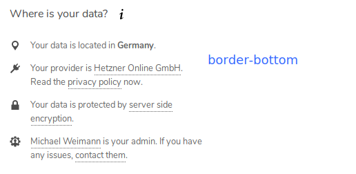
@nextcloud/designers regarding links, here are the two dotted options:

text-decoration

border-bottom

Where the text-decoration way looks cleaner on the whole, border-bottom is easier to read.

@weeman1337
Copy link
Member Author

weeman1337 commented Dec 18, 2018

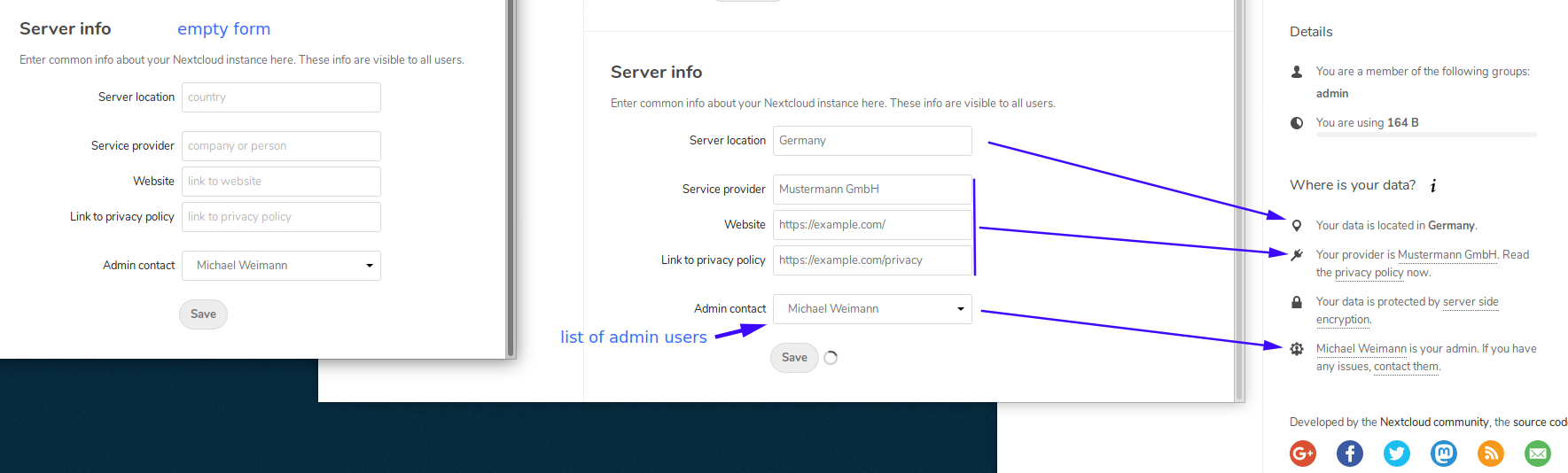
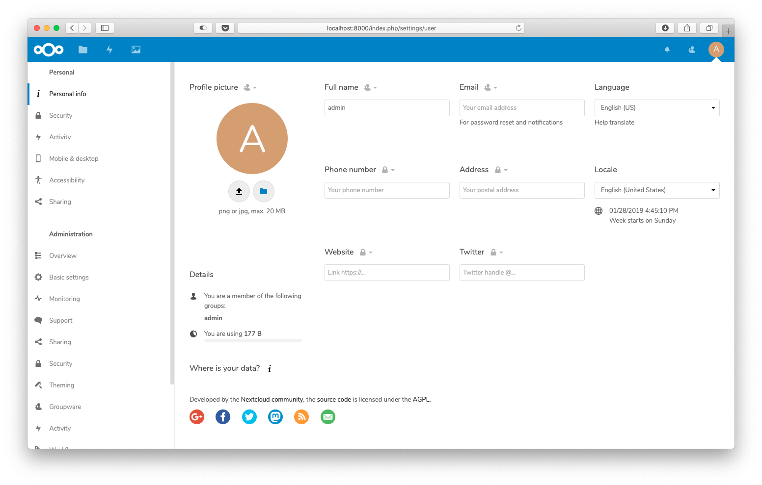
Here is the settings view:

image

I placed it in the "Basic settings" at the bottom.

@skjnldsv
Copy link
Member

skjnldsv commented Dec 18, 2018

It looks amazing!!!
Can I be peaky and ask the loader to be on the button to save the form? 🙈 We tend to do that in most of the places and looks better imho. Not that big of a deal though ;)

I prefer the border bottom for the design. Better looking. More aerated :)

@weeman1337
Copy link
Member Author

Can I be peaky and ask the loader to be on the button to save the form? see_no_evil We tend to do that in most of the places and looks better imho. Not that big of a deal though ;)

@skjnldsv jep - fine for me. Can you give me an example, so I can have a look copy the style.

There is also some feedback (I took it from the settings above). Does anything common exist for that, too?

image

@skjnldsv
Copy link
Member

skjnldsv commented Dec 18, 2018

Could be nice to have a standard actually! I don't think we really have one yet! 🤔
You know what, I'll let you decide! We could then make sure to have the new standard in as many places as we can on the settings! 🚀 🙇‍♂️

@weeman1337
Copy link
Member Author

@skjnldsv what about this:
button

@weeman1337 weeman1337 force-pushed the feature/11319/where-is-your-data branch from f4f17f3 to 54ac94a Compare December 18, 2018 21:08
@skjnldsv
Copy link
Member

I really like it!! 🎉 😍
Some quick thinking:

  • I would actually make sure the size does not change that much, because it's confusing to the user.
  • I would also not use an input since the loader cannot work (fallback to gif since no pseudo-elements can be applied on an inline element) Use a label to link the action to the input! 😉
  • No need for the ... since the loader already give a progress state
  • I would use an icon by default for the save button. It draws attention and would also prevent your button from moving too much when switching from "save" to "saving" since the loader width would already be taken by the icon

I'm sure @jancborchardt will have some insights as well!

@weeman1337
Copy link
Member Author

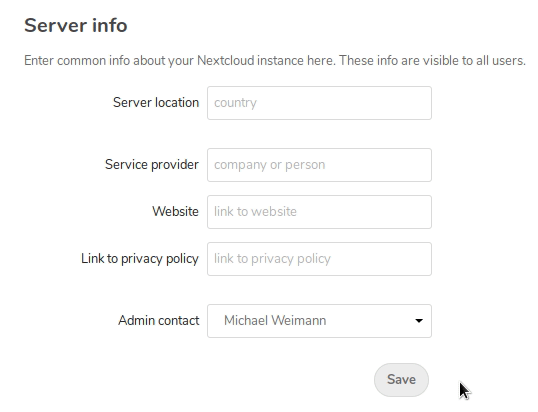
Update today: the server info is now stored and loaded.

I put the info into the config. Why?: My idea is if you deploy an instance you can simply put it into the file. If anyone thinks it should be a db setting, let me know.

The funky save button also got an update: The spinner shows with 1s delay to prevent unnecessary flickering. It says "saved" until you change any form value. Works fine so far. With another icon for the default state ("save") it doesn't jump that much.

@jancborchardt
Copy link
Member

jancborchardt commented Dec 20, 2018

Agree with what @skjnldsv said, some additional feedback:

  • Buttons should usually go on the right, but being aligned with the fields seems good too, and the size switching will be less strange since the icon and the start of the text will always stay
  • The Save button should have class="primary" to appear blue
  • "Saving" and "Saved" states should have a capital first letter
  • The placeholders of the input fields should also have a capital first letter
  • For the "Website" and "Link to privacy policy" fields, the placeholder should be "https://…"
  • Actually thinking about it: Shouldn’t the company/instance name, website link and privacy policy link be taken from Theming, where we already have that info? cc @juliushaertl
  • Let’s use border-bottom for the links for now. We have to do this generally in the server but this is a good start. (Please make sure to prefix it so it only changes the link styles in this specific container)

If there is no data put in for one of the parts yet, like the server location for example, that part should simply not be shown in the list.

Awesome work @weeman1337! 🎉

@jancborchardt
Copy link
Member

Sorry, forgot to answer your question. For the provider icon, simply use icon-home:

https://docs.nextcloud.com/server/15/developer_manual/design/icons.html

@weeman1337
Copy link
Member Author

Actually thinking about it: Shouldn’t the company/instance name, website link and privacy policy link be taken from Theming, where we already have that info?

Yes, I see some of the info is already there. Having it redundant doesn't make sense. I think "name" in theming is more the instance name. So missing is "server location", "provider name" and "admin contact". I could also add these fields to the theming section. @nextcloud/designers ¯\_(ツ)_/¯

@jancborchardt
Copy link
Member

jancborchardt commented Dec 21, 2018

I could also add these fields to the theming section.

Not sure if this makes sense. Thinking about it though … Mastodon for example also shows the instance admin in more public places like the home page (and Discourse also has a page for it), and server location is something we could even show in the footer (just an idea, probably too much info) so it would indeed be more related to general theming. @juliushaertl what do you think?

Let’s just make sure that we do it step by step. And the first step is to just not duplicate info we already have in theming. :)

@weeman1337
Copy link
Member Author

Ping @juliushaertl - waiting for a response where to put the fields..

@skjnldsv
Copy link
Member

skjnldsv commented Jan 8, 2019

I think there should be a dedicated option to it. Theming is design only, nothing related to administration or mails should go there I think :)

@jancborchardt
Copy link
Member

Theming is design only, nothing related to administration or mails should go there I think :)

That’s not true though. ;) This is the one place where you set things like the instance name, link, privacy policy & terms links etc. These are used across the app, including in emails and such. It’s good that it’s only this one place, and hence the things we need for "Who Owns Your Data" should also either be pulled from there, or if it extends it, be added there.

@weeman1337 the Unsplash app also adds a section in the Theming settings, maybe you can check that out?

@MariusBluem
Copy link
Member

„Your Data is protected by“ should be changed to „Your Files are encrypted with“ since

  • encryption is only about files and not about all data (maybe we should clarify this even more)
  • encrypted is more neutral than protect

Signed-off-by: Michael Weimann <[email protected]>
@MariusBluem
Copy link
Member

MariusBluem commented Jan 20, 2019

@MariusBluem I've updated the wording:

Thanks 👍

What do you think about "About this server" instead of "Where is your data?"? @nextcloud/designers

@jancborchardt
Copy link
Member

@MariusBluem I’d say let’s do any further changes in follow-up pull requests. :) The "Where is your data?" is direct and nice.

cc @nextcloud/javascript @nextcloud/designers for review as well 🙂

Copy link
Member

@MorrisJobke MorrisJobke left a comment

Choose a reason for hiding this comment

The reason will be displayed to describe this comment to others. Learn more.

Tested and works 👍

The only minor part that would be nice to be fixed is that if there is nothing specified also the header should not be shown:

bildschirmfoto 2019-01-28 um 16 45 11

Copy link
Member

@skjnldsv skjnldsv left a comment

Choose a reason for hiding this comment

The reason will be displayed to describe this comment to others. Learn more.

See Morris's comment :)

@weeman1337
Copy link
Member Author

@skjnldsv the section is now optional.

Copy link
Member

@MorrisJobke MorrisJobke left a comment

Choose a reason for hiding this comment

The reason will be displayed to describe this comment to others. Learn more.

Tested and works 👍

Copy link
Contributor

@kesselb kesselb left a comment

Choose a reason for hiding this comment

The reason will be displayed to describe this comment to others. Learn more.

😎 Some code style and we're done ;-)

*
* @return array
*/
private function getWhereIsYourDataParams() {
Copy link
Contributor

Choose a reason for hiding this comment

The reason will be displayed to describe this comment to others. Learn more.

typehint array

*
* @return string
*/
public function getSection() {
Copy link
Contributor

Choose a reason for hiding this comment

The reason will be displayed to describe this comment to others. Learn more.

return type string

* the admin section. The forms are arranged in ascending order of the
* priority values. It is required to return a value between 0 and 100.
*/
public function getPriority() {
Copy link
Contributor

Choose a reason for hiding this comment

The reason will be displayed to describe this comment to others. Learn more.

return type int

<?php echo $l->t(
'%s%s%s is your admin. If you have any issues, %scontact them%s.',
[
'<a href="mailto:' . $_['adminMail'] . '" target="_blank" title="" rel="noreferrer noopener">',
Copy link
Contributor

Choose a reason for hiding this comment

The reason will be displayed to describe this comment to others. Learn more.

In theory there could be an admin account without email. I guess we could ignore that for now.

@georgehrke
Copy link
Member

@weeman1337 I actually developed something very similar lately, but as an independent app instead of putting it into the server.

I have to two fix some minor issues and will push it to a repository tonight.
Maybe we can merge our efforts together? :)

signal-attachment-2019-01-13-213155
signal-attachment-2019-01-13-222419

@weeman1337
Copy link
Member Author

@georgehrke thanks for the info. So that will be the official "where is my data" app?

That would mean this PR is obsolete?

@MorrisJobke
Copy link
Member

@georgehrke thanks for the info. So that will be the official "where is my data" app?

That would mean this PR is obsolete?

I would not say so. I would like to have this as it is in this PR. Then we can think on how to integrate both of them into one interface. The problem here was that @karlitschek was not aware of this PR and asked @georgehrke to do it in an app.

@karlitschek
Copy link
Member

Yes. It's totally my fault that I wasn't aware of the duplicate work. Sorry. Not sure what the best way is to proceed. Whatever you suggest. @MorrisJobke @weeman1337 @georgehrke

@MorrisJobke
Copy link
Member

@georgehrke @weeman1337 I would get this PR here in because it is fully working and was tested already. Also the design team had a look at it and it's approved. We then can check out how to combine or integrate it with your approach because you feature a lot more context due to the user data manifesto.

@MorrisJobke
Copy link
Member

@skjnldsv @danielkesselberg @georgehrke @rullzer Please review.

Signed-off-by: Michael Weimann <[email protected]>
use OCP\IUserManager;
use OCP\L10N\IFactory;
use OCP\Settings\ISettings;
use OCP\Encryption\IManager as EncryptionManager;
Copy link
Contributor

Choose a reason for hiding this comment

The reason will be displayed to describe this comment to others. Learn more.

IEncryptionManager would be more clear here.

Copy link
Member

Choose a reason for hiding this comment

The reason will be displayed to describe this comment to others. Learn more.

Let's do this later as well together with the email check.

@MorrisJobke MorrisJobke merged commit 34dc165 into master Feb 11, 2019
@MorrisJobke MorrisJobke deleted the feature/11319/where-is-your-data branch February 11, 2019 10:15
Sign up for free to join this conversation on GitHub. Already have an account? Sign in to comment

Labels

3. to review Waiting for reviews design Design, UI, UX, etc. enhancement feature: settings

Projects

None yet

Development

Successfully merging this pull request may close these issues.