-
-
Notifications
You must be signed in to change notification settings - Fork 4.7k
Remove extra margin from warning messages in authenticate page #15407
New issue
Have a question about this project? Sign up for a free GitHub account to open an issue and contact its maintainers and the community.
By clicking “Sign up for GitHub”, you agree to our terms of service and privacy statement. We’ll occasionally send you account related emails.
Already on GitHub? Sign in to your account
Remove extra margin from warning messages in authenticate page #15407
Conversation
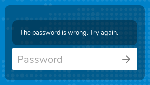
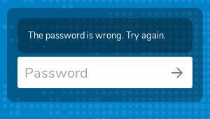
In the public share authentication page the form elements appear inside
a container that uses the "warning" CSS class. When the given password
is wrong a warning message is shown inside that container; this message
uses the "warning" CSS class too, so the top margin set for ".warning"
elements need to be removed in that case.

Signed-off-by: Daniel Calviño Sánchez <[email protected]>
|
/backport to stable16 |
 rullzer
left a comment
There was a problem hiding this comment.
Choose a reason for hiding this comment
The reason will be displayed to describe this comment to others. Learn more.
I like it
 juliusknorr
left a comment
There was a problem hiding this comment.
Choose a reason for hiding this comment
The reason will be displayed to describe this comment to others. Learn more.
👍
| background-color: transparent !important; | ||
| } | ||
|
|
||
| .warning > .warning { |
There was a problem hiding this comment.
Choose a reason for hiding this comment
The reason will be displayed to describe this comment to others. Learn more.
🙈
There was a problem hiding this comment.
Choose a reason for hiding this comment
The reason will be displayed to describe this comment to others. Learn more.
🤷♂️
There was a problem hiding this comment.
Choose a reason for hiding this comment
The reason will be displayed to describe this comment to others. Learn more.
🙃
|
backport to stable16 in #15409 |
In the public share authentication page the form elements appear inside a container that uses the
warningCSS class. When the given password is wrong a warning message is shown inside that container; this message uses thewarningCSS class too, so the top margin set for.warningelements need to be removed in that case.The extra margin is there even in Nextcloud 14, but as it is just a style fix I think that backporting just to Nextcloud 16 is enough (but feel free to call backportbot if you disagree ;-) ).
Before:

After:
