Guest flex instead of absolute #7249
Conversation
Signed-off-by: John Molakvoæ (skjnldsv) <[email protected]>
Signed-off-by: John Molakvoæ (skjnldsv) <[email protected]>
Codecov Report
@@             Coverage Diff              @@
##             master    #7249      +/-   ##
============================================
+ Coverage     50.84%   50.84%   +<.01%
  Complexity    24548    24548
============================================
  Files          1585     1585
  Lines         93804    93804
  Branches       1354     1354
============================================
+ Hits          47693    47698       +5
+ Misses        46111    46106       -5
|
|
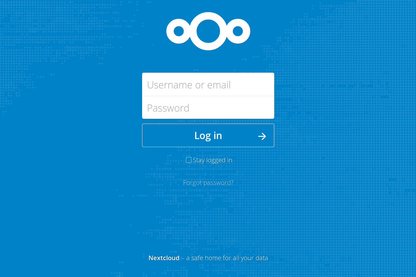
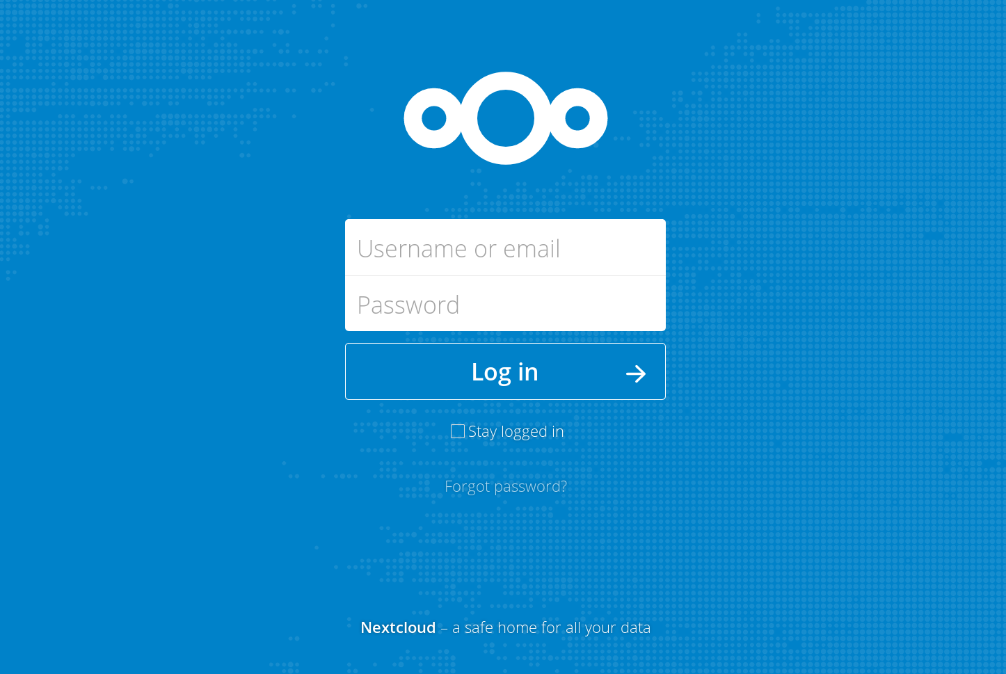
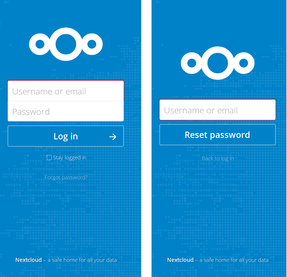
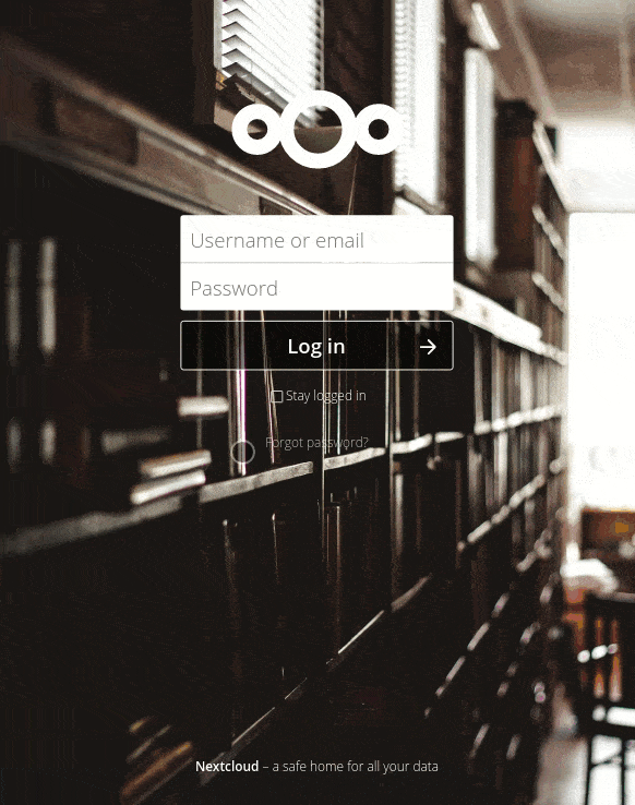
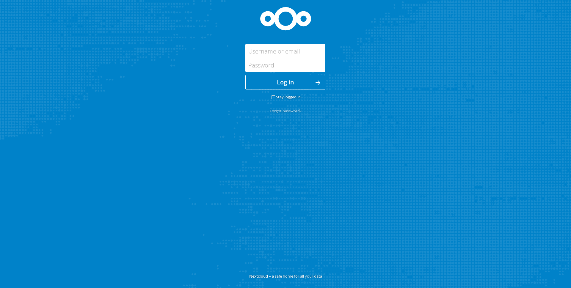
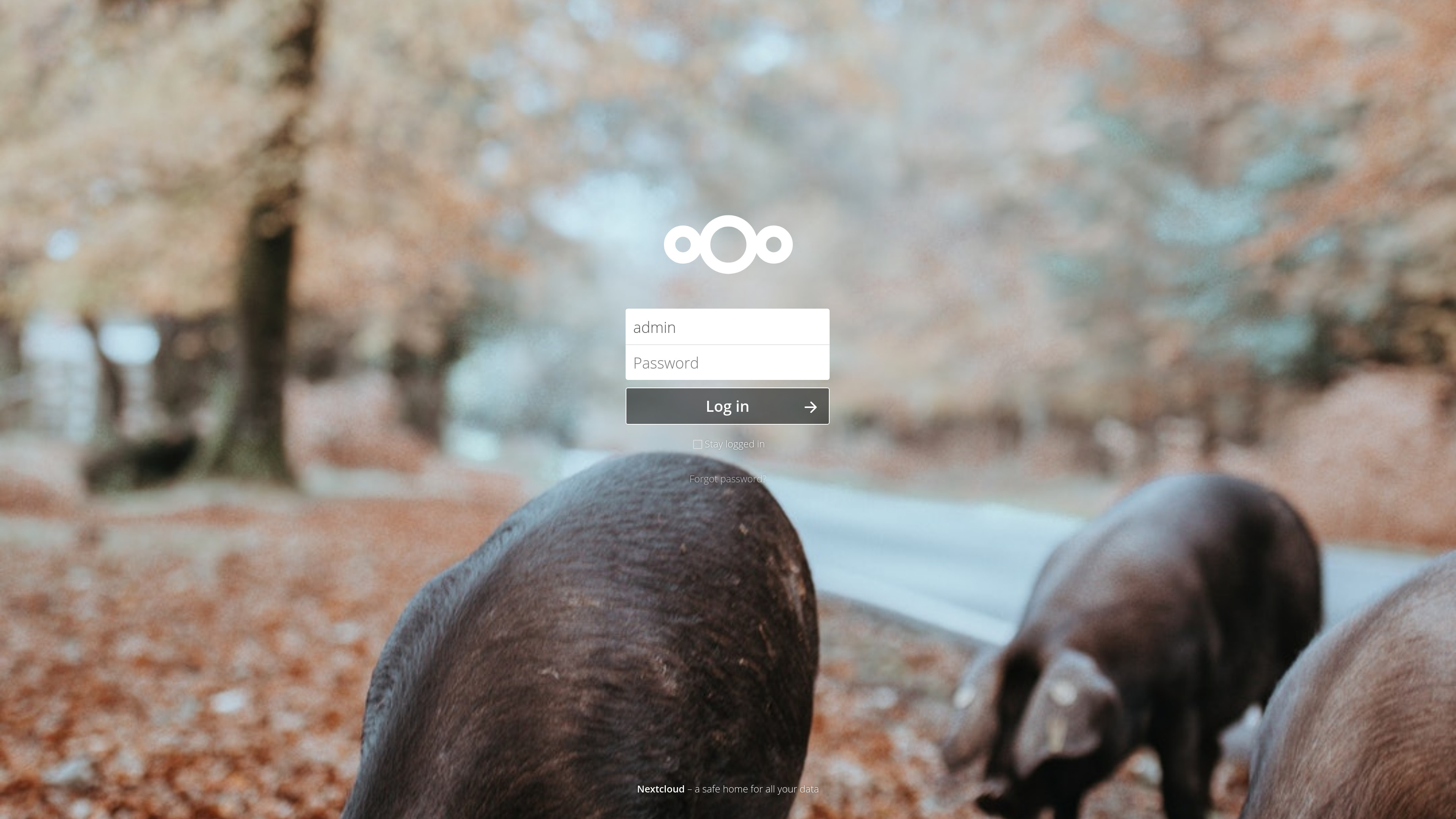
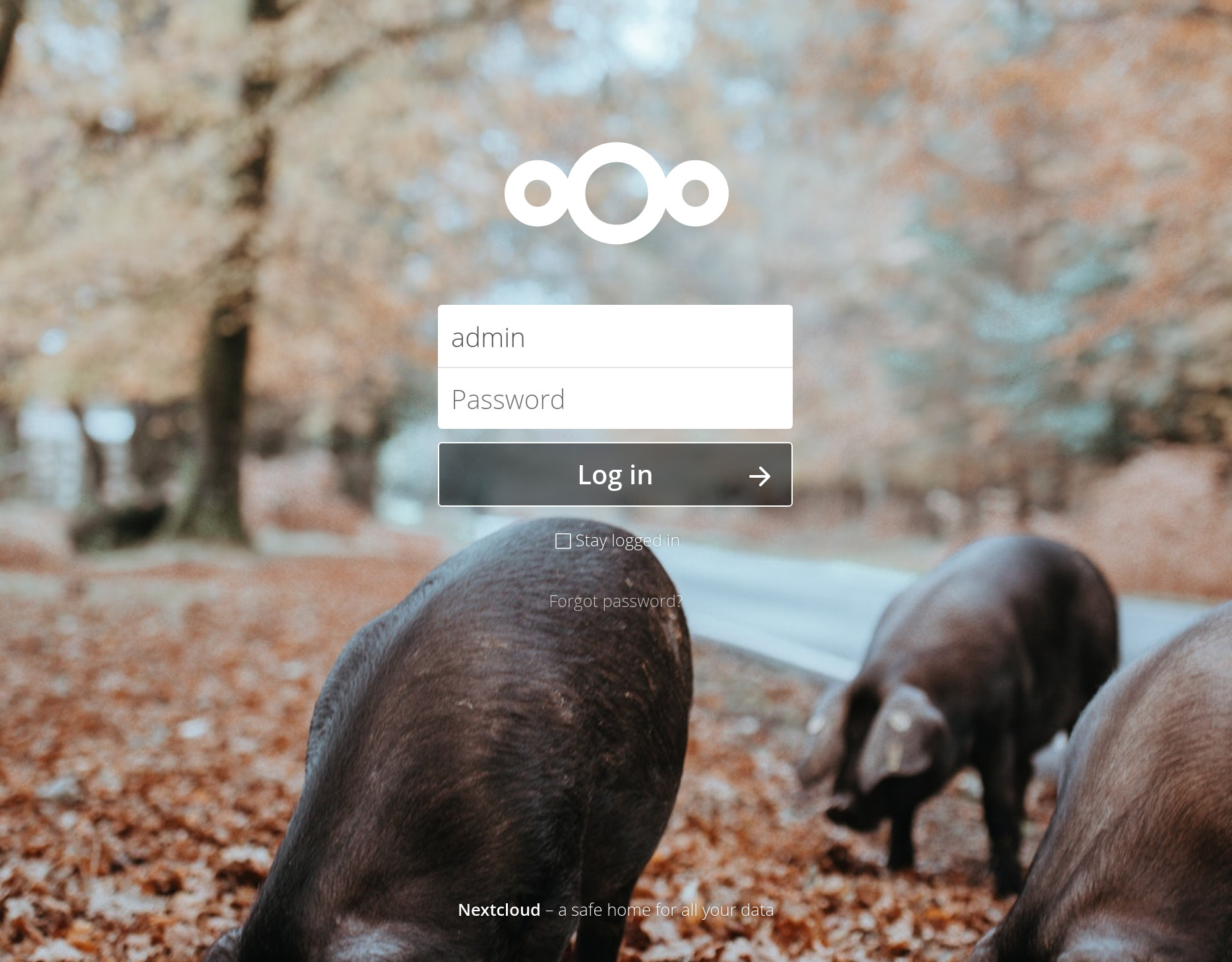
On small screens it seems to be a bit too high, no? Also the issue we have on master since the vertical centering change is still present. When the height of the content changes, the alignment changes. This makes the content move around vertically in cases like an update where the content changes very quickly. You can easily test it with the »Forgot password« view where the content is shorter: |
|
Okay, it's an easy fix, but we need to ask ourselves: (@nextcloud/designers)
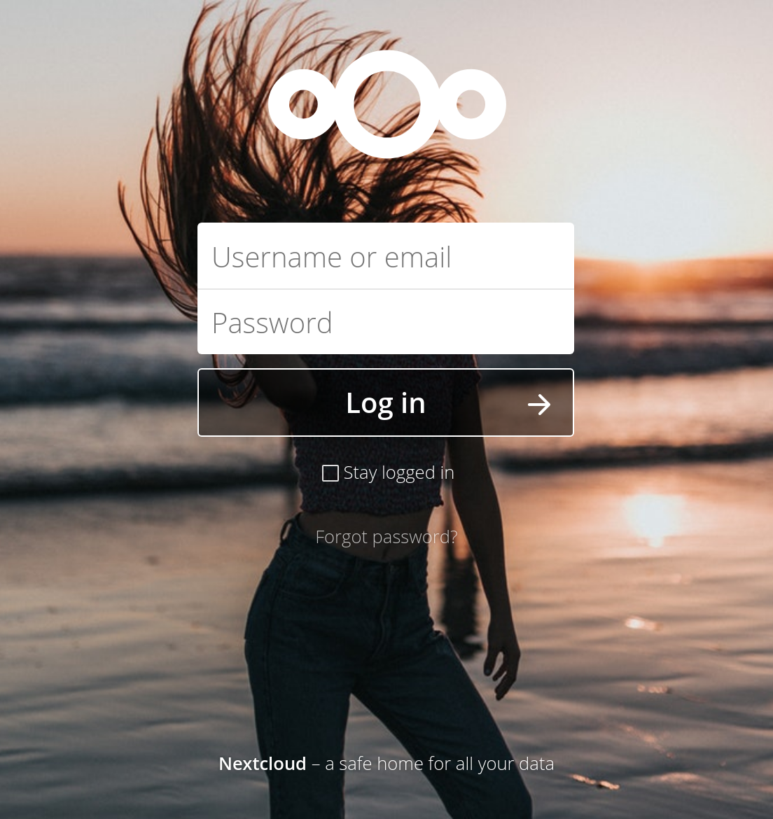
Ps: yes, it's me on the pictures |

|
Before we had both, or a better inbetween. A constant position of the logo for changing content, but also good position in general. Sure in theory vertical alignment is great. But of in practice it has these issues does it make more sense to revert to before? |
|
Perhaps we should introduce media queries... |
|
The problem is independent of the screen size. :) When the content is vertically centered but then the content changes quickly (like on update), or even slower (like on Forgot password) everything moves around. That's why we need to make sure the top part of the content (like the logo) is always at the same position. That's why it was set with a margin-top set to a percentage before. Sure it's not absolutely perfect and not vertically centered, but it's a better working solution. @skjnldsv @pixelipo except if you say there's an easy way to achieve the same. But right now it seems we are adding complexity on top of complexity to make a fairly simple case work. ;) |
|
@jancborchardt I don't like absolute positionning. This is a pain in the ass and we should never use it for main contents. That being said, going to flex and margin is the solution. We can indeed just put the first margin top to a specific value like 00vh or stuff that depends on the full screen height so we don't have a jump like you say :) PS: current master has the jump like you said, so either way, this pr is not the problem here ;) |
|
Is it feasible to modify the html as well or are there to many pages that would be affected? |
|
@Henni yes it is. But to be fair I was considering standardizing the guest page for 14. With a flex column. Right now the idea was just to go for a quick removal of the absolute positioning :) |
Signed-off-by: John Molakvoæ (skjnldsv) <[email protected]>
|
@jancborchardt Should be better now :)
|
|
@skjnldsv yes, master has the issue too because #6736 introduced it. ;) It also caused another issue as commented by @ChristophWurst in there too. That's why we have to go with a solution we can backport to stable13 now e have feature freeze, without breaking much. That said, looks much better now! :) 👍 |
|
I'll fix the totp in another pr. Please review now! :) |
|
OK, here's my
|


|
@pixelipo agreed with all of those, however all those we should do separately as we need something minimally invasive we can use for master now cause it’s feature freeze. :) Maybe the easiest is still to revert #6736 – @MorrisJobke @skjnldsv? |
|
@jancborchardt how is the update screen with the current master? I can't test right now :/ |
|
OK, I've copied my comment into a new issue: #7265 As far as I'm concerned, we should merge this as I see no other problems |
|
@jancborchardt it does not on my side. @MorrisJobke is this the same for you? |
Not really - it is not fully centered but maybe at 1/3 to 1/4 depending on the zoom level (in the middle when zoomed in, between middle and a third when in normal mode and between a quarter and a third when zoomed out). |
|
@MorrisJobke that's how it's supposed to be then. @jancborchardt could you try again? :) |
|
Shameless bump! |
|
Let's go with this for now. @jancborchardt Please have another look how it works now and then we look why it works for us and not on your system. Merging ... |
|
Works fine in Chrome (left) but the issue persists in Firefox (incognito window, cache cleared, latest master). Can no one reproduce? |
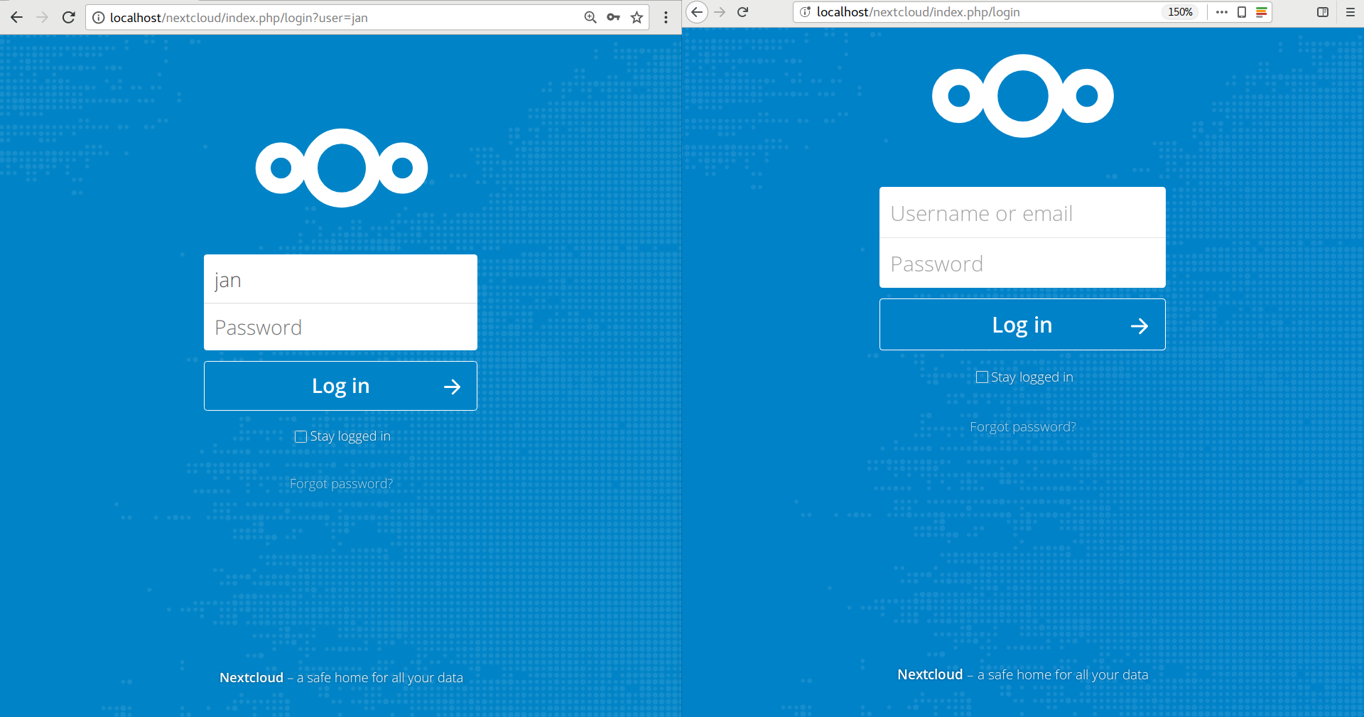
After a reinstall and refresh it now also shows up in Firefox :/ @skjnldsv Could you have a look? |
|
Taking a look right now! |
This allows the browser to automatically compute the full content.
Everything is center except the footer as long as the window as enough space to display everything.
The fallback in case of big content or small screen is the reducing of the blank space between the man content and the top and the main content and the footer. After that, the total height is expanded by a scroll.
Examples with various sizes:
Update example (very big picture)