Update the design of the task list #1136
Conversation
Codecov Report
@@             Coverage Diff             @@
##           master    #1136       +/-   ##
===========================================
+ Coverage   27.82%   78.76%   +50.93%
===========================================
  Files          48        8       -40
  Lines        2609      113     -2496
  Branches      494        0      -494
===========================================
- Hits          726       89      -637
+ Misses       1743       24     -1719
+ Partials 140 0 -140 |
|
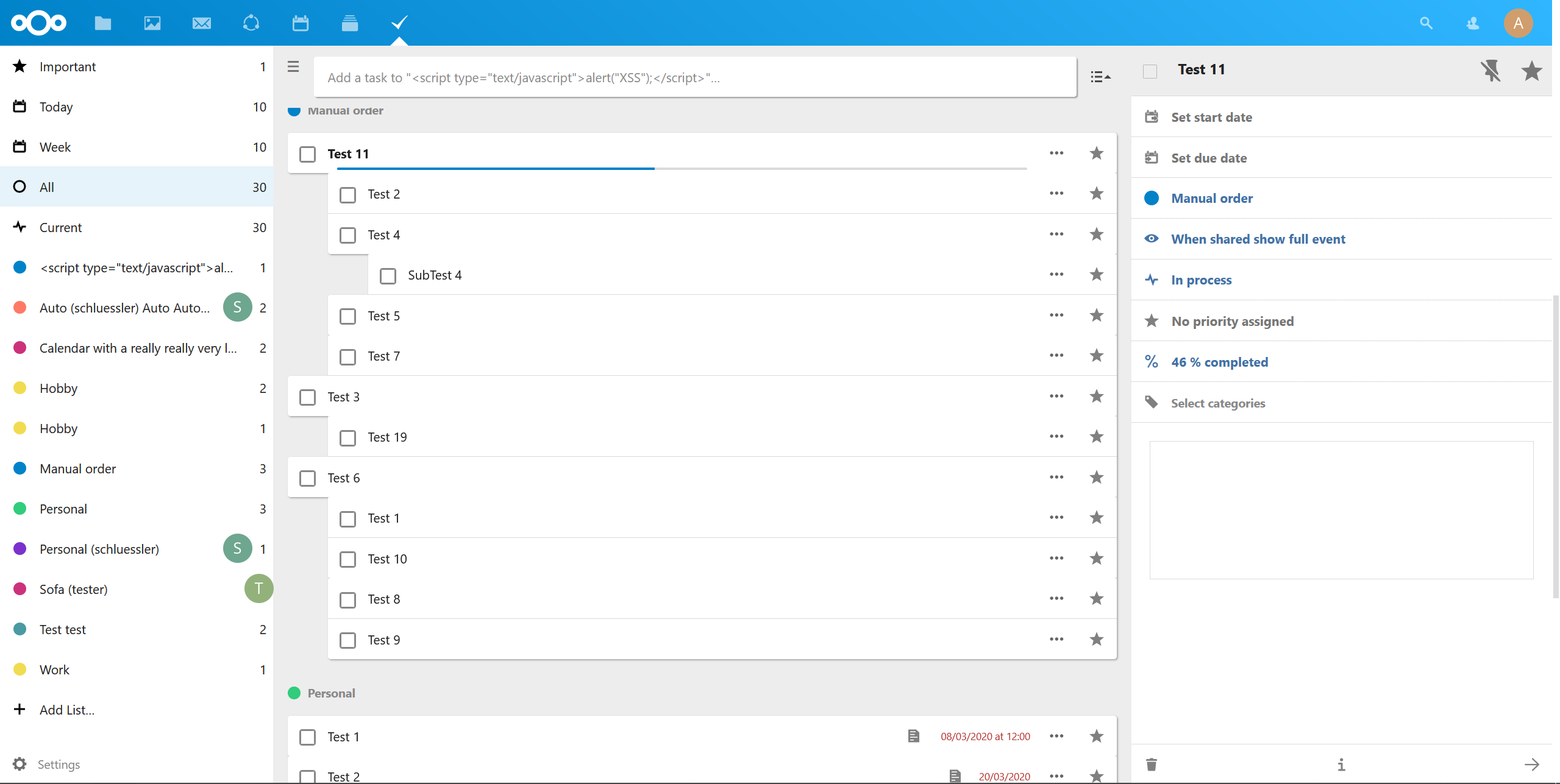
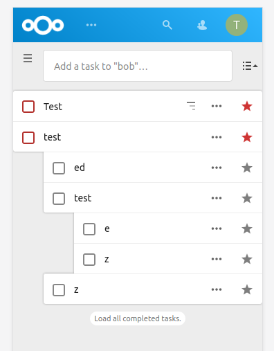
It looks nice already, but there are some visual issues:
|
|
I will have a look at the issues I mentioned tomorrow, but feel free to work on it in the meantime. |
|
@raimund-schluessler Thanks for the in-depth feedback. I did not want to touch to the structure / Vue components too much, that's why I used the subtasks-container to kind of hide the round corners when necessary. If we could have classes for each case you described, then we would have a cleaner solution for sure.
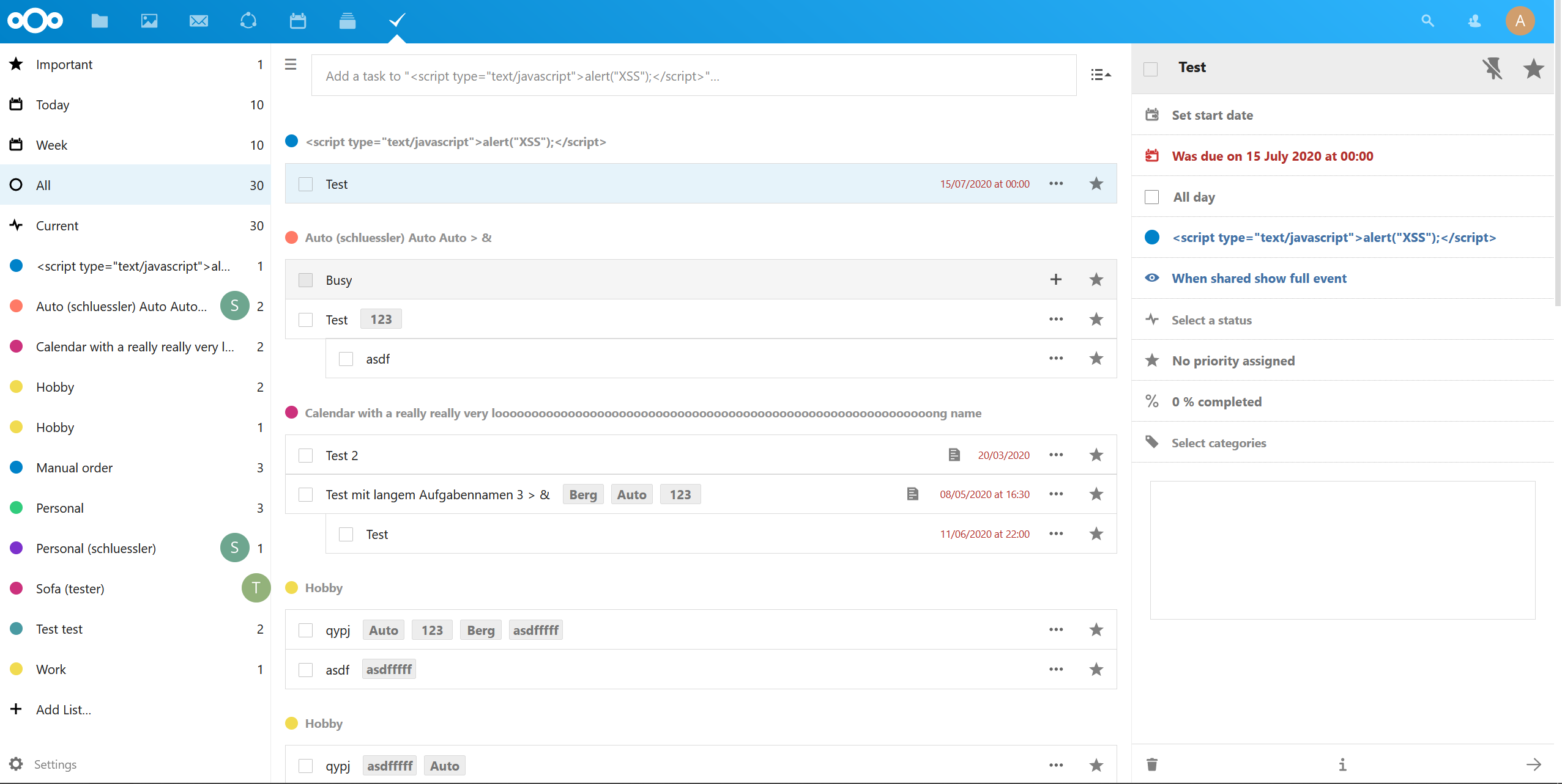
Is that something new? I'm using Nextcloud 16 I don't have the background changing on hover in lists. Not even in the vanilla tasks app. I am not sure we should add that on tasks personally, but that's another concern. |
I think that would be good.
That's how current master looks on Nextcloud 19: Nextcloud 16 is end-of-life since 2020-06-04, would be good to update anyway 😉 |
|
Okay thanks, time pass by really fast right? I'll have to update my instance then so that I can work on up to date software. Sorry for the inconvenience. |
No need to apologize. It's rare enough that someone actually contributes code 👍 |
|
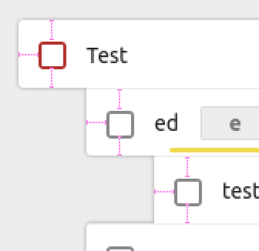
Memo to myself: CSS selector to show a round corner at the top left for tasks whose previous sibling has subtasks shown: li.task-item.hasSubtasksVisible + li.task-item > div.task-body {
border-top-left-radius: var(--border-radius-large);
} |
|
@raimund-schluessler I think you should also select when user is adding a subtask to the previous task. Something like li.task-item.hasSubtasksVisible + li.task-item > div.task-body,
li.task-item.hasAddSubtaskVisible + li.task-item > div.task-body {
border-top-left-radius: var(--border-radius-large);
}Because a task could have no subtasks or all subtasks hidden but have the adding subtask input displayed. |
Here's an updated style.scss that matches the designs I shown in issue #664

Signed-off-by: Tim Krief <[email protected]>
The lines between two rows on the same level were rounded off on the left, which looked a bit off. Now they are straight.

Signed-off-by: Tim Krief <[email protected]>
Added a subtasksHidden class when all class are hidden in a task-item and fixed the style for tasks with hidden subtasks.

Signed-off-by: Tim Krief <[email protected]>
Signed-off-by: Tim Krief <[email protected]>
Fixed an edge case where the style would not work for the last element of the tree with all subtasks hidden and the input field for adding subtasks displayed.

Signed-off-by: Tim Krief <[email protected]>
Signed-off-by: Tim Krief <[email protected]>
Signed-off-by: Raimund Schlüßler <[email protected]>
e39cf9d to
3c4672a
Compare
Signed-off-by: Raimund Schlüßler <[email protected]>
Signed-off-by: Raimund Schlüßler <[email protected]>
Signed-off-by: Raimund Schlüßler <[email protected]>
Signed-off-by: Raimund Schlüßler <[email protected]>
Signed-off-by: Raimund Schlüßler <[email protected]>
3121ea6 to
8c911b9
Compare
|
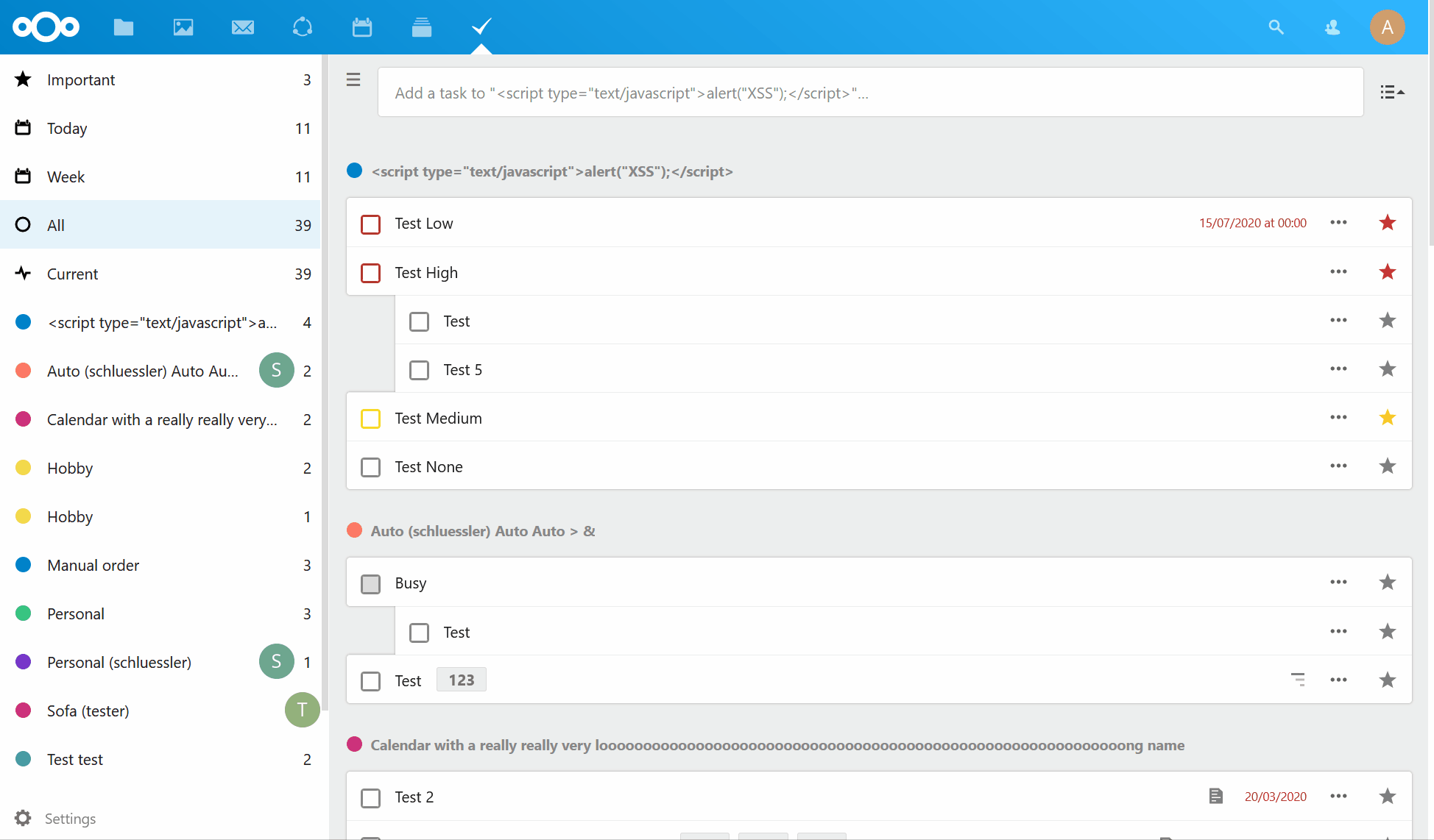
I fixed all issues, and I think it looks really good, see #1136 (comment). |
|
Congrats! You achieved that pretty quickly. I'm setting up a local dev environment so that I can properly try it, but just by the look of your screenshots, it looks like what I had, and even better with your fixes. I'm really hyped about this! |
|
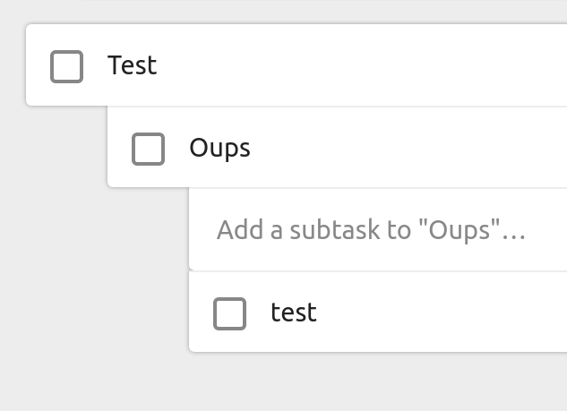
The only issue is that while dragging a task, the round corners are not correctly updated, since the new subtask relationship only really changes after the task was dropped. However, with
Also, I created a build, so anyone can test it easily: |
|
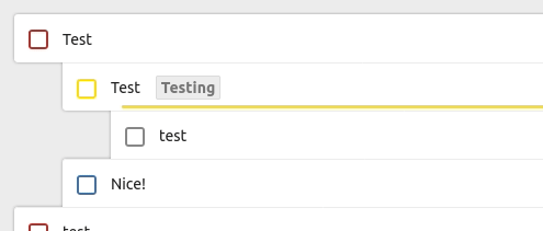
Nice job! I just tried it and it feels really nice. Here are the four little details that I found while trying out the build.
👍 |
|
@timkrief Thanks for the feedback, I will take care of the issues. 👍 |
Signed-off-by: Raimund Schlüßler <[email protected]>
Signed-off-by: Raimund Schlüßler <[email protected]>
Signed-off-by: Raimund Schlüßler <[email protected]>
Signed-off-by: Raimund Schlüßler <[email protected]>
Signed-off-by: Raimund Schlüßler <[email protected]>
|
I fixed all issues you found:
The task checkbox color might be a bit to light now, but it's the Nextcloud default border color |
|
Btw, only one design detail I noticed with the design improvements from here: The shadow currently is blurring into every direction equally. Usually 1px shift to the bottom makes it look nicer (ref sun and real world and such ;) (In the pull request it was also shifted 1px to bottom and right at some point, but that looks strange as well. Only shifting to bottom looks best.) |
I purposely didn't do that, because I didn't want to introduce such a 3D effect. I think the general interface design of the last years went away from 3D effects to a more flat appearance. |
|
Wow I really like the new changes, they look really good. But I feel like they do not fit in with the rest of Nextcloud. I'm not hoping these changes to be undone but rather that NC move more into this direction, is anything like this planned in the future? Edit: Sorry if I'm wrong here, kindly point me to the correct thread please. |
|
@grandeljay i can see at least a PR for changing the background of the Deck app. So if you are interested into pushing this topic forward, i'd suggest to have a look at the other apps and make fitting suggestions which elements can be adapted - i don't think that those changes qualifies as a "theme" which simply can be generously stamped at each app 🤷♂ |
Follow-up of #1135. Updates the style of the task list to a more friendly appearance. Please have a look @timkrief
Also @jancborchardt and @nextcloud/designers for review.