To plot extra vertical or horizontal lines use the horizontal_line() or vertical_line() methods (in short hline() and vline() respectively). Note that both methods accept as coordinates date-time strings, if the plot allows it.
import plotext as plt
y = plt.sin()
plt.scatter(y)
plt.title("Extra Lines")
plt.vline(100, "magenta")
plt.hline(0.5, "blue+")
plt.plotsize(100, 30)
plt.show()
or directly on terminal:
python3 -c "import plotext as plt; y = plt.sin(); plt.scatter(y); plt.title('Extra Lines'); plt.vline(100, 'magenta'); plt.hline(0.5, 'blue+'); plt.plotsize(100, 30); plt.show()"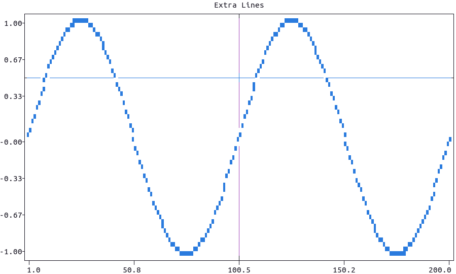
More documentation can be accessed with doc.vertical_line() and doc.horizontal_line().
To add text to the plot at certain x and y coordinates use the text() function which, if needed, accepts date-time strings as coordinates.
Here is how to use it for a labelled bar plot:
import plotext as plt

pizzas = ["Sausage", "Pepperoni", "Mushrooms", "Cheese", "Chicken", "Beef"]
percentages = [14, 36, 11, 8, 7, 4]

plt.bar(pizzas, percentages)
plt.title("Labelled Bar Plot using Text()")

[plt.text(pizzas[i], x = i + 1, y = percentages[i] + 1.5, alignment = 'center', color = 'red') for i in range(len(pizzas))]
plt.ylim(0, 38)
plt.plotsize(100, 30)
plt.show()
or directly on terminal:
python3 -c "import plotext as plt; pizzas = ['Sausage', 'Pepperoni', 'Mushrooms', 'Cheese', 'Chicken', 'Beef']; percentages = [14, 36, 11, 8, 7, 4]; plt.bar(pizzas, percentages); plt.title('Labelled Bar Plot using Text()'); [plt.text(pizzas[i], x = i + 1, y = percentages[i] + 1.5, alignment = 'center', color = 'red') for i in range(len(pizzas))]; plt.ylim(0, 38); plt.plotsize(100, 30); plt.show()"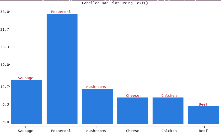
More documentation can be accessed with doc.text().
To add a simple label + value indicator to, for example, a matrix of plots, use the function indicator(value, label).
- Note that both
labelandvaluecould be numerical or in string form. - The
colorandstyleof the plot could be changed using the correspondent parameters.
Here is a basic example:
import plotext as plt
plt.indicator(45.3, 'Price')
plt.plotsize(30, 10)
plt.show()
or directly on terminal:
python3 -c "import plotext as plt; plt.indicator(45.3, 'Price'); plt.plotsize(30, 10); plt.show()"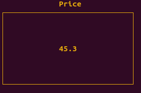
More documentation can be accessed with doc.indicator().
To add shapes to a plot use the rectangle() or polygon() functions.
- The dimensions and position of each shape could be changed using its
xandyparameters (for both rectangles and polygons),sidesandradius(for polygons only). - A circle could be simulated by a polygon with high
sides. - The
radiusparameter is the distance of the polygon vertices to its center: for a simulated circle this corresponds to its actual radius, hence the name. - The aspect of the shapes could be changed with the
linesandfillparameters, to plot lines between the vertices (as by default) and fill the shape with colored markers (Falseby default),
Here is an example:
import plotext as plt
plt.title('Shapes')
plt.polygon()
plt.rectangle()
plt.polygon(sides = 100) # to simulate a circle
plt.show()
or directly on terminal:
python3 -c "import plotext as plt; plt.clf(); plt.title('Shapes'); plt.polygon(); plt.rectangle(); plt.polygon(sides = 100); plt.show()"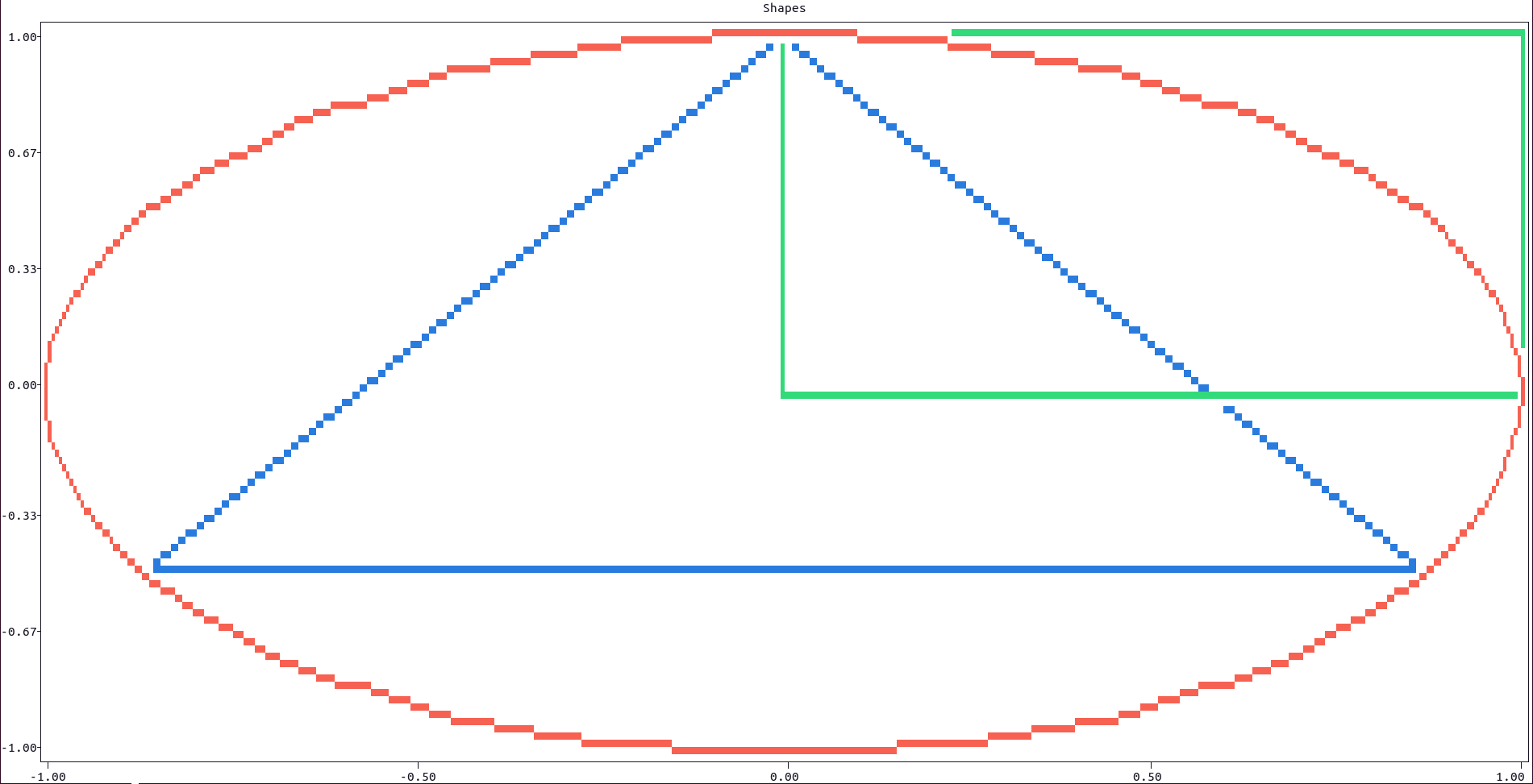
More documentation can be accessed with doc.rectangle() and doc.polygon().