Add organization profile #5
Conversation
|
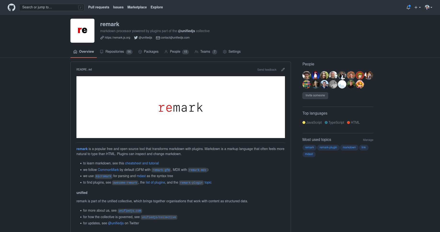
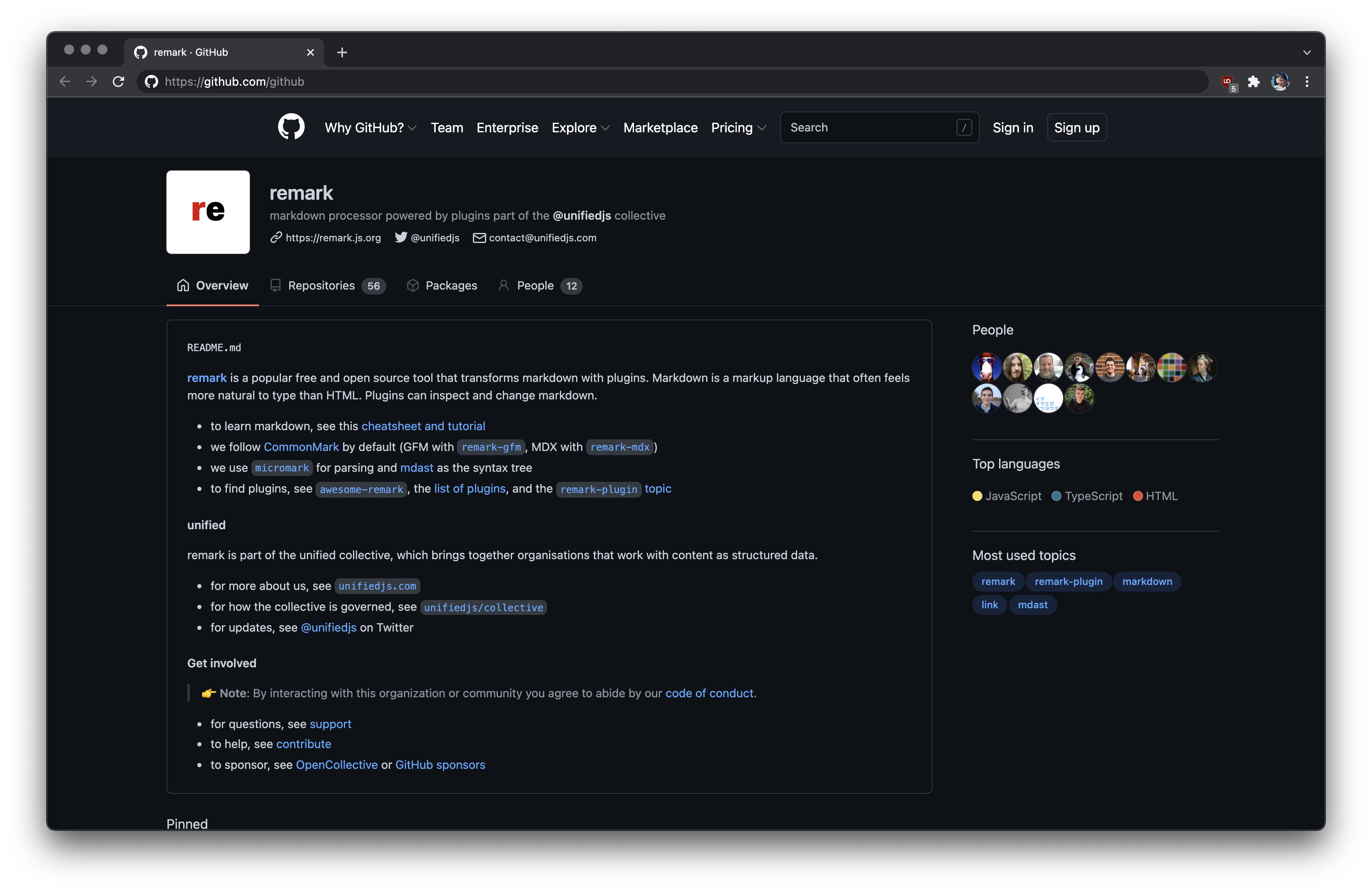
There aren’t a lot of examples of orgs with profiles yet: |
 Murderlon
left a comment
Murderlon
left a comment
There was a problem hiding this comment.
Nice, didn't know this existed for orgs. Might be good to mention remark falls under the unified collective?
|
I was hoping the: * for more about us, see `unifiedjs.com`
* for updates, see Twitter…of which the latter links to unifiedjs, not explain that enough? What would you add? |
|
When 'Crowdsourcing the evolution of text parsing with unified' was written we defined the goal of the collective as:
So it could perhaps be interesting to have a bit of that shared vision in the org profiles, and optionally link to the other orgs part of it, or just unified, and optionally only link from there to the other orgs. |
|
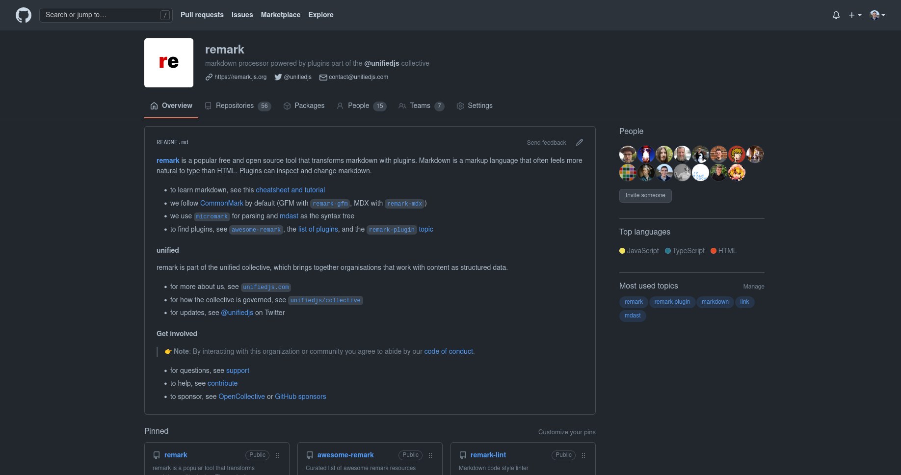
@Murderlon how about this? |
This comment has been minimized.
This comment has been minimized.
|
Not bad, right? view |
|
I think I like it? |
|
We could put unified and get involved in a details: “More info”. |
That's one option. Another would be cutting the full width logo
|
|
yeah. I personally quite like it. It grabs the viewer. (if limited data says anything, the inspiration also all have it: #5 (comment)) |
|
I think explaining what remark is, and linking to what’s most important, in prose, might be more important than showing projects as fast as possible? |
Maybe something still flashy but with less padding around the edges?
|
|
And if some of the bullet points could be turned horizontal. (maybe tables), even more space could be saved, while still conveying the key information. |
|
But what's the real problem of hiding pinned projects under the fold? I get that it's a change, but there are some very useful links in there, that might be better to have above the fold? |
Because people want to get to the repositories. This hides that with the options after the change being:
I'm not saying your content is bad, it's good!
may not have thought through that design fully. 😅 |
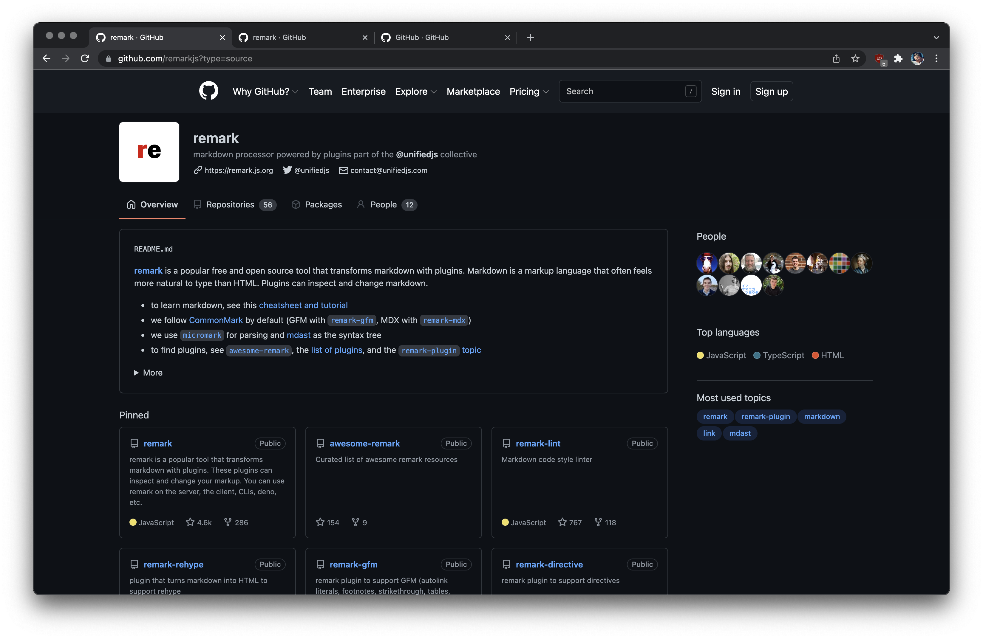
Do they? the list of repositories is mostly garbage: last updated, not very useful. The pinned repos are a bit useful. But the intro already links to half of these, and links to three good places to find plugins. Those explain plugins in more detail, and include more plugins (not all plugins are maintained in remark).
Is that really the goal of this page? It was the only thing on org pages before. So again I get that it’s a change. But I have a hunch that there might be other valid reasons for people to visit the org page: to learn about the org and find the most useful links (not just repos). I don’t think many folks really go and search for plugins by searching or browsing our org, instead I’m assuming they use global github search or our lists of plugins? |
I really don't know GitHub's goal for the page.
That could be, and if so, putting as much of that information that we think people want/need to see in the fold would still be a goal. |
|
I meant why people go to that page. I’m not sure what you mean by MySpace page, but it sounds like we agree what should go on the org page? About, contact, profile. Not top repos / all repos?
I’m not sure what you propose here? There is a lot of useful information in there? Is the problem the repos being too low? Or is the image a problem? Repos higherIf there is a problem with repos being too low, we can try and get them higher:
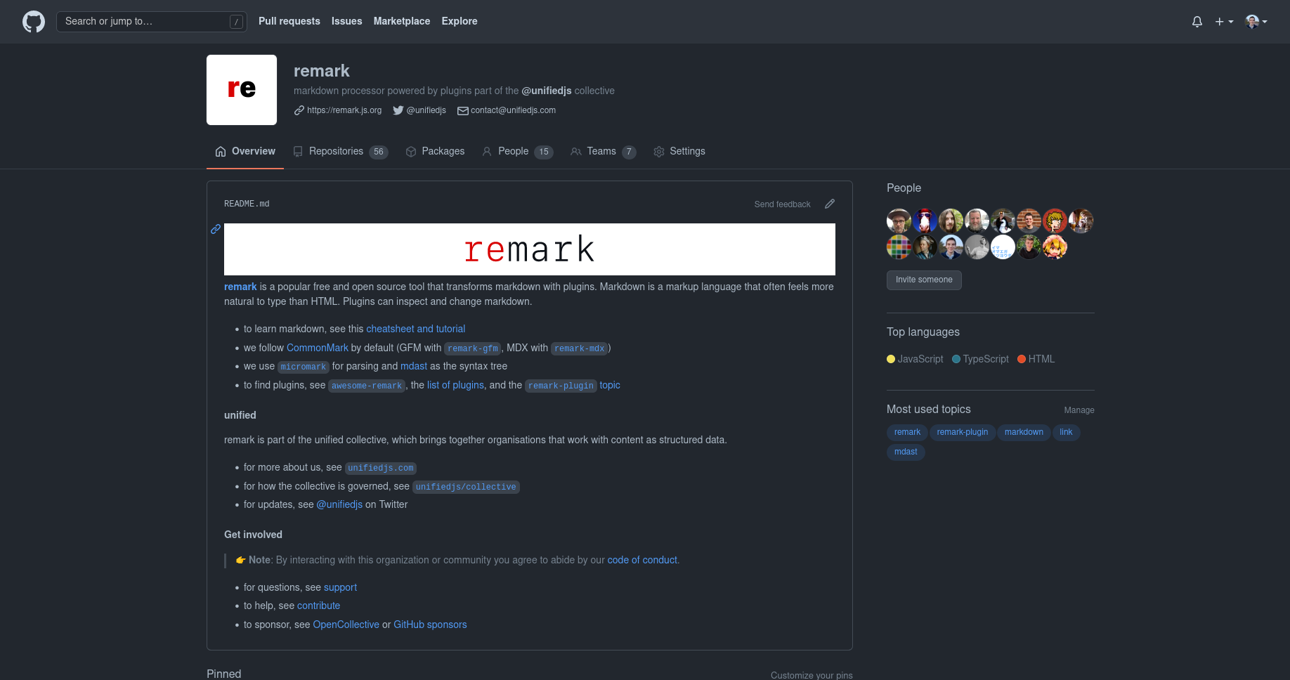
I think this hides too much useful information behind details, on the GitHub app it puts useful information behind two interactions, I personally don’t get why repos should be as high as possible, and as folds are dynamic it wouldn’t work everywhere. No imageIf the image is too large, we can remove it:
I’m 🤷♂️ on this. It does make more info available, not the repos though, it feels rather busy to me. |
Initial checklist
Description of changes
View rendered.
I want to add a profile for the remark org. It will be rendered here.
This file contains that. I already pushed an initial version so it can be more easily previewed.
But in this PR I want to discuss what should end up there and amend it.