Improve text accessibility #1666
Conversation
|
This is probably a bit of subjective / contentious change. It's also interesting that the Vue "green" fails the contrast test, but I didn't want to mess with Vue's visual identity. We could probably darken it (its usually on a bright white background) and tweak it a little without many people noticing, but that's really up to the cores. Also if anyone has a lot of design / UX experience, please weigh in; this is a fairly naive patch from my side, as part of my recent learning about web accessibility. |
|
Thanks @robcresswell! This is something I'll want Evan to approve before merging, but before that we can get some of our designers to review. Also tagging @callumacrae since he specializes in accessibility. |
|
I've no opinion on the visuals yet, but adding VIM swap file extension to |
|
OK, I quite like the visual changes personally, and I think it does indeed improve readability. The foreground/background color contrast has been improved (from 9.28 to 10.07), and the new font size is more friendly I think. Over to @yyx990803, for branding/visual considerations. |
|
In case anyone else looking isn't familiar with the preview tool:
|
|
Just reverted the code font change that I realised I left in, as it was subjective, doesn't really affect accessibility, and alters the visual identity of the docs. (Personally I would recommend using native font stacks for docs like these as they are technical in nature, not company-branded, and it reduces the network overhead in both bandwidth and latency, but thats a separate discussion) |
|
Code blocks can now go off the right - I'm not sure if there was a convention keeping them on the page before though. <meta name="viewport" content="width=device-width, initial-scale=1, maximum-scale=1, user-scalable=no">Scrolling is disabled on mobile, would be great to deal with that: w3c/html#602 Good work :) |
|
Thanks for the feedback @callumacrae; will take a look at both of those points over the next couple of days |
|
Hey @robcresswell! Any updates on this? Thanks for your help! |
|
Hey @sdras! Okay if I take a look over the weekend? To be honest, I'd forgotten I had this open, but I'm happy to work on it if its still deemed valuable? If not, feel free to close it. |
|
Yeah absolutely. Thanks @robcresswell! |
|
Okay, that might be the slowest update anyone has ever made to a PR, ever. Hopefully addressed some of the comments around line wrapping, and have also altered the meta to allow mobile zoom. I'm really quite new to the a11y side of things, so please point me in the right direction if I've made some mistakes. @sdras, thanks for your patience after requesting an update. I should've asked for three weekends 😇 |
|
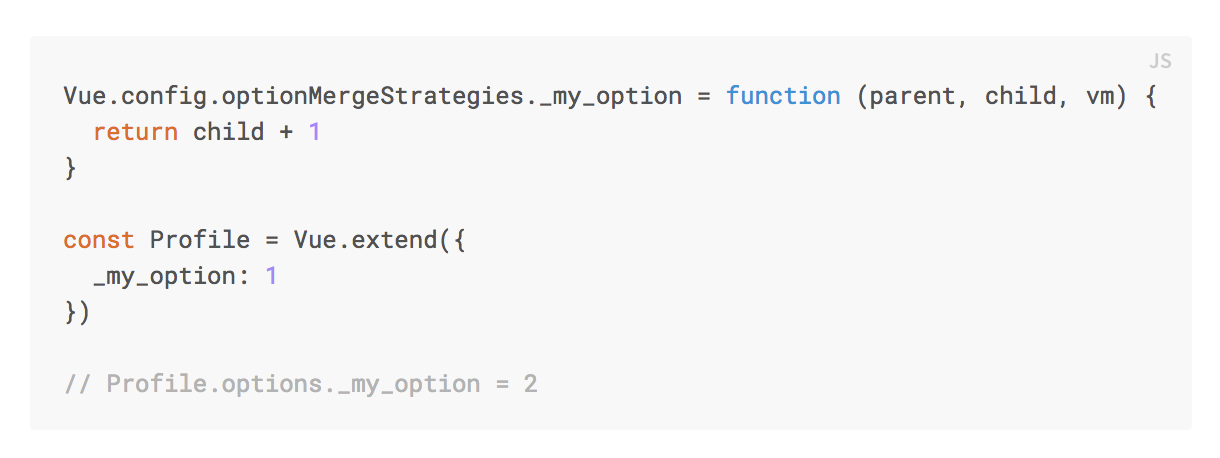
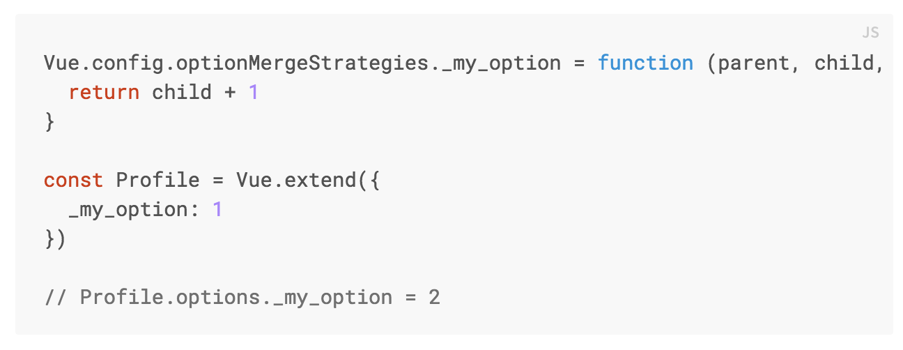
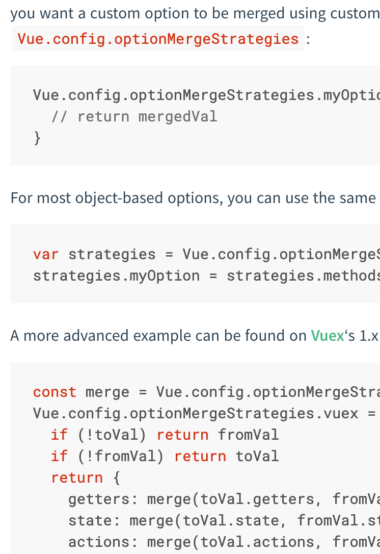
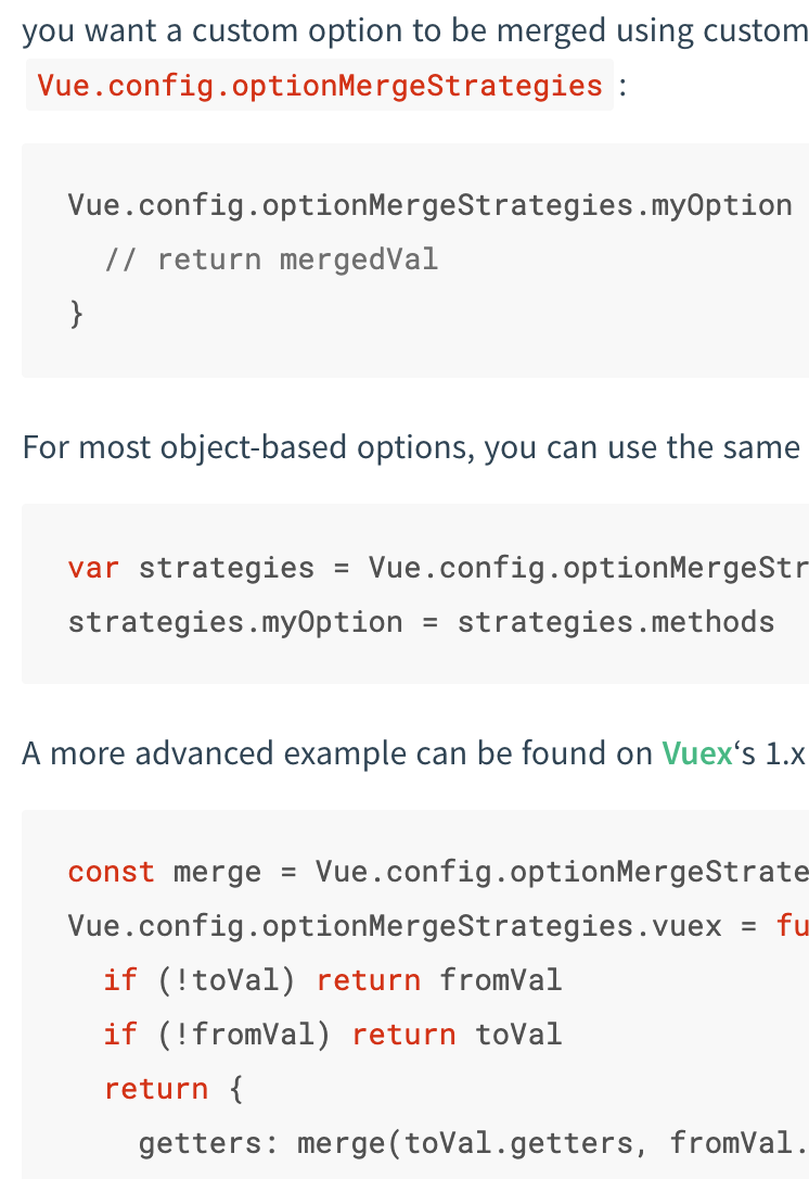
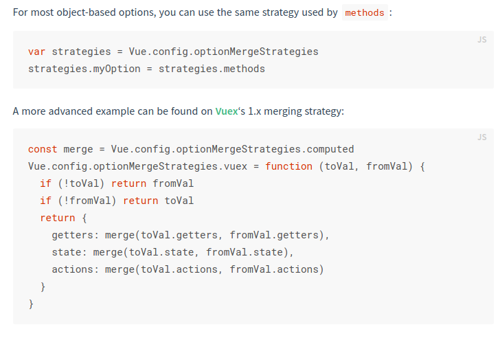
For some side-by-side comparisons, to save reviewer time: BEFORE https://vuejs.org/v2/guide/mixins.html#Custom-Option-Merge-Strategies BEFORE https://vuejs.org/v2/guide/transitions.html |
|
I feel a bit uneasy with the increased font size for code which IMO is unbalanced with the paragraph text and looks crowded now with the 1.5em line-height. I've played along with the numbers and found this combination to be more balanced: code, pre {
font-size: 0.85em;
}
pre code {
line-height: 1.9;
font-size: 1em;
}Compare the screenshots of the current PR:
And with my values, notice the inline
WDYT? |
|
@phanan Agreed, that is nicer. I'll update quickly. |
This patch makes a few changes:

- Alter the "light" text colour so that it is WCAG AAA compliant for
  legibility.
- Adjust code colours to be at least WCAG AA compliant.
- Darken the "medium" and "dark" colours, so as to preserve significance
  of different shades
- Make text use the font-size set by the browser so users with visual
  impairment can choose their own size, rather than hardcoding 15px and
  forcing people to zoom. Most browsers default to 16px, in my
  understanding. Also adjust the max-width of the body, to account for
  the increased font-size and prevent aggressive line wrapping.
- Adjust some of the site meta tags to allow scaling on mobile
|
Okay:
|
|
(screenshot looks a little blurry due to resizing, click it to view properly) |
|
I think I might be the only human in the world for whom larger text sizes hurt their eyes 😅I asked a few more "normal" humans and they all say it's easier for them to read, so I think this is an improvement. 👍 Thank you for using rem and allowing the user to scale now as well. Thank you! 🎇 |
|
Thanks again! Cheers! 💚 |
|
@sdras Oh no, I'm sorry 😅 Thanks for your patience 🙏 |
This patch makes a few changes: