New feature - PasswordBox styles with "reveal password" functionality #2828
Conversation
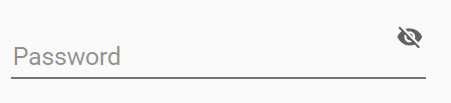
There are still issues with the positioning of the floating hint when password is revealed but empty; the hint should float up, but it does not.
Floating hint still misplaced when password is empty and revealed
Reveal button aligns with the "clear text" button for consistency. Although I think the "clear text" button is floating a little too high in 2 of the styles (but that is the same for the normal PasswordBox and TextBox styles)
Avoid leaking memory by replacing the regular event handler with a weak event handler.
|
Good job! Just have to fix the hint bug and it will be perfect. |
…MaterialDesignInXAML#2830)

Co-authored-by: Material Design Service Account <[email protected]>
Respects a cursor set from outside, otherwise falls back to the desired defaults
…lDesignInXAML#2829)

Using materialDesign:TransitionAssist.DisableTransitions="true" duration of animation for content cover opacity should be set to 0 to skip animations at all on close dialog host
…x with helper text left margin (MaterialDesignInXAML#2820)

* Fix left margin for error message on outlined TextBox

The error message and helper text should have the same Margin.Left value for the outlined TextBox.

* Adjusted error text left margin for filled text fields

ComboBoxes, DatePicker and TimePicker all rely on the fields internally, and thus inherit these changes.

* Added UI test for the filled style as well

* Retain original bottom margin

I want to make as few changes as possible to the original style (margin)
* Refactoring DataGridAssist mouse handling

Rather than handling the tunneling event and "pre-processing", it now handles the (already handled - by the cell) bubbling event to perform additional actions.

* Added template column example

Fixed issue where it would not switch to edit on click

Co-authored-by: Kevin Bost <[email protected]>
 nicolaihenriksen
changed the title
nicolaihenriksen
changed the title
There are still issues with the positioning of the floating hint when password is revealed but empty; the hint should float up, but it does not.
Floating hint still misplaced when password is empty and revealed
Reveal button aligns with the "clear text" button for consistency. Although I think the "clear text" button is floating a little too high in 2 of the styles (but that is the same for the normal PasswordBox and TextBox styles)
Avoid leaking memory by replacing the regular event handler with a weak event handler.
…eatureRevealPasswordBox
|
@Keboo I resolved the conflicts in this branch after you merged the other PRs, however one thing is a bit weird to me. I have replaced the usage of the |
|
Looks like you did it fine. Even though the deletion does not show in the change set it is because the other PR already did it, and you also took care of it in this commit when resolving conflicts. I pushed a commit to your branch for the hint issue. I believe it should now be resolved. The issue was that the password box hint proxy only checked if the password box itself had focus, not if the focus was within a child, so I adjusted that (IMO it also makes more sense). I believe the behavior is correct, but let me know what you think, |
Makes a lot of sense. Thanks for the help! It works now. |
Also fixed a bug regarding the opacity of the PART_ClearButton which was not consistent across the styles.
 Keboo
added
enhancement
release notes
Keboo
added
enhancement
release notes
|
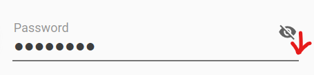
When using MaterialDesignFloatingHintRevealPasswordBox, reveal button position is not alinged properly. It is in line with the floating hint instead of on the textbox. |
|
@jamesport079 This has just been refactored a bit so that it follows the "clear" icon placement available via I agree with you that this is something that annoys my eye, but nevertheless it is spec'ed that way. Try with building the branch in the PR and run with that, or wait for it to make it into a nightly build if that is easier for you. |
|
It is not following the spec as such... material.io center justifies the icon in line with label when the field is empty (see snaphot). This is the MaterialDesign equivalent...
|
|
I agree there is a misalignment, but not only related to the reveal button then (same for the clear button). This should be created as a new issue instead of a discussion here in a closed PR. The "misalignment" in material.io shows when you enter some text in the field (on my phone now, so screenshot not possible) |
|
Yes agreed, clear button has the same problem. I will bring up issue in a new thread. Thanks! |
5 participants
As discussed in issue #2812 it could be useful to have a
PasswordBoxwith "reveal password" toggle functionality.This PR adds 4 styles for that specific purpose (a default style, and 3 derived styles; same concept as the normal
PasswordBoxstyles).Details
The "reveal" styles include a "raw"
TextBoxin the same place as the "password content", and then visibility of those elements are controlled by thePasswordBoxAssist.IsPasswordRevealedattached property. They of course also contain the "reveal button" located to the right of the password. There is also some focus stuff and whatnot that was needed in order to get the "right feel".I actually opted not to go for the behavior approach as discussed, because to my knowledge I would then need to add a new nuget dependency (Microsoft.Xaml.Behaviors.Wpf) which I would rather not. I might be wrong, in which case just let me know. So I ended up doing something similar but only using attached properties. It is still quite simple to actually bind to the
PasswordBox.Passwordproperty using this approach, and since it is simply usingPasswordBoxAssistattached properties, it is a concept that the users will be familiar with. You can see examples of this in the samples I added in the demo tool. Reveal button icons and "reveal mode" are all publicly available attached properties onPasswordBoxAssistallowing the user full flexibility.Testing
I added a UI test to ensure the "3-way"
Bindingworks as expected. The 3-wayBindingcan be illustrated like this:VM<-->PasswordBox<-->RevealedPasswordTextBox. A change in any of the 3 should trigger an update in the other 2 (depending on theBinding.UpdateSourceTriggervalue).Issue(s)
There is some vertical alignment of the "reveal" button that annoys my eye, but I chose to align it with the "clear text" button which is an opt-in feature for
TextBox/PasswordBoxand can be enabled if one so desires (the samples I added all have it enabled). For 2 of the styles, the buttons hover a bit too high compared to the baseline of the text in my opinion. It does however align with the material.io specs, so I guess it should be that way.There might also be some cosmetic things around the width of the IBeam and the
Foregroundcolor. But those also exist on the normalTextBox/PasswordBoxwhich I think has to do with the 150% scaling I have on my monitors. I have tried settingUseLayoutRoundingandSnapToDevicePixelsto true, but the issue still persists. Look at how the width of the IBeam changes depending on where it is shown (zoomed to 200%):