Modify attachements view at thread envelope #6310
Conversation
bd76477 to
90ddfbd
Compare
|
@jancborchardt @nimishavijay please have a look. We can create a ticket if this needs any kind of discussion :) |
|
@sazanof very cool! Did you see the mockup by @nimishavijay at #5768 (comment) about attachments when writing a message? We could use the same style here, and yours is mostly there, I’m mainly seeing 2 things:
|
|
@jancborchardt, @ChristophWurst hello! Yes, I saw this comment. I really liked the implementation. I came across it after (=)) how I implemented this functionality. So far I haven't figured out how to render previews. And so, I have already opened a branch in parallel to implement exactly the idea you referred to. However, there will be much more changes than those that I made earlier. Perhaps as a temporary measure. Why did I move the additional actions button to the icon - we mainly use laptops 1920x1080 15.6"
maybe. I just looked at roundcube and a couple more email clients and made a display of all attachments at once. |
|
Do you think it might be worth moving the block with attachments above the body of the letter? |
90ddfbd to
6ed1d66
Compare
|
I have received a lot of feedback from users that attachments on top are more convenient. I also looked at how it is implemented by other clients. In the vast majority - attachments are located on top. Therefore, I suggest you consider this revision. Perhaps, in terms of convenience, this is indeed the case. Thanks!
|
fd5b1e4 to
507c403
Compare
|
@jancborchardt @nimishavijay Could we get another round of feedback for this (especially regarding showing on top vs bottom)? Both bullet points from the last review have been implemented. |
58e9bcc to
4d14b25
Compare
|
@st3iny thank you for you review. I corrected the attachment padding and
|

 st3iny
left a comment
st3iny
left a comment
There was a problem hiding this comment.
Tested and works. My previous feedback was addressed.
I'd suggest to keep the attachments on the top and open an issue for discussion. This can be changed easily later.
|
@sazanof Please squash your commits into one. |
4d14b25 to
1f4099c
Compare
|
It actually looks really good! The design itself looks great, only one question: Is the name of the file in bold? We should change it to regular. I would actually expect the attachments to be below the body text. Gmail and Apple Mail show it below. Outlook shows it above. Do you know what other clients show it above? |
|
@nimishavijay hello! Thank you for your feedback! Rainloop Roundcube TB (bottom, but with fixed position) Yandex I think it will be (almost) equally cool anywhere. Why did I give preference to the top? Because it immediately catches the eye, it is immediately emphasized that the letter has attachments. Yes, if the text is large, then as you said, in this case, attachments are also better on top. The fact that they are collapsed in my opinion does not matter: there is a similar design of attachments when writing a letter. I thought it would be more compact and clearer, more accessible. Of course, all decisions are yours. But I had to share my point of view. 🌹 PS. Yes, the bold font should be removed. 😅 UPD bold font restore to regular |

d2feb12 to
ea9d6f0
Compare
 JuliaKirschenheuter
left a comment
JuliaKirschenheuter
left a comment
There was a problem hiding this comment.
The attachments on the top looks great, and works well (on mobile too)
|
Thanks for the examples! I'm leaning towards showing it at the bottom because we try to avoid expanding/collapsing interactions, but since there are many clients which show on top this sounds alright as well :) cc @jancborchardt about the placement |
|
Agree with @nimishavijay (and the initial design) that attachments should be shown on the bottom. :)
Hope that clarifies it |
st3iny
left a comment
There was a problem hiding this comment.
Don't merge yet due to what Jan and Nimisha said.
8932f30 to
16b33cc
Compare
|
@jancborchardt @nimishavijay like this?
|
|
Yes @sazanof, beautiful! :) |
16b33cc to
67182d0
Compare
|
@st3iny I guess your review is outdated since @nimishavijay’s and my points were addressed? Design-wise this is good to go now. cc @ChristophWurst |
67182d0 to
5f9a862
Compare
src/components/MessageAttachment.vue
Outdated
| .attachment:hover, | ||
| .attachment span:hover { | ||
| background-color: var(--color-background-hover); | ||
| cursor: pointer; |
There was a problem hiding this comment.
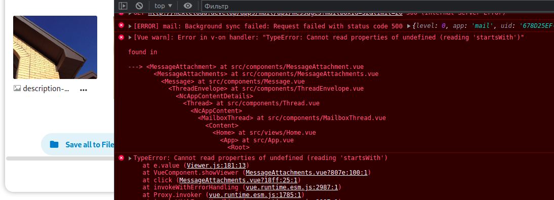
this got lost. images should appear clickable if clicking triggers a preview. this will conflict with #7066
There was a problem hiding this comment.
Restored.
I didn't quite understand what exactly was lost. I didn't see the difference. Unless there was no style for .attachment span:hover.
3fc2fd3 to
3991a60
Compare
|
Hello! I resolved conflicts =) |
 ChristophWurst
left a comment
ChristophWurst
left a comment
There was a problem hiding this comment.
Code and UI look good
This will likely conflict with #7066, which is planned to be merged today. I'll see if I can resolve the conflicts later on.
@ChristophWurst |
3991a60 to
6424652
Compare
|
It is not expected. @GretaD ran into the same bug. Could you possibly provide the info from #7066 (comment)? |
Signed-off-by: Mikhail Sazanov <[email protected]>
9e5193b to
e55bc6f
Compare
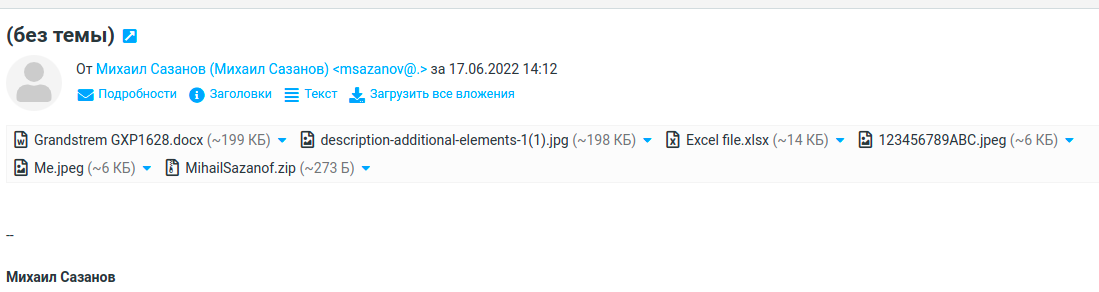
Hello! I don't know whether to open a PR or ISSUE, but as a suggestion, I decided to experiment a little with the visual arrangement of attachments in the message.
I don't know if my PR will be useful, but if there is an opportunity, please read it.
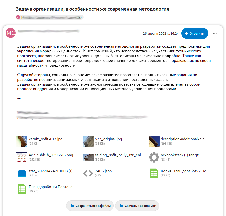
I'll try to attach a GIF to fully show the logic of the work. In this drop-down menu, it may be worth moving the preview as well
As an option - it would be possible to use vertical scrolling of two rows ...
Thank you!
Fixes #7120