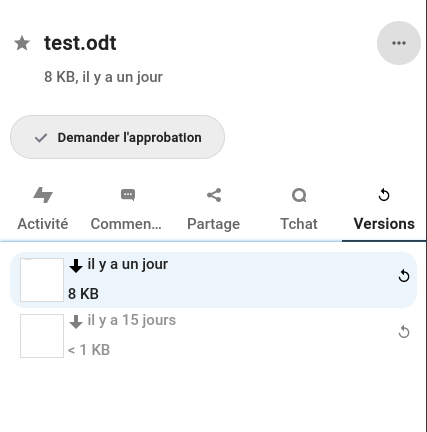
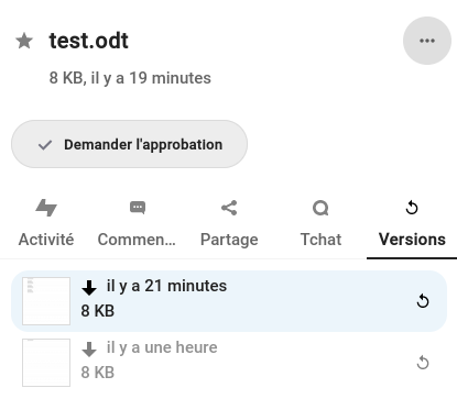
Highlight selected file version (in Nextcloud Office and other similar context) #32492
Conversation
Adding same css behavior as hover.
Fixes UX issue when user often doesn't know what history file version has been selected previously.
|
For reviewers : Impact of new CSS property on front rendering. |
|
Very nice work! I only have some small suggestions:
|
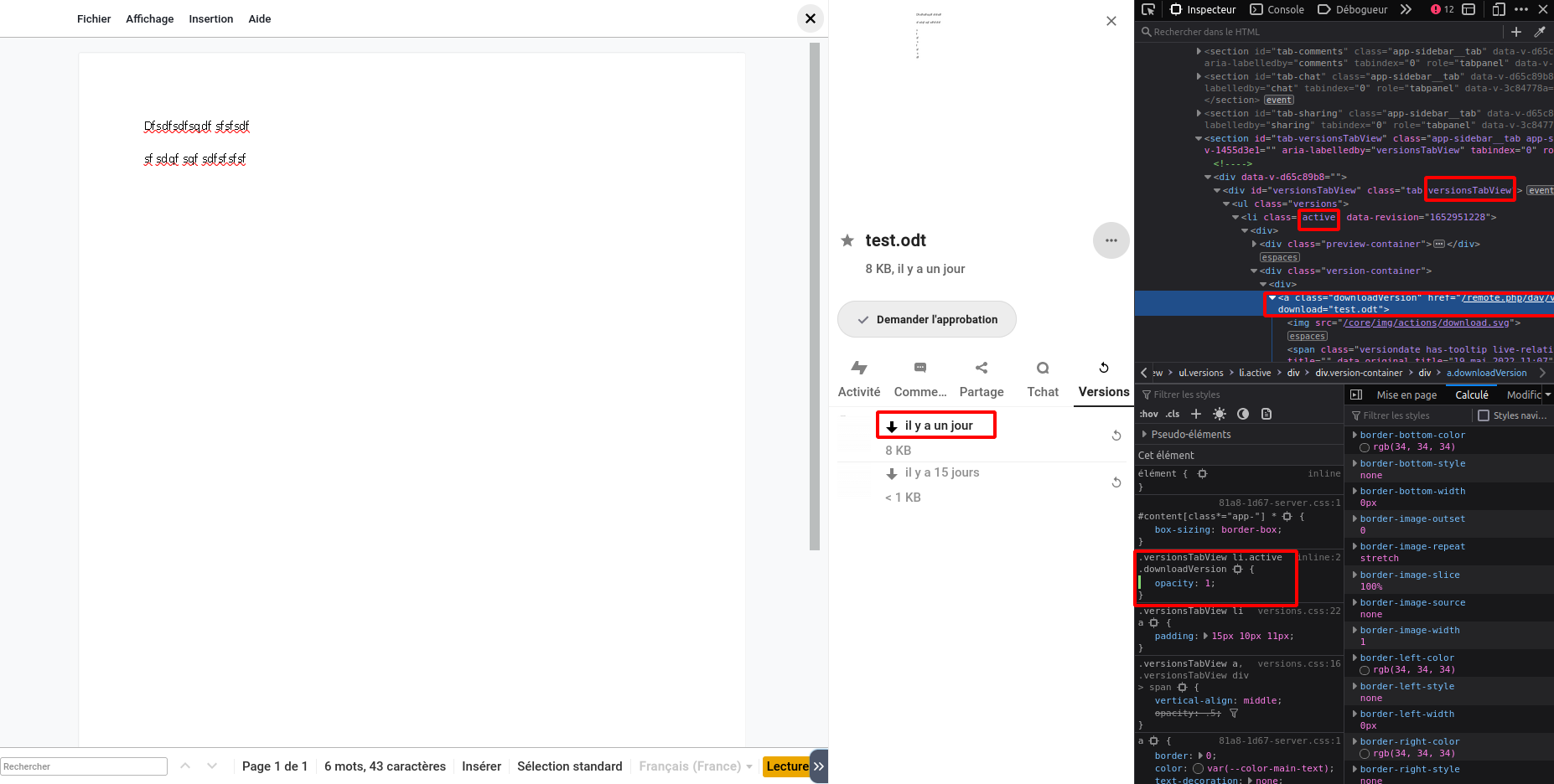
When "active" class is enabled :
- Background color (with var(--color-primary-light)) + border radius (16px), like in Nextcloud Talk
- Subline color: var(--color-main-text)
Consequence of this change :
- Slight shift of the document preview thumbnail and the restore button so that they are not stuck to the edge of the frame when it is light blue.
- Removal of the light grey border that was applied to the "li" tag as it followed the newly added rounding.
- Improved the visibility of the thumbnail with the addition of a grey var(--color-border-dark) border as it was not very visible on the white background of the interface outside the general context of this pull request.
@nimishavijay , thank your for your reply ! When "active" class is enabled :
Bonus :
|
|
Please post screenshots so it is easy for everyone to review design changes :) |
|
|
Super nice! Looks great now! Only some issues with alignment which are more visible with the colored background:
|
|
I'll take care of that next week. |
Nimishavijay said :
- the restore button should be vertically centered and moved to the left such that it has equal space in its top, bottom and right
- Move both the lines of text (including the download icon) 2px to the right because it looks too close to the filetype icon
- I'm also thinking the subline text (8KB) could be moved 1 or 2px upwards to have more space below, since there is no border to separate the list items
|
@nimishavijay , here are the last changes. |
|
Looks perfect! No other comments from my side! Really really nice work :) 🚀 |
|
@jancborchardt @nimishavijay , |
 artonge
left a comment
artonge
left a comment
There was a problem hiding this comment.
The code could probably be refactored to be more simple, but if it works, then ok :)
Signed-off-by: Nextcloud bot <[email protected]>
… is wrong or has expired

Signed-off-by: Cyrille Bollu <[email protected]>
Signed-off-by: Carl Schwan <[email protected]>
This is not always needed and slow down the upload

Signed-off-by: Carl Schwan <[email protected]>
…xpires

Closes nextcloud/activity#784

Signed-off-by: Thomas Citharel <[email protected]>
Signed-off-by: Nextcloud bot <[email protected]>
Signed-off-by: Christopher Ng <[email protected]>
Often times the mount point has a leading slash.
This fix sanitizes it to make sure matching works.

Signed-off-by: Vincent Petry <[email protected]>
Signed-off-by: Vincent Petry <[email protected]>
Signed-off-by: Christoph Wurst <[email protected]>
Adding same css behavior as hover.
Fixes UX issue when user often doesn't know what history file version has been selected previously.

Signed-off-by: Jerome-Herbinet <[email protected]>
When "active" class is enabled :
- Background color (with var(--color-primary-light)) + border radius (16px), like in Nextcloud Talk
- Subline color: var(--color-main-text)
Consequence of this change :
- Slight shift of the document preview thumbnail and the restore button so that they are not stuck to the edge of the frame when it is light blue.
- Removal of the light grey border that was applied to the "li" tag as it followed the newly added rounding.
- Improved the visibility of the thumbnail with the addition of a grey var(--color-border-dark) border as it was not very visible on the white background of the interface outside the general context of this pull request.

Signed-off-by: Jerome-Herbinet <[email protected]>
Nimishavijay said :
- the restore button should be vertically centered and moved to the left such that it has equal space in its top, bottom and right
- Move both the lines of text (including the download icon) 2px to the right because it looks too close to the filetype icon
- I'm also thinking the subline text (8KB) could be moved 1 or 2px upwards to have more space below, since there is no border to separate the list items

Signed-off-by: Jerome-Herbinet <[email protected]>
|
Something went wrong with the rebase :/ |
Yeah, I made a mistake in helping Jérôme with his PR... We have rebased the branch So, you think we have to resolve conflicts or create a new PR ? |
Preferably clean this PR, but if it is too much work, you can create a new PR. Not sure how you ended up in this state, but I would do something like to recover: git checkout patch-1
git checkout -b patch-1.bak
git branch -D patch-1 # Destructive step on local repo
git checkout master
git checkout -b patch-1
git cherry-pick 4d61008caeff0db760c2f4aa52e698251863b2b1
git cherry-pick 85279020f2c5dd6cfed48d410bde03203b8984d5
git cherry-pick 699efb45fa6e16317f0b14cd915ffd8c2eb9c2b0
git push --force # Destructive step on remote repoBut be careful to not lose your work ! |
|
I close my messy PR and I will create a new one later. Have a nice day. |
After my PR nextcloud#32492 fail, I create a new PR.

Signed-off-by: Jérôme Herbinet <[email protected]>

Signed-off-by: Jérôme Herbinet <[email protected]>
|
New PR #33434 @nimishavijay |
|
After my PR nextcloud#32492 fail, I create a new PR.

Signed-off-by: Jérôme Herbinet <[email protected]>

Signed-off-by: Jérôme Herbinet <[email protected]>
After my PR nextcloud#32492 fail, I create a new PR.

Signed-off-by: Jérôme Herbinet <[email protected]>

Signed-off-by: Jérôme Herbinet <[email protected]>
Adding same css behavior as hover.
Fixes UX issue when user often doesn't know what history file version has been selected previously.
The "active" CSS class already exists and is already added/removed on the "li" tag. The only missing stuff is the CSS property that i have added in this pull request.