[Site Design Revamp] Enlarges design thumbnails #16474
Conversation
 antonis
added
[Type] Task
Site Creation
Part of a WIP Feature
antonis
added
[Type] Task
Site Creation
Part of a WIP Feature
|
You can trigger optional UI/connected tests for these changes by visiting CircleCI here. |
antonis
changed the title
|
You can test the changes on this Pull Request by downloading the APKs: |
|
👋 I've updated the issue to include the exact dimensions from the designs, which it looks like you're matching for mobile (200px). 👍 I'm not sure if Android will need to handle tablet widths, which appear to be 250px. |
Thank you for pointing this out @twstokes 🙇 |
 mkevins
left a comment
mkevins
left a comment
mkevins
left a comment
There was a problem hiding this comment.
I tested this on a Pixel 3a (physical device) for both the page and site design pickers, in both portrait and landscape modes, and it is working as described. Also, the code changes look great.
Thank you for also mentioning the alternative approaches, and the rationale for going with this approach. I completely agree with the rationale, and appreciate the effort to find the cleanest way forward, reducing the potential for tensions to arise between the usages of these shared implementations. Great work Antonis!
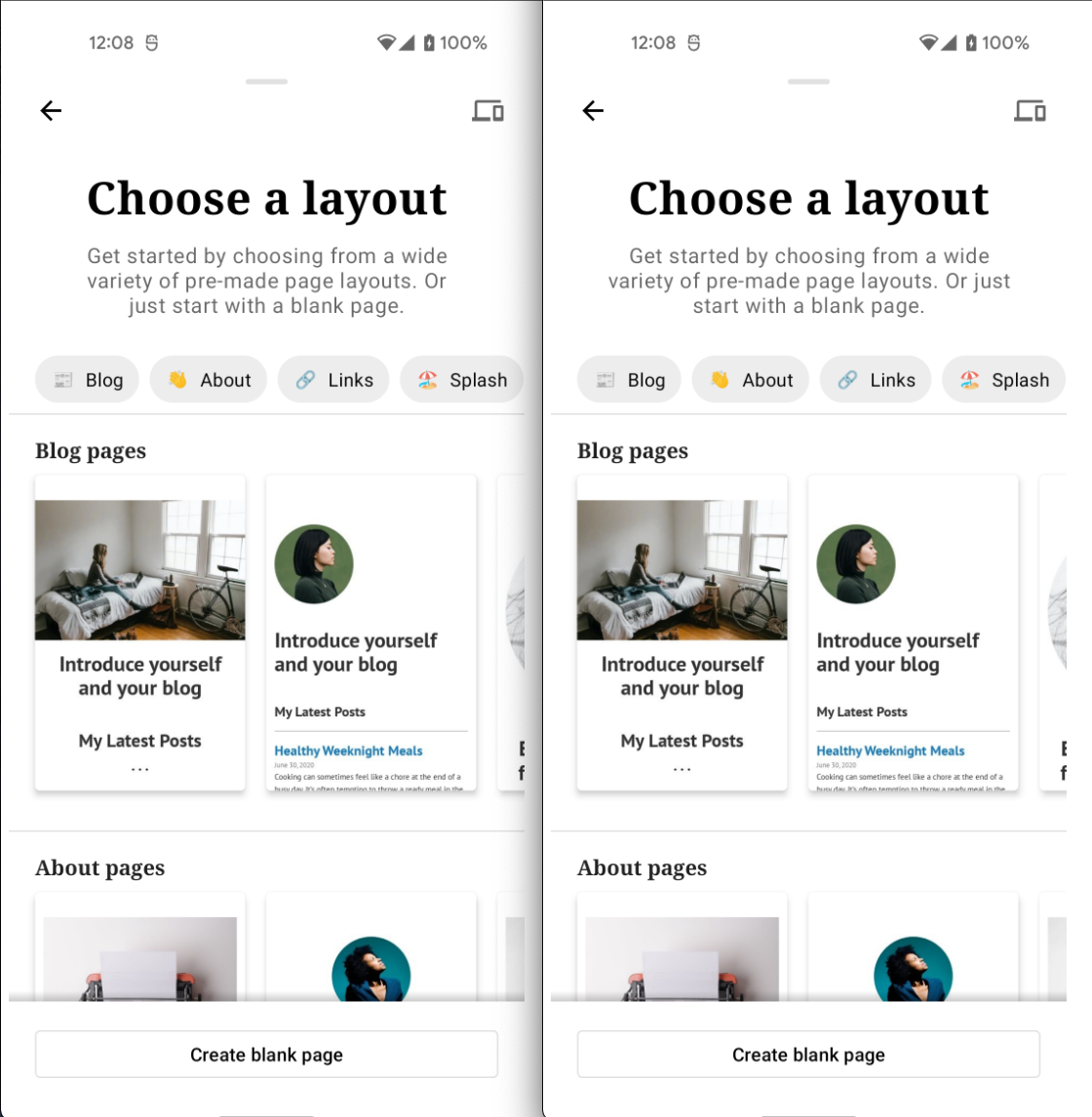
One minor observation (not a blocker, but perhaps just something to confirm), I noticed that in the screenshots for the page picker provided in the description:
screenshots
Verify that the UI of the page layout picker is unchanged
Before (19.8) |
After |
|---|---|
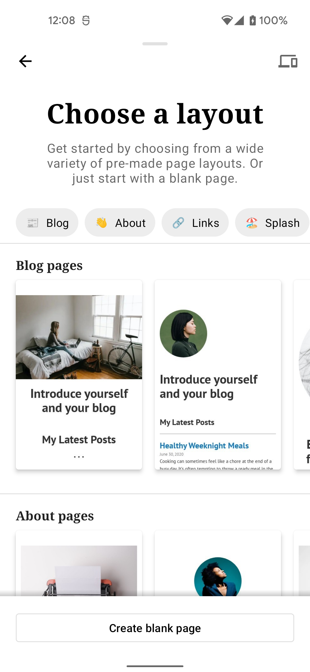 |
 |
the first category (Blog) seems slightly smaller in the "after" image (i.e. the horizontal rules seem closer together vertically compared to the "before" image). I didn't notice this in my testing, but only when looking closely at the provided screenshots, so perhaps this is more of an issue with the screenshots themselves? I also notice the clock is offset a bit, so I'm thinking it's a screenshot issue, and not an implementation issue.
|
Thank you for reviewing @mkevins 🙇
|
Thanks for confirming 👍 I figured it must be from the way it was displayed, since the clock was not aligned either, and that's not part of "our" UI 😄 . |
Fixes #16408
Description
This PR enlarges the the thumbnails of the site design picker by dynamically setting the layout dimension. This is achieved by:
and the Site Design picker
The PR also sets the loading skeleton dimensions to match those of the thumbnails on each screen.
Note:
Other alternative approaches were considered/tried. One involved creating separate layout files but due to the structure of the code this required duplicating the implementation of the
LayoutCategoryAdapterand its nested components.To test
Start the site creation flow and verify that the thumbnails are enlarged
feature/site-design-revamp)Verify that the UI of the page layout picker is unchanged
19.8)Regression Notes
Potential unintended areas of impact
Page Layout Picker UI
What I did to test those areas of impact (or what existing automated tests I relied on)
Manual testing and the existing
ModalLayoutPickerViewModelTestWhat automated tests I added (or what prevented me from doing so)
Relied on existing tests
PR submission checklist:
RELEASE-NOTES.txtif necessary.