Replace the 'new collective' form with a modal #504
Conversation
819ba63 to
c180284
Compare
1 flaky tests on run #368 ↗︎Details:
|
|||||||||||||||||||||
| Test | ||
|---|---|---|
| Collective > after creation > has all the ui elements |
Screenshot
|
|
This comment has been generated by cypress-bot as a result of this project's GitHub integration settings.
68f5eb9 to
f554c22
Compare
 jancborchardt
left a comment
jancborchardt
left a comment
There was a problem hiding this comment.
Looks very nice, very much like in Talk :) cc @marcoambrosini. 2 pieces of feedback:
- Also like in Talk, in the first step we could already list some permissions, e.g. the editing and sharing permissions, as well as the default page mode? Then it’s not so empty, and the permissions are set before anything is shared, very secure.
- The "Collective with that name already exists" could already be shown in the name input step, no? (Like how web services often check in the background if the account name is still available.)
There was a problem hiding this comment.
Super nice! Flow looks really great :) Agreed with @jancborchardt plus some points from my side:
- The icon for selecting a circle seems unclear. Maybe it could a button with a label "Choose circle" or something like that?
- "Select members" --> "Add people"? cc @jancborchardt on this one
- It also seems like it's confusing to create a personal collective. We could possibly add a secondary button on the left of "Select members" which says "Create" or something. also cc @jancborchardt
- Hover feedback for the emoji seems to be a few pixels too wide, it should be a circle (equal width and height)
- Each item in the list of users doesn't need to have a background, background shown only on hover and select would work better :)
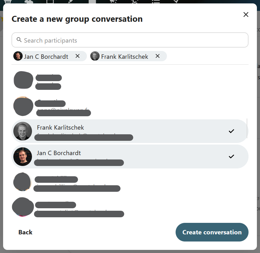
- The checkmark could have more margin all around. Even better: Align all checkmarks to the right, similar to creating a new group conversation in Talk
- Also a question: what is the symbol in the search field on the right?

|
Wow that looks very nice! 🤩
|
In the long run I thought that we could provide templates for the new collective here. That's why I kept it empty for now. Sure, we could add settings there, but I'd like to do this in a follow-up if at all, as it requires quite a bit of extra work.
Yeah, that would be a nice user experience. On the other hand, that would require an API call to check if a circle with a specifici name exists (circle names are global on the instance) and that would mean to allow enumeration. At the moment, when creating a collective, the backend tries to create the circle and errors out if it already exists. That's way harder to brute-force than an API that allows to check if a name is taken. |
Hehe, that's my password manager 😉 |
7f4e65a to
d33e85a
Compare
|
@nimishavijay @jancborchardt @julien-nc I tried to address all your feedback, thanks a lot. Some ideas I didn't implement, but I commented on them instead, see above. Screenshots and screencast above are updated as well. |
d33e85a to
c3fd35e
Compare
|
Looks really nice! |
Thanks for looking into it @susnux! The main reason is that the member picker dialog should look similar to how it looks in Talk when creating a new conversation and in Contacts when picking members for a circle. I agree that we should streamline this into a nextcloud-vue component at some point. |
d5498c6 to
3f28b8a
Compare
95cad3e to
c6bcbd6
Compare
 max-nextcloud
left a comment
max-nextcloud
left a comment
There was a problem hiding this comment.
Just had a look at the code so far.
Looks good to me. 🎉
Just some minor comments.
 nimishavijay
left a comment
nimishavijay
left a comment
There was a problem hiding this comment.
Looks great! Only point I noticed is the button for choosing a circle is a bit confusing without a label, but we can merge this now and open a follow up issue about it :)
Signed-off-by: Jonas <[email protected]>
Fixes: #464

Signed-off-by: Jonas <[email protected]>
Signed-off-by: Jonas <[email protected]>
Signed-off-by: Jonas <[email protected]>
Signed-off-by: Jonas <[email protected]>
* Fix emoji button width to 44px
* "Select member" => "Add people"
* No default background for member search results
* Align checkmarks for selected member search results to right
* Fix invisible circle picker dropdown menu
* Add min-height to selected members area to prevent content jumping
* Clear search results before starting a new search

Signed-off-by: Jonas <[email protected]>
Signed-off-by: Jonas <[email protected]>
Signed-off-by: Jonas <[email protected]>
c6bcbd6 to
3eba24e
Compare
* Remove dead code that dealt with duplicate diplayNames in search
  results. We don't use displayName at all.
* Move code to filter and sort results into its own helper function.
* Further minor improvements.

Signed-off-by: Jonas <[email protected]>
Signed-off-by: Jonas <[email protected]>
3eba24e to
eca453b
Compare
📝 Summary
🖼️ Screenshots
Screencast
recording.webm
🚧 TODO
onCreate()before givingmemberstoADD_MEMBERS_TO_CIRCLE🏁 Checklist
npm run lint/npm run stylelint/composer run cs:check)